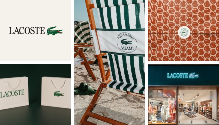
Paris, France – Lacoste has introduced a new visual identity, refining its core brand elements in a move that leans on heritage while sharpening its contemporary expression.
At the centre of the update is typography. Drawing from archival references, the brand reintroduces a stronger use of serif characters through a bespoke typeface defined by precise proportions, rhythm, and spacing—positioned as a key structuring element of its visual system.
The redesign pulls heavily from the brand’s origins. Early works by founder René Lacoste and illustrator Robert George have been revisited, with existing codes refined rather than replaced.
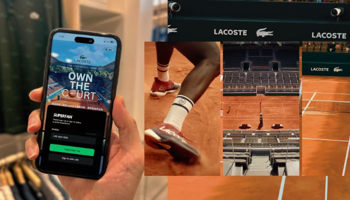
The crocodile emblem, one of fashion’s most recognisable logos, remains central. Its application has been adjusted to allow greater prominence across contexts, particularly in standalone use.
Subtle refinements include a more visible red tongue—an original detail now emphasised to reflect a sense of playfulness.
Colour has also been recalibrated. Lacoste’s signature green has been aligned more closely with its original shade, while the broader palette highlights historic tones, including clay—referencing tennis courts—and farine, inspired by the off-white of René Lacoste’s first blazer.
Additional elements extend the brand’s heritage cues. René Lacoste’s handwritten signature is being introduced across selected touchpoints, including Café Lacoste, adding a more personal dimension. Archival-inspired motifs tied to tennis, golf, and the crocodile will also feature more prominently, particularly in packaging.
Developed with Commission Studio, the updated identity will be rolled out progressively across all brand expressions in the coming months.