![[Brand Refresh] Dominos x Unbox Your Cravings](https://marketech-apac.com/wp-content/uploads/2026/06/Brand-Refresh-Dominos-x-Unbox-Your-Cravings.jpg)
Singapore – Domino’s Pizza Singapore has unveiled a refreshed brand identity and new regional platform, “Unbox Your Cravings”, as the pizza chain looks to sharpen its relevance among younger consumers and reposition itself around everyday indulgence. The refresh introduces a bolder visual system across...
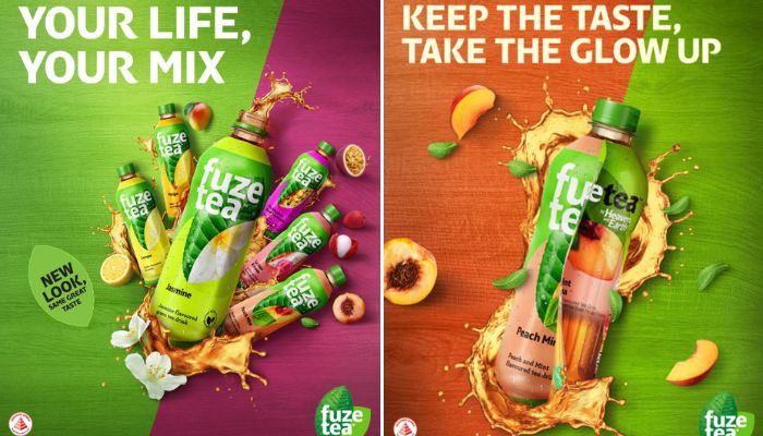
Singapore – Fuze Tea has launched “Don’t Compromise” in Singapore, a new brand platform designed to deepen its relevance among Gen Z consumers while strengthening its positioning in the competitive ready-to-drink tea category. The campaign marks a broader refresh for the brand in Singapore, combining...
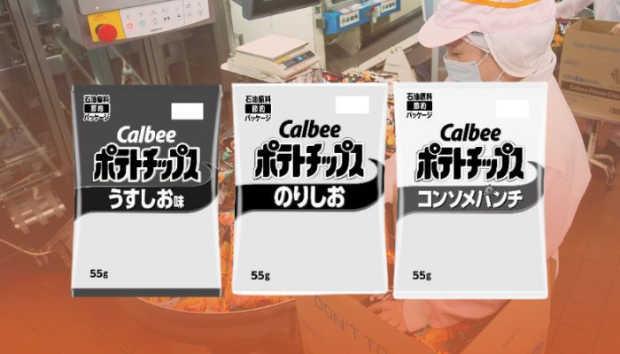
Japan – Japanese snack food maker Calbee, Inc. has announced that it will temporarily revise packaging specifications for select products due to supply instability affecting certain raw materials amid ongoing tensions in the Middle East. In a notice on its official website, Calbee said the measure is...

According to the company, the new platform highlights the role of small, everyday moments of happiness and positions the beverage as part of those experiences.
![[Brand Identity Refresh] Lacoste 2026](https://marketech-apac.com/wp-content/uploads/2026/04/Brand-Identity-Refresh-Lacoste-2026.jpg)
Paris, France – Lacoste has introduced a new visual identity, refining its core brand elements in a move that leans on heritage while sharpening its contemporary expression. At the centre of the update is typography. Drawing from archival references, the brand reintroduces a stronger use of serif characters...
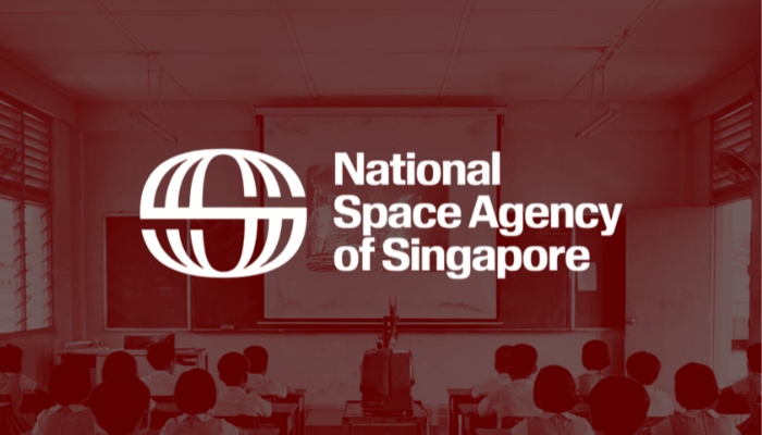
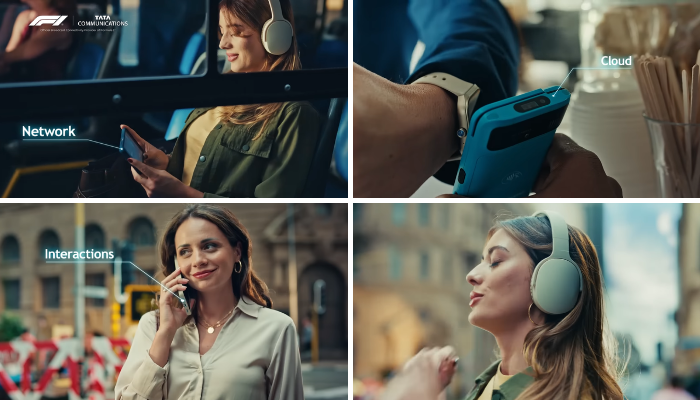
Singapore – National Space Agency of Singapore (NSAS) has officially unveiled its new brand identity, marking the formal launch of the country’s autonomous space agency. The reveal follows the agency’s initial announcement at the Singapore Space Summit 2026 in February, signalling Singapore’s growing...
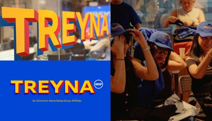
It is not a mere assumption to say that the Omnicom-IPG merger has changed the trajectory of the advertising landscape. To cope, some agencies have rewritten names and identities, and a few battled for independence. If one came to think that TREYNA’s rebranding last December ended there, the group has...
For Amitabh, ‘Together, limitless’, which was done alongside McCann, is the external reflection of the brand’s internal transformation into a strategic partner that can orchestrate this complex digital landscape.

Makati, Philippines — InLife Benefits Insurance Company, Inc. has formally unveiled a new brand identity following InLife’s full acquisition of Generali Philippines in May 2025. The rebrand marks a new phase for the company, which has close to three decades of experience in providing employee benefits,...

Individual airlines within the Group will retain their own identities but will increasingly carry the “Member of Lufthansa Group” endorsement across touchpoints.
![[Report] Gemini SEA Users](https://marketech-apac.com/wp-content/uploads/2026/07/Report-Gemini-SEA-Users.webp)