APAC – Global health and beauty retailer AS Watson announces its brand refresh featuring a modernised visual identity that injects more energy into the brand, as well as a new brand circle that focuses on the brand’s values.
The refreshed brand direction aims to bring its 180 years of heritage to the forefront of the business with added vitality to propel the company towards achieving sustainable growth in decades to come.
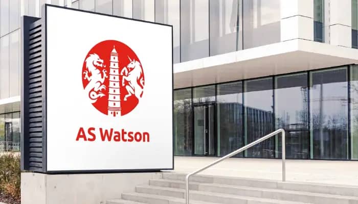
Within the newly refreshed logo, a red-colour background has been introduced alongside the existing dragon and unicorn, symbolising a combination of east and west, as well as a nine-level pagoda, which represents ethics, values and respect.
The brand name has also taken a simplified approach by renaming ‘A.S. Watson’ as ‘AS Watson’, symbolising the past, present and future achievements of the brand.
Furthermore, the AS Watson Brand Circle is introduced to symbolise unity and wholeness in the organisation, bringing together its clear purpose, vision, mission and DNA.
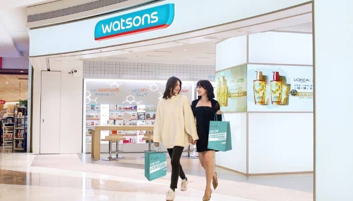
AS Watson’s rebrand aims to embrace new opportunities, with the goal to be a first-choice shopping destination for quality health, beauty and lifestyle products and services on its O+O platforms.
Expressing her excitement on the refresh, Malina Ngai, CEO of AS Watson (Asia & Europe), said, “This marks a significant milestone in our company’s history. We are AS Watson! Together with our 130,000 colleagues, business partners and stakeholders in the communities where we operate, we are dedicated to love our customers and deliver our simple yet powerful purpose – to put a smile on our customers’ faces today and tomorrow.”