Singapore — Germany-based automotive manufacturer and industrial sector supplier Schaeffler has announced the launch of a new series of regional motifs as part of the company’s global image campaign to promote its new claim, “We pioneer motion.” The company said the new motifs aim to highlight its corporate purpose and strategic direction. 

Schaeffler said the goal of the global campaign is to bolster its corporate brand worldwide and to underscore the company’s global orientation as a leading automotive and industrial supplier. Meanwhile, the regional campaign focused on APAC presented four new creative designs representing the brand’s ethos on innovation, tradition, uniqueness, and passion to succeed, while also drawing inspiration from the cultural diversity of the Asia Pacific region. It will be exclusive on digital channels like display and programmatic advertisements across social media platforms and display networks websites in six regional markets.

Dharmesh Arora, regional CEO at Schaeffler APAC commented on the regional extension of the global campaign, saying, “As a global company with strong local presence in multiple markets in the Asia Pacific region, the regional image campaign provides a strong foundation for us to communicate our pioneering spirit and innovative strength, which has been present since we invented the cage-guided needle roller bearing 70 years ago.”

Arora adds, “Additionally, as we embark on our Roadmap 2025 strategy, we look to sharpen and strengthen our focus on creating new and exciting opportunities to reach and engage with stakeholders through an integrated approach.”

The current regional campaign rides on the success of the first three waves of the global image campaign, which were rolled out in Germany, China, the USA, Japan, and India in October last year with the third wave including markets such as France and Italy. The global image motifs have generated an estimated 773 million impressions on multiple platforms and channels, leading to increased awareness and engagement to the Schaeffler brand. 

Ashish Shukul, director of communications and marketing of Schaeffler for APAC, said that Schaeffler’s global image campaign has given a major facelift to the company’s brand imagery and visual identity. Shukul added by saying that the momentum gained from the strong performance of the global campaign, especially the outstanding results in India, allowed us to extend Schaeffler’s campaign to other key markets like Australia, Indonesia, Korea, Singapore, Thailand, and Vietnam.

“We want to make our key stakeholders even more aware of Schaeffler’s extensive manufacturing and technology footprint in the Asia Pacific region. By leveraging learnings from the first three waves of the global campaign, we have adopted a much more targeted and culturally-relevant approach to enhance the presence and visibility of the Schaeffler brand. This also allows us to highlight the leading qualities that make us the preferred technology partner of our customers’ sectors, ” Shukul said.

Singapore foodpanda, leading delivery and grocery platform in Asia, celebrates its 10th anniversary with the unveiling of its first-of-its-kind brand ambassador — Pau-pau. The mascot will be given its own unique characteristics and will be featured on foodpanda’s different marketing platforms.

The introduction of Pau-Pau builds on foodpanda’s earlier brand refresh. The pink panda is the platform’s venture towards new brand representation, where, aside from the traditional marketing environments, the new brand ambassador will also be utilized to maximize digital marketing touchpoints.

Idan Haim, foodpanda’s vice president for growth and marketing, commented, “Pau-Pau is a first-of-its-kind among food delivery platforms in Asia! More than anything else, we wanted to create a personality that evokes love among customers. We want Pau-Pau to be an inspiration for people to live life on their own terms and to its fullest. We are excited for our customers to meet Pau-Pau, as we mark the start of a new decade for foodpanda in Asia,” Haim said.

Pau-pau will be featured on the LINE and Instagram apps as an available sticker to bolster use in consumer expression and communication. It will progressively be rolled out into all of foodpanda channels and interfaces, namely the app, website, digital and social media platforms, as well as live-environment activations and more.

The mascot has been developed with a unique set of characteristics that will further help it relate with a wider range of audiences across the Asian market; foodpanda said Pau-pau believes in caring for the environment, empowerment, and living freely.

Eunha Bhang, chief creative officer of delivery hero Asia, gave her thoughts on the uniqueness of the character.

“In creating Pau-Pau, we wanted him to also have a dimension of purpose — that he stands for something more than just being an adorable mascot. Pau-Pau embodies and brings to life the foodpanda spirit by helping our communities reimagine how they use delivery and thereby adding vibrancy and fun in their lives,” she shared.

With the announcement of Pau-pau, one of the character’s key projects will be spearheading the campaign for plastic-free and environmentally-friendly consumerism with foodpanda’s Global Sustainable Packaging Programme to encourage merchant and consumer responsibility.

The one-of-its-kind ambassador was first rolled out in Japan, Taiwan, and Cambodia in December 2021, which was subsequently followed by its appearance in other foodpanda networks namely Singapore, Malaysia, Thailand, Hong Kong, and Laos. The next phase will introduce the ambassador in the Philippines, Myanmar, Pakistan, and Bangladesh.

Last November, foodpanda also announced its partnership with Chinese tech giant Xiaomi to venture into q-commerce allowing the option of purchasing consumer electronic products and appliances through its apps. 

Singapore – World Table Tennis (WTT), the global table tennis competition, is launching with a new brand identity spearheaded by brand agency Superunion. The new identity aims to capture new audiences, attract new partners, and inspire sports fans and consumers to play and enjoy the game. 

WTT, created by the International Table Tennis Federation (ITTF), has seen that table tennis was only taken seriously as a competitive and commercial sport in a few countries, hence, wants to change this. 

With a fresh gradient visual creative, Superunion said it developed the new brand in a way that would change the way the world sees table tennis, to position WTT in the center stage, and bring its elite athletes, thrilling events, and exhilarating entertainment to the global audience. 

Inspired by WTT’s vision to show table tennis in a different light, Superunion’s creative strategy was to reverse the audience’s viewpoint by showing the game from the ball’s eye view, capturing the energy and skill of the game and allowing the audience to see table tennis from a new, unique perspective – literally. 

The identity design mirrors sports photography, capturing how each player focuses on the ball in motion. It follows the movements of the spinning ball at a break-neck speed, playing out the drama, precision, skill, passion, and mental agility that the players bring to the table. The whole new look speaks of ‘uncompromising confidence’ – whether that’s the new iconic black table or the redesigned theatre of play.

The World Table Tennis Cup Finals will be held in Singapore from 4 December to 7 December. 

Last June, Superunion was also the agency behind the official branding of TMBThanachart Bank, the recently merged banking institution in Thailand. 

Singapore – Float Foods, the local home-grown foodtech startup, has tapped the services of dentsu Singapore to be its brand and digital strategy partner to aid the startup in the commercial launch of Asia’s first plant-based whole egg product, OnlyEg.

Through the appointment, dentsu Singapore will be responsible for developing the product’s go-to-market brand strategy, identity, design and launch campaign in Singapore in 2022.

Speaking about the startup launch in Singapore, Vinita Choolani, founder and CEO at Float Foods, said that the prime reason they aim with the launch is due to the fact that COVID-19 has highlighted a burgeoning food security problem, especially in Singapore, adding that they have identified a critical need for Singapore to plug that gap to ensure the long-term safety of our food ecosystem. 

“Equally important, we recognized that it needed to be done in a clean and sustainable way that allowed people to eat healthily and economically. That was why Float Foods was born and our breakthrough plant-based whole egg protein product will be able to change the way eggs are consumed in Asian cultures where it is a key diet,” Choolani said.

She added, however, that any game-changing product and technology requires radical collaboration with partners who believe in it, further stating that it has therefore been important for them to work with investors and partners who appreciate the startup’s vision to advance Singapore’s food ecosystem.

“That is why dentsu Singapore is a clear choice for us as a partner for the launch of OnlyEg. Its appreciation of Float Foods’ longer-term value to the food landscape in Singapore, combined with dentsu’s capabilities in brand and digital strategy, was a strong proposition for us. We look forward to bringing this to launch together,” Choolani stated.

Meanwhile, Prakash Kamdar, CEO at dentsu Singapore, commented that their company’s commitment for being a force of good and growth is stemmed from their focus on helping businesses achieve good for growth, yet it is not every day that they get to work with a partner who is positively revolutionizing the landscape in which it operates in.

“As such, we are incredibly delighted to be able to support Float Foods in its go-to-market strategy and execution as it champions change in the way we manage food supply and security in Singapore while taking care of the environment. We are grateful for the confidence placed on our ability to bring our integrated thinking and capabilities to the table. Our team has a deep appreciation for Float Foods’ vision and principles, which will be applied in building a strong brand strategy that will help to successfully launch OnlyEg to the market once it is ready,” Kamdar concluded.

In overview, Float Foods has raised US$2.2m in seed funding and is collaborating with research and development agencies in Singapore to optimize OnlyEg for commercial readiness by 2022. The foodtech startup also plans to roll out more plant-based products in Singapore and the region in the next two years.

In the age of always-on e-commerce and notoriously short attention spans, it can be tempting to downplay your branding in favor of acquisition-focused digital advertising. Branding, however, is an important aspect of all marketing campaigns, regardless of the objective.

Think of branding as your foundation. Taking the time to build a strong brand, investing time and money into your brand strategy, will ultimately result in more successful performance over time. While sales activations and offer-led initiatives will provide short-term sales uplift, brand building will result in long-term growth and stability.

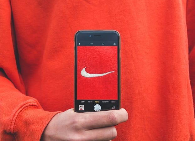
Your brand represents the reason your business exists – your ‘why’, what you do, and why you’re different. It is about everything that makes you a better choice than your competitors and when done well, can portray all of that in a shade of Cadbury purple or a Nike ‘swoosh’.

While there are many arguments for developing a strong branding strategy, here are the top four reasons why branding is such an important element in reaching your performance objectives:

Brings new customers

Strategic brand awareness campaigns introduce your business to new potential customers. It’s often said that an audience needs to see your brand at least 7 times before they will consider purchasing. This number is reduced if you have a strong, unique brand positioning. If your brand is memorable, you won’t necessarily need as many impressions to be effective.

When you have both a strong brand identity and are consistently marketing, you will improve your reach and consideration. Brand awareness helps to bond new customers to your brand.

Builds trust

Customers are more likely to purchase from brands that they know and trust. A strong brand identity helps to build a connection with your target audience as they will recognize, know, and understand your product and point of differentiation via brand messaging.

A trusted brand also leads to brand loyalty and repeat purchases. Customers will rebook or rebuy your product with little to no forethought. These sales are far easier and more cost-effective to achieve than first-time sales. If they like your product and your brand, customers are also more likely to recommend you to their family and friends, exponentially improving your ROI.

Establishes target audience

Starting with a clear brand identity will help to position your offering and to target the customers you want to attract. Brand strategy will help to develop a deep understanding of your ideal customer’s demographics, attitudes, and behaviors, helping to tailor your products and messaging. It is expensive to market to everyone, and so having a strong understanding of who your brand is ‘for’ will help to specify your campaign targeting, therefore reducing advertising waste and making your dollar work harder.

Builds resilience

Research has shown that brands with high brand equity are more likely to be insulated in times of economic uncertainty, with a faster recovery when the market returns. A strong, clear positioning, along with loyal customers and consistent messaging helps a business to weather bad times while preparing them to accelerate during the good times.

Working on your brand identity and awareness cements your spot in your customer’s mind and will help to protect your business and ensure it can bounce back more quickly in times of turbulence.

Brand awareness is a core indicator of marketing success. It is your base and marketing ‘foundation’, upon which actionable sales promotions should sit. Every piece of communication should look, feel and sound like your brand, reinforcing who you are and why you are the best choice.

An effective brand strategy will increase your overall return on investment. While it can be more difficult to measure brand awareness compared to lead generation or revenue targets, campaigns that allow for both are more likely to have improved performance outcomes and ultimately reach their objectives.

Brand awareness is a slower path than the sugar-hit of a sales-focused goal, however, it is vital for long-term stability. A strong brand foundation will improve the results of your promotional and lead-focused activity, across all channels.

This article was written by Charlotte Ward, director of Agnes Media.
Agnes Media is a measurement-first marketing agency that regularly recommends their clients incorporate a combination of both brand and performance activity to maximize efficiencies using a holistic approach.

Singapore – theAsianparent, the content and community platform for parents in Asia, has hired its first-ever chief branding officer, Fiza Hasan Malhotra

Malhotra most recently comes from Singapore-headquartered workplace design consultancy, Space Matrix, as its global marketing director. She boasts more than two decades of experience in brand innovation and marketing strategy. 

theAsianparent is the largest content hub and community platform for parents in Asia which spans across 13 markets in the region such as in Malaysia, Singapore, and the Philippines. In November, it has also announced its new country manager for Indonesia, Rotsen Quispe

Malhotra’s career spans digital transformation, public relations, corporate communications, event management, and social entrepreneurship. Prior to her role at Space Matrix, she was the head of business development and corporate innovation at Impact Hub Singapore. She has also worked for global brands Credit Suisse and Citibank. 

Malhotra said, “My goal is to put theAsianparent Group and its core brands on the path of global market leadership, powered by authentic brand experiences delivered to our community of parents, employees, clients, and our current and future stakeholders.” 

For one of her first projects as the new CBO, Malhotra helmed theAsianparent Awards, which seeks to find and celebrate the most trustworthy parent and baby brands for Asian parents across the region through its panel of parent judges and by community vote.

Of the appointment, founder and theAsianparent Group CEO, Roshni Mahtani Cheung, says, “theAsianparent brand is one I chose with care and nurtured from its infancy, so it is with even greater care that I chose whom to entrust it to. theAsianparent has come to mean many wonderful things to those who encounter it. We want to distill all that into one essence, so when anyone hears the brand or sees the icon, they know, in a snap, what we stand for.”

Malhotra adds, “I am excited to be part of a team that is passionate not only about performance and innovation but also impact—with our mission to help 100 million parents have healthy pregnancies and families. We are currently Southeast Asia’s largest parenting community and continue to look at market expansion and other opportunities across our platforms. To help build and grow a Singapore HQ brand into a leading global player is a huge passion of mine and I look forward to leading the team in reaching that summit.”

In March, the platform entered MARKETECH APAC’s top 5 stories for its VIP Parents Platform (VIPP). VIPP is the hub’s platform to getting to know the most proactive parents and giving them the opportunity to be influencers as well as for brands to reach out to the said cohort. 

Thailand – Following the merge of two of Thailand’s mainstream banks, TMB Bank and Thanachart Bank (TBank), the two have launched their official brand identity as the new TMBThanachart Bank. 

In 2019, the plan to merge was officially announced, where completion had been awaited for 2021. Now that the banks have finally unified, it unveils a brand identity that is a true fusion of each of the banks’ original and standalone brandings. 

The banks’ original brandings prior the merge

Also to have the moniker ‘ttb’, the merger was fulfilled to bolster their banking and financial service offerings to customers, with a purpose to be Thais’ top partner in achieving financial well-being.

Developed by global brand agency Superunion in Thailand, ttb’s brand identity combines TMB’s blue branding and TBank’s orange hue trademark. The branding is simple yet fresh, bearing the letters ‘ttb’ and specifically as that, in small capitals. 

Kanchana Rojvatunyu, the appointed chief marketing officer of the new TMBThanachart Bank, commented, “Our mission is to help people achieve better financial well-being that enables our customers to reach financial freedom and achieve their life goals.”

TMBThanachart Bank will also carry the brand slogan ‘Make REAL Change’. Superunion said that it will signify the bank’s objective to make a positive impact on people’s lives, providing the right solutions to help customers save, invest and spend smarter and eventually, support them to achieve financial stability.

Prachawan Ketavan, Superunion Thailand’s director of strategic planning, shared the concept behind the brand and said the team leveraged on the colors which proved to be very important to both banks. Ketavan said they maintained this element but refreshed them with brighter tones, “providing a balance of stability and dynamism” which also reflects the nature of the new business. 

The connected letters, meanwhile, Ketavan continued, aims to send across the feeling of freshness and being approachable, something fit “for the next digital era of banking in Thailand.”

“As the financial landscape in Thailand continues to evolve, we’re proud to have worked with ttb at such a pivotal point in their history. The brand is fresh and dynamic and reflects both their ambitions and what their customers deserve,” said Ketavan.

According to Dan Ellis, managing creative director at Superunion, the logo and all the foundational assets of the brand were created with a process called ‘Dimensional Branding’. 

Ellis said, “We think about every dimension of the brand, how would it feel, sound, move, speak, respond, interact and importantly stand out in the hearts and minds of Thais.”

TMBThanachart Bank has also released an official film to share the story of the new logo. In it, the bank depicted the coming together of the two entities, which it shows to be borne out of passion and determination. 

Fresh from the merge, ttb has released one of its first offerings, the ‘ttb reserve’; a privilege program that is catered to high-wealth customers, specifically those with over 30 million baht, to provide them deposit, investment, as well as insurance services in preparation for retirement

London – Branding is a multi-dimensional endeavor, and there could never be too many facets for companies and products to unearth in the goal to serve fresh and ingenious ways of asserting one’s identity. In light of recent developments among brands, it seems that to extract the ‘gem’ in branding is to simply pay attention to one of our God-given senses – our sonic appetite. 

In a new announcement, Colgate has revealed that it will now be joining the earlier adopters of audio branding such as McDonald’s and Intel, to develop its first-ever global sonic identity. 

So how will Colgate sound like? In a feature published on YouTube by MassiveMusic, the international creative music agency in London tapped by the brand to develop its sound, it is said that the audio will simply carry these important elements – strong beat, bright sounds, and ‘surprising moments’. 

Most importantly, it will feature ‘humming’ – which had been decided as the centerpiece of the branding’s ‘big idea’ on ‘Optimism’.

In partnership with its New York team, MassiveMusic shared that in the mid of conceptualization, they have been trying to uncover what ultimately makes a sound ‘optimistic’. Optimism has been Colgate’s core value, never leaving the sight of its campaigns through the years, and it was crucial that the audio embodies it and sounds like it. 

This is in turn has motivated the team to turn to the power of science. According to MassiveMusic, they spoke and worked with academics, ethnomusicologists, and neuroscientists, and at the end of their research, they have been directed to one simple but authentic signifier of positivity – the human hum. 

In the same feature, viewers are taken to the first listen of the sonic identity – an upbeat and cheery hum – that would go in sync with the smile visual animation in the Colgate logo. 

The sonic identity consists of a blend of both female and male tones, and the sonic logo was meticulously recorded in such a way as to sound “very real, close, and natural.” 

The choice of key was also based on research, selecting the ‘D Major’ which is widely accepted as optimistic in nature. The agency said the choice of notation and the portmanteau bend towards the end of the sonic logo was also deliberately thought of to create an activating feeling without being overbearing. 

Roscoe Williamson, global creative strategy director at MassiveMusic, shared that the biggest challenge of the project was its complex nature – the need to create a system of branded ‘watermarked’ music, stemming from a sonic DNA that would be adopted by more than 200 countries and across a broad range of platforms and mediums. 

“And so we created a sonic architecture that could handle this complexity and an overarching aesthetic to the new Colgate music and sound that has universal appeal. To do this, we worked with a team of academics and experts and were able to define music and sound cues that throughout history have represented optimism. These cues are at the heart of Colgate’s new sonic brand and have enabled a flexible system that represents the optimistic nature of the brand in a highly distinctive and holistic way,” said Williamson. 

Meanwhile, Jared Richardson, global head of design at Colgate, commented, “It really was an incredible experience developing the sound of Colgate with MassiveMusic. The process, collaboration, and outcome were fascinating and really enjoyable. The result is a strategically valuable asset that will play out across our global marketing campaigns. We look forward to continuing developing this side of our brand.”

The new sonic brand will be rolled out across North America, Latin America, Europe, Africa-Eurasia, and Asia. 

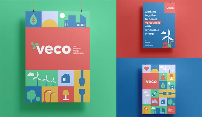
Australia – Creative communications agency Keep Left has launched an innovative brand project for the Victorian Energy Collaboration (VECO), the largest emissions reduction project ever undertaken by local governments worldwide.

VECO sees 46 local government councils in the state pool their energy contracts into one Power Purchase Agreement via Red Energy, to deliver 100% renewable energy that powers up council-owned infrastructure including public libraries, streetlights, and leisure centers, among others.

As the creative partner on the project, Keep Left was tasked with building the brand from inception, which included concepting the name, brand messaging, and visual identity, as well as launching creatives, such as a brand film, an explainer video, a website, and marketing collateral for all local councils involved. 

In addition, the agency has also provided PR and consultation on the launch communication plan for VECO.

Keep Left’s CEO Caroline Catterall shared that it is always exciting to build a brand from scratch and see it come to life from initial ideas through to the finished work, but even more so when it’s such an important project.

She added, “When it comes to climate change people often wonder what they can do to make a difference. VECO is proof that big changes can happen at a local level through the power of collaboration and cooperation.”

“We are so pleased to have been on this journey with the Darebin City Council as the visionaries behind this initiative and thank them for their partnership in bringing VECO to life,” said Catterall.

Singapore – Food and grocery delivery platform foodpanda has announced a revamp to its brand identity across Asia, spanning 400 cities and 12 markets.

The brand identity revamp accentuates foodpanda’s brand color pink across its visual designs, which is also enhanced alongside the prominence of the signature panda logo.

The same visual approach applies to foodpanda’s marketing initiatives both online and offline, for instance with rider- and partner-related branding, foodpanda retains its bold, instantly identifiable ‘fun pink’, but expands its palette to include more complementary colors.

According to Reinald Chee, head of creative at foodpanda, the emphasis on the color pink is rooted in the company’s desire to keep the brand color recognizable by millions of customers across Asia. Furthermore, Chee added that the brand revamp highlights the various personalities of the brand: “friendly, caring, smart, and that little bit rebellious – not afraid to change the status quo or take risks.”

“Our aim has been to create a design language that’s as seamless as our transaction process. At the end of the day, brand identity is all about making a more enjoyable experience for everyone,” Chee stated.

Meanwhile, Idan Haim, vice president of growth and marketing at foodpanda hopes that the brand revamp will help build a solid foundation of the company in terms of customer experience.

“Foodpanda’s refreshed identity reconsiders all customer touchpoints with the brand, connecting the technology behind our app and website with our millions of users’ everyday experiences, from our iconic rider bags and jackets to packaging, marketing campaigns and the app itself,” Haim stated.

Foodpanda-Brand-Identity-Revamp-Asia-2

Aside from the brand identity, foodpanda has also revamped its user interface homescreen, dubbed the ‘bento’. The new interface allows users to seamlessly choose the foodpanda service they need – food delivery, self pick-up, shops or pandamart – while making it easier to explore top restaurants and promotions available in their location.

The brand refresh comes at a time when foodpanda continues to expand its business verticals beyond food delivery, into quick commerce (q-commerce), including grocery delivery via pandamart cloud stores, and through partnerships with leading shops and convenience stores.

“We analyzed every touchpoint with our service, from the app to the rider box. Using thorough insights about the user journey, we envisioned a design direction that could bridge the gap between our tech and the real-life experience of millions of customers,” Chee added.

Foodpanda’s brand refresh will be progressively introduced across all online and offline platforms from April 2021. The refresh has started in Singapore, Bangladesh and Cambodia, and will be launching in Hong Kong, Japan, Laos, Malaysia, Myanmar, Pakistan, the Philippines, Taiwan and Thailand in the coming weeks.