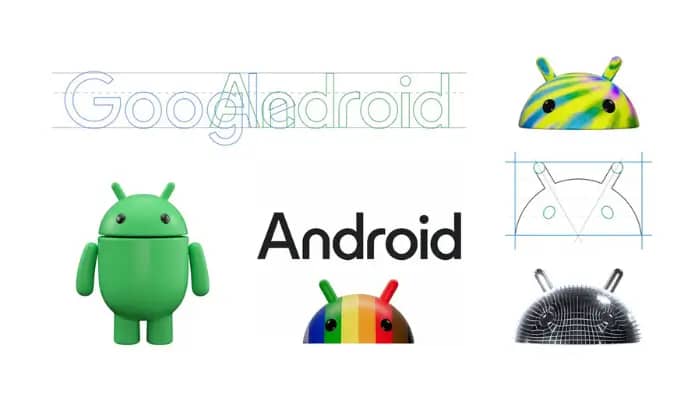
Singapore – Android, the largest mobile operating system globally, has unveiled its recent brand revamp, which includes its iconic robot mascot more prominently by introducing a new 3D look.
In a blog post by Jason Fournier, director of Android consumer brand management, the ‘bugdroid’ — the face and most identifiable element of the Android robot — now appears with more dimension, and a lot more character.
As a visual signifier of the brand, they wanted the bugdroid to appear as dynamic as Android itself.
“We’ve also updated the robot’s full-body appearance to ensure it can easily transition between digital and real-life environments, making it a versatile and reliable companion across channels, platforms and contexts,” he said.
Meanwhile, their new visuals draw inspiration from their material design to complement the Google brand palette, as well as be adaptable. The refreshed and dynamic robot shows up where Android connects with people, community and cultural moments, and additionally reflect individual passions, personality and context.
“While we’ve added more curves and personality unique to Android, the new Android stylization more closely mirrors Google’s logo and creates balance between the two. We hope these small but significant updates to the Android typeface will better communicate the relationship between Android devices and the Google apps and services people already know,” he added.
Over the past decade, the Android brand has undergone several updates to modernize its look and feel and evolve with the needs of our community. In 2019, for instance, they changed their logo to be more accessible and easier to read. In addition, they have also updated the naming convention for Android releases from fanciful (e.g., Android Lollipop) to simple (e.g., Android 14), making subsequent releases clearer and easier to understand globally.