

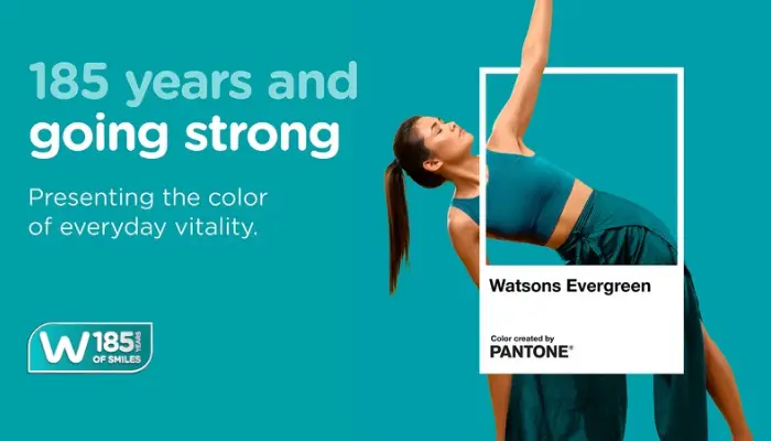
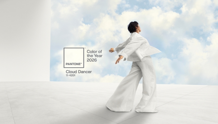
Hong Kong – Watsons is marking its 185th anniversary by turning one of its most recognisable brand assets into a global identity, unveiling ‘Watsons Evergreen’ in collaboration with the Pantone Color Institute™.
Rolling out across 16 markets spanning Asia, Europe, and the Middle East, the initiative transforms Watsons’ signature blue-green hue into an official brand colour representing vitality, care, and wellbeing.
Developed with the Pantone Color Institute, Watsons Evergreen is designed to create a consistent visual identity across the retailer’s global footprint while reinforcing its purpose of helping customers “Look Good, Do Good, Feel Great.”
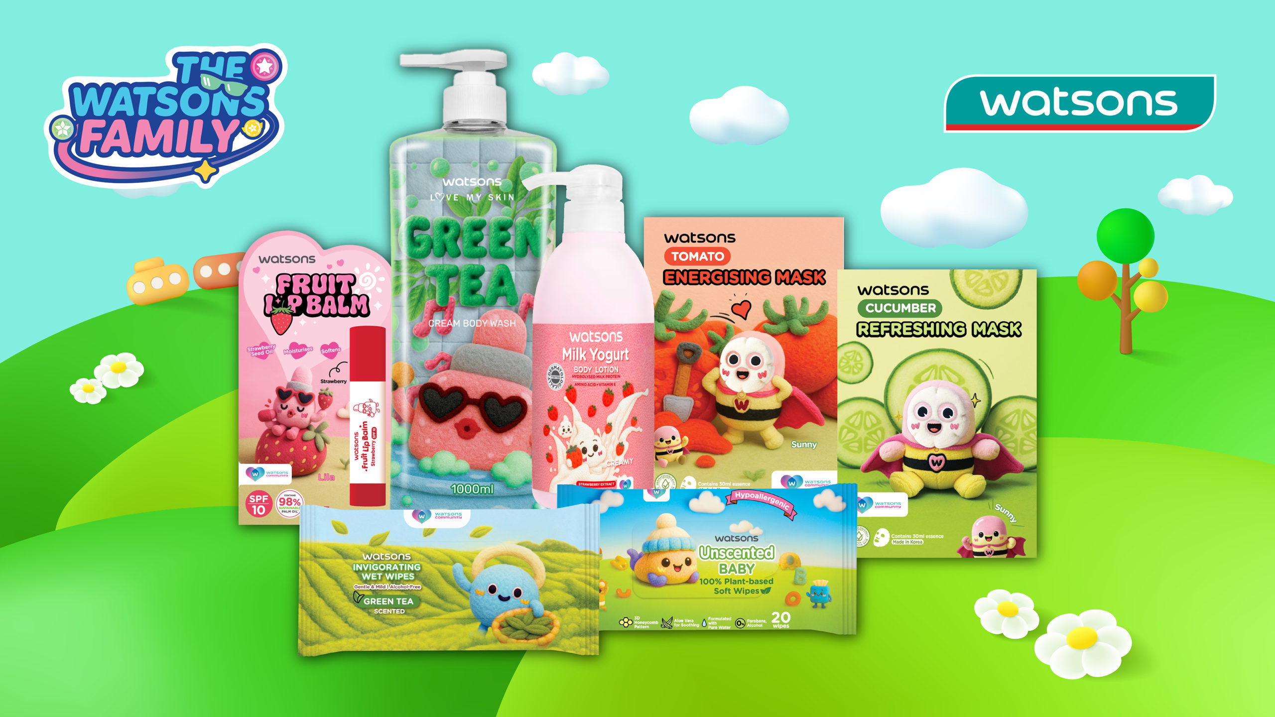
The colour has long appeared across Watsons’ stores, logo, digital platforms, merchandising displays, and own-brand products. Through the anniversary campaign, the retailer will further integrate the identity through customer activations, community initiatives, and curated product offerings across its markets.
According to Watsons, the initiative reflects its long-standing relationship with customers while signalling its future direction as the health and beauty retailer continues to evolve.
Jared DeGuzman, Customer Director at Watsons International, said, “For 185 years, Watsons has helped customers feel healthier, happier and more confident in their daily lives. Watsons Evergreen captures that role in a simple yet powerful way.”
“By partnering with Pantone, we’ve transformed our iconic brand colour into a global symbol of vitality, care and wellbeing that will connect customers across every Watsons market,” he added.
Meanwhile, Laurie Pressman, Vice President of the Pantone Color Institute, said the colour reflects both the retailer’s heritage and continued evolution.
“Watsons Evergreen captures the essence of a brand that has stood the test of time while continuing to grow and evolve. It is a colour that speaks of vitality and longevity, and of a deep, lasting connection to the customers and communities Watsons has served for generations,” Pressman said.
The campaign forms part of AS Watson Group’s broader 185th anniversary celebrations, with Watsons positioning the colour as a long-term global brand asset that unites its heritage with its future across international markets.







![[Partnership] Sanrio IP](https://marketech-apac.com/wp-content/uploads/2026/07/Partnership-Sanrio-IP.webp)