South Korea – After 41 years, Korean Air has unveiled a refreshed corporate identity, featuring a modernised take on its iconic Taegeuk symbol and an updated logo.
Unveiled at the airline’s headquarters hangar in Seoul, Korean Air’s redesigned deep blue Taegeuk symbol took centre stage. The new design pays homage to the airline’s heritage while embracing contemporary aesthetics. With a sleek, minimalist style that aligns with global branding trends, the updated logo retains Korean Air’s distinct identity.
Building on this foundation, the updated logo seamlessly merges the Taegeuk symbol with the ‘KOREAN AIR’ logotype. Rendered in dark blue, the symbol reflects tradition, while the logotype, positioned alongside it, features subtle brushstroke-inspired details, smooth curves, and open connections, offering a modern interpretation of Korean elegance.
The new branding offers three variations: the full logo with both the Taegeuk symbol and ‘KOREAN AIR,’ a streamlined version with just ‘KOREAN,’ and a standalone Taegeuk symbol.
To strengthen brand consistency, Korean Air also introduced a 3D motif inspired by the Taegeuk’s flowing curves. In light blue with red accents, it will feature on check-in screens, mobile SKYPASS cards, and the airline’s website. For textiles and printed materials, 2D patterns reflecting Korea’s landscapes, Taegeuk curves, and traditional “Jogakbo” patchwork will be used.


Additionally, Korean Air has crafted a proprietary typeface and iconography that echo the logotype’s design elements. These visual assets will be gradually rolled out across airport facilities, lounges, and inflight environments.
This is Korean Air’s first significant brand update since 1984, when the Taegeuk symbol was introduced. Widely recognised, the symbol represents both the airline and South Korea. The refreshed corporate identity will be gradually implemented across aircraft liveries, inflight services, and customer touchpoints.
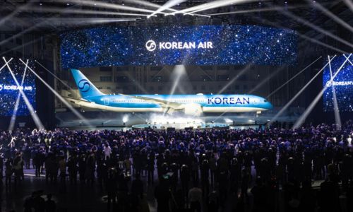
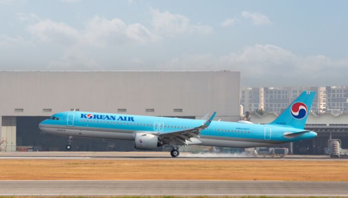
In addition to its updated logo, Korean Air revealed a new aircraft livery with the unveiling of a Boeing 787-10. The design features a bold “KOREAN” logotype and an enlarged Taegeuk symbol for greater visual impact. Retaining the signature sky-blue colour, the livery now includes metallic paint for a premium effect. The traditional cheat line has been replaced with a smooth, flowing curve that enhances the aircraft’s modern and refined look.
Alongside its refreshed look, Korean Air introduced upgraded inflight meals at Grand Hyatt Incheon. Aligned with the airline’s new corporate identity, the enhancements focus on providing a more refined dining experience for passengers.

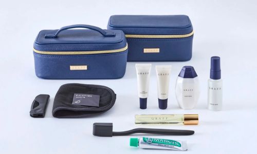
To enhance the onboard experience, Korean Air collaborated with luxury brands for its premium tableware, first-class bedding, and Frette loungewear. Additionally, premium-class amenity kits, developed in partnership with British brand Graff, feature elegant pouches with skincare products and perfume.
During his address, Walter Cho, chairman and CEO of Hanjin Group and Korean Air, shared, “As a unified Korean Air, we are committed to more than just transportation—we aim to connect people, cultures, and the world through the skies. With this foundation, we will build an industry-leading safety system, elevate the customer experience, and strengthen trust through open communication with all stakeholders. Together, we’ll create a more connected and better world.”
He continued, “With the full integration of Asiana Airlines, our role as Korea’s flagship carrier has grown even more significant. We will bring together our expertise, refine our strengths, and unite cultures to create an innovative, unmatched airline experience.”