
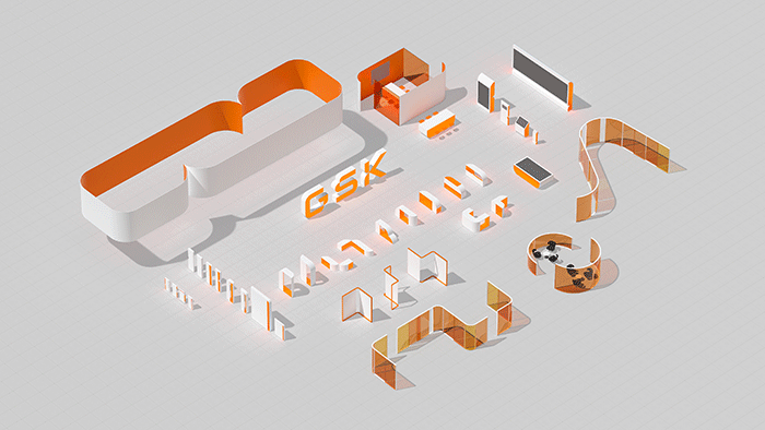
London, United Kingdom – Global pharmaceutical company GSK has unveiled an updated brand identity that symbolises how through the unity of science, technology and talent, people can all work together to get ahead of disease. This new identity was redesigned by brand consultancy Wolff Olins, which helped update the brand to reflect GSK’s new purpose, ambition, strategy, and culture.
Inspired by the striking imagery found in biosciences, the new identity, which retains the GSK name and its well-known orange logo, features numerous curved forms that evoke the highly adaptable nature of the human immune system, acting as a reminder of the constant need to evolve and adapt. Housed in a redesigned shape known as the ‘signal’, the new GSK logo always points the way ahead. The identity system flexes, adapts, and moves to engage audiences across all the digital, social and physical environments that the brand will appear in.
Moreover, the brand new identity showcases the diversity of GSK’s people and partners, representing talent from across its influential worldwide network of GSK people, suppliers and innovative partners.
GSK said that this move follows its new Ahead Together purpose and growth ambitions, as well as the proposed demerger this year, which will see GSK become a company 100% focused on biopharma innovation, while its consumer business, Haleon, will start life as an independent leader in consumer healthcare.
Emma Walmsley, GSK’s CEO, noted that GSK is moving towards their most significant corporate change in 20 years with the demerger of their Consumer Healthcare business, Haleon.
“GSK will now be purely focused on biopharma innovation, with bold ambitions for health impact, shareholder returns and as a company where people thrive. Our branding reflects our purpose: to unite science, technology and talent to get ahead of disease together,” said Walmsley.
Meanwhile, Emma Barratt, Wolff Olins’ global executive creative director, said, “Our ambition was to create a brand identity that signalled extraordinary adaptability – of the human immune system, of tech, of GSK’s people – so that the brand identity could work everywhere, and retain a feeling of constant innovation. But we had to balance this out with a need for warmth.”
David Stevens, Wolff Olins’ executive strategy director, commented, “What excited me most about all this was the desire to elevate GSK’s brand identity beyond the usual pharma brands and make a category-defining shift – towards something that would appeal to world-class talent at the cutting edge of science and technology.”
Through this rebranding, Wolff Olins has also developed a branding system that would work for everyone in the business. This includes close attention to accessibility was paid throughout every asset and application, and all assets have been tested for legibility both on-screen and in print, as well as a custom typeface by Face37 utilising ink traps for legibility was commissioned. The identity also contains a series of adaptable 3D forms enabling GSK to shape environments that suit all users.


![[Report] Gemini SEA Users](https://marketech-apac.com/wp-content/uploads/2026/07/Report-Gemini-SEA-Users.webp)