London, United Kingdom – Global media network PHD, part of the Omnicom Media Group, has unveiled a new visual brand identity, which mirrors their ‘Make The Leap’ philosophy, a call to leverage the power of imagination to drive disproportionate growth for its clients’ business.

The updated brand identity, created in collaboration with independent design director Cosmo Jameson, has been designed with digital, motion, and audio capabilities in mind and reimagined to fully embody the company’s philosophy.

At the core of the new branding are visual assets that represent PHD’s values of creativity, courage, openness, collaboration, and curiosity – a reflection of the fact that it’s the creativity and innovation of PHD’s talent that powers business growth.

Philippa Brown, worldwide CEO at PHD stated that for over 30 years, the company has put creativity, innovation, and thought leadership at the heart of the business.

“Creativity and the power of imagination are what fuel our industry and we believe that only by making imaginative leaps in creativity can we best help our clients flourish and, therefore, leap forward commercially. The evolution of our identity brings this idea to life, with a contemporary and dynamic mark that positions us for the future,” Brown stated.

Meanwhile, Mark Holden, worldwide chief strategy officer at PHD, commented that their new identity focuses on creativity above all else since he believes that it is the power of imagination that drives disproportionate growth, not just reports and spreadsheets.

“In the modern world, advancements in data and technology have enabled marketers to improve how they target and measure their campaigns. However, while this is hugely important, at PHD, we know that every great campaign starts with a great creative idea,” Holden added.

Avril Canavan, worldwide chief marketing officer at PHD, commented “Our new identity is strategically designed with digital and motion in mind to reflect how we work today as well as being a symbol of our ethos. The brand mark is dynamic and flexible, capable of making a physical leap itself to trigger imagery or film and reveal a world reimagined.”

The new branding is being implemented internally and externally across all of PHD’s over 100 markets.

Singapore – Singapore’s multicurrency e-wallet YouTrip revealed in a press announcement that it will be undergoing a brand rehaul, slated for early 2022. 

The advanced announcement comes as the fintech unveils its plans to establish an innovation lab in Singapore to fast-track its technology capabilities and product development. The fintech shared that the new lab will see its workforce double by 2022 which will be crucial in driving the development of a new suite of multicurrency products including the new brand identity. 

YouTrip’s brand proposition is to offer the best mobile financial services by simplifying foreign currency payments and offering the best exchange rates. With the new branding, the fintech aims to reflect its transformation from a travel wallet to a broader digital payments app that drives its mission of simplifying multicurrency spending. 

Together with a new brand debut, YouTrip will also be redesigned with new features such as a virtual card, an interactive exchange rates dashboard, and also YouTrip exclusive deals, as well as the ability to hold more popular currencies in the wallet.

YouTrip also revealed the launch of another product YouTrip Business, likewise to be released in early 2022. 

YouTrip Business is a new multicurrency corporate credit card aimed at helping companies of all sizes save money and time on cross-border payments. Compared to the consumer product, the new business card promises higher spending limits while transacting at the best exchange rates in over currencies, with credit terms offered to selected business account users. YouTrip Business will also enable companies to issue multicurrency cards to employees. 

Caecilia Chu, co-founder and CEO of YouTrip, commented that despite the travel standstill, there has been continued significant growth in overseas online spending which underscores the importance of cross-border payments for consumers and businesses.

According to YouTrip’s own cross-border e-commerce study for 2021, there has been an 84% year-on-year increase in online overseas purchases by Singaporean users from the period of July 2020 to June 2021.

Chu said, “With this shift in spending, our advancement in innovation to offer a wider suite of multicurrency is timely, and drives our goal of elevating the cross-border payment experience for our users in Singapore and the region. We are incredibly excited to embark on this next phase of our business growth and Singapore’s developed tech ecosystem provides the conducive conditions to propel this forward.”

She adds, “Singapore is a special place to us, being the first market where we introduced YouTrip to the world…we look forward to driving the next generation of cross-border payment innovations, and to help build a stronger pipeline of talents that will fortify Singapore’s position as a global fintech hub.”

Perth, Australia – To better represent the University’s vision towards a vision of a modern institution ready for the future, Murdoch University has unveiled its newest brand identity, created in partnership with marketing communications company Wunderman Thompson.

The new brand identity, according to Murdoch University Vice Chancellor Eeva Leinonen, supports the University’s vision to be recognized as a world-changing University by Western Australians, and national and international communities.

“We are a university of free thinkers, it is the foundation of everything we do, and our updated branding epitomizes this. This program builds upon Murdoch’s existing brand with an updated identity that reflects Murdoch as a modern university for the future,” Leinonen stated.

Meanwhile, Gary Smith, chancellor at Murdoch University, commented that the new brand identity was created with an ethos to challenge the traditional approach and embrace new ways of thinking.

“We are proud of our heritage, and while we respect our past, we must always look to the future – from our learning and teaching, to our built environment and research endeavours. The Murdoch University brand is more than a logo and free thinking is more than our slogan. It represents opening doors to an education for more people, teaching beyond the classroom walls and lighting the fire of curiosity in our students,” Smith explained.

The brand identity revamp is released as the University approaches its 50th anniversary. At the same time, Murdoch University has also uploaded a video showcasing the new brand identity to various students, faculty members and stakeholders of the University.

Neil Cullingford, director of marketing and communications at Murdoch University, said, “Our brand has always been built on the idea of free thinking, and in that spirit our visual identity needed to evolve to signal our future focus and global outlook. With free thinking being more relevant than ever, we challenged Wunderman Thompson to create an identity to carry Murdoch into the next 50 years and beyond.”

Meanwhile, Doni Savvides, partner at Wunderman Thompson, commented, “The new identity is a testament to the valuable partnership we’ve built over several years. It’s a demonstration of Murdoch’s core foundations and a commitment to being a progressive university. Aligning the visual brand narrative to free thinking has been a creative collaboration that the Wunderman Thompson team have felt privileged to be a part of.”

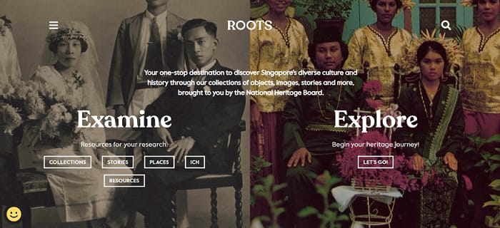
Singapore – Singapore’s National Heritage Board (NHB) has unveiled a revitalized brand and digital experience for its platform Roots, and independent creative agency The Secret Little Agency or TSLA is the creative brains behind the fresh highly aesthetic visual identity.

NHB is Singapore’s dedicated organization for the preservation of its cultural heritage and in 2016, it launched Roots.gov.sg to provide added avenue and to digitize its heritage to make easier and closer the access for nationals on cultural assets.

The brand and user experience (UX) revamp was done in celebration of Roots’ 5th anniversary. TSLA pored over the site’s original web pages, conducting multiple focus groups across different user profiles to organize over 120,000 pieces of content into intuitive categories with the objective to improve delivery of content and facilitate a better user journey on the portal.

According to Norfaiz Noeryamin, manager for NHB’s Strategic Communications & Digital division, the revamped Roots.gov.sg is designed to be a one-stop digital concierge that brings together content from across its line of heritage programs – its ‘National Collection’, ‘Heritage Trails’ and ‘National Monuments’ and other intangible cultural heritage from its inventory. The portal will also be integrating resources from other platforms like the National Library Board’s Infopedia and the Esplanade’s Offstage websites to facilitate information gathering. 

“With these enhancements, it is now easier than ever for everyone to discover the depth and breadth of Singapore’s heritage,” said Noeryamin.

Roots’ old logo vs. new logo

Aside from the general UX and UI (user interface), TSLA also improved the platform’s ontology functions where the remit also extended to integrated marketing. 

“You’re going through every artifact, article, photograph, and piece of content thinking there is so much here, and yet, Singapore is still in its infancy compared to older civilizations. To be able to build our Roots right and redesign how all generations access this treasure trove of heritage was an incredible experience for us,” said a spokesperson from TSLA Design.


New Delhi, India – One of the largest smartphone brands in India, POCO, has unveiled its new brand identity through a series of ‘quirky and fun’ campaigns, created in partnership with advertising agency DDB Mudra.

The campaign revolves around its new brand identity ‘Made of Mad’ wherein the brand story is told with unconventional and edgy visuals. The campaign goes beyond just being a showcase of the specifications of the phone but rather highlights the brand ideology.

The ‘Made of Mad’ campaign sees five advertising spots rolled out, with the primary campaign titled as ‘Legend of Mad’. The main campaign narrates the story of POCO’s mascot ‘Mad’ who aids famous people like Isaac Newton and Albert Einstein solve in a fictional setting the problems they are known to solve, like the theory of gravity or theory of relativity.

Other campaigns are an allude to internet culture, like using ‘when life gives you Madness’ which is derived from the Internet meme ‘when life gives you lemons’, and ‘Unboxing Madness’ which is an allude to the internet phenomenon of unboxing videos online.

As part of its greater appeal to the Gen Z’s and millennials, POCO used unconventional visuals and storytelling devices that could leave a lasting impact, which is a direct opposite of conventional brand storytelling through celebrity endorsements and a focus on product features.

For Raghav Chitra, marketing lead at POCO India, the ‘Made of Mad’ brand identity is a creative rendition of what POCO fans and consumers can expect from a brand that exudes a unique, compelling philosophy behind its products.

POCO-India-DDB-Mudra-Representatives
(Left) Raghav Chitra, Marketing Lead, POCO India; (Right) Vishnu Srivastav, Creative Director, DDB Mudra Group

“It is also a representation of our consumers who are driven by the spirit of ‘mad’: independent, ambitious, eccentric, and irreverent in their pursuit of perfection. Through this initiative, we want to build a belief system that enhances the overall POCO experience that our users find relevant,” Chitra stated.

Meanwhile, Vishnu Srivastav, creative director at DDB Mudra Group said, “The effort was to differentiate POCO clearly in the minds of the youth. Somewhere along the way we heard from consumers that POCO must be ‘mad’ to give such features at such a price. So, we wanted to celebrate this mad spirit in our own way with work that’s both eccentric and entertaining.”

The ‘Made of Mad’ campaign has been rolled out across POCO’s social media channels.

Auckland, New Zealand – The recruitment service of the Auckland University of Technology has announced a rebranding from ‘AUT Internz’ to ‘AUT talenthub’.

The recruitment service works by offering a diverse range of roles for recruited students in various sectors, including project management, software development, communication, creative technology, events and business.

The rebranding endeavor comes as the university aims to bring further focus to recruitment and placement of graduates, as well as internships into the paid New Zealand market.

“Businesses come to us because we can look after their graduate and internship recruitment for them. We give employers a free and easy way to access the large pool of graduates and do the time-consuming work for them of advertising and screening their roles, then providing a shortlist of candidates who have been well-prepped for interviews,” said Jade Bradley, candidate manager for AUT talenthub.

Meanwhile, Rachel Shareef, relationship manager for AUT talenthub notes that AUT talenthub has been widely used by organizations in the local market due to the reputation of past students recruited by the service, and at the same time AUT talenthub aids organizations to help them in the recruitment process of potential work candidates.

Some of the services AUT talenthub offers is its AUT Employability service, which helps students upgrade their CV and LinkedIn profiles and develop stronger interview skills through interview practice.

“Students tell us they like talenthub because we take the pressure off their job search and give them advice about the process of looking for their first job, whether an internship or a graduate role,” Bradley added.

For now, a focus on local graduate and internship opportunities will be prioritized by AUT talenthub to create a greater demand in the local market, according to Anna Williams, director for employability, international and recreation at Auckland University of Technology.

“This is a unique student service within the New Zealand university space, one that really gives our students unique opportunities as they enter into their careers,” Williams stated.


MARKETECH APAC_Webinar_Inside_Innovation_Higehr_Ed_Strategy

Join us as we bring you an in-depth webinar on how you can improve online strategies, one that’s able to deliver a seamless and intelligent digital experience that would effectively accelerate student recruitment efforts as well as improve student retention. Register here.

Singapore – In an appeal to encourage more people from the younger generation to donate blood for a better cause, the Singapore Red Cross (SRC) has revamped the look of its existing mascot, ‘Blood Buddy’, or more commonly known as ‘BB’.

Officially launched back in 2005, ‘Blood Buddy’ has traditionally been recognized as a physical mascot at malls, mobile blood donation drives, and outreach activities run by SRC.

The revamp of the mascot stems from SRC’s objective to engage the youth and advocate blood donation with a consistent brand voice. With a refreshed image that reflects its adorable and lively personality, ‘Blood Buddy’ is well-positioned to connect with young and potential donors who are at the early stages of their blood donation journey. 

“We also recognize the importance of inculcating the habit of giving blood from a young age, and we hope to encourage youth to adopt blood donation as a lifestyle. This is where Blood Buddy will be a lively and relatable voice of encouragement for those getting started on their blood donation journey,” said Prakash Menon, director of the Blood Donor Programme at Singapore Red Cross.

The revamp also comes in line with the organization’s ‘One More Step’ campaign, which encourages potential donors to take small, incremental steps towards the eventual goal of being a regular blood donor who donates at least twice a year. Through the campaign, ‘Blood Buddy’ serves to empathize with the physical and emotional concerns all blood donors have and to showcase the small steps one can easily take to give blood and help save lives.

“Over the years, we’ve observed that many potential blood donors are deterred by prevailing misconceptions towards blood donation. Through ‘One More Step’, and with the help of Blood Buddy, we want to dispel these concerns and at the same time remind people of the power of their individual actions. Each of us can contribute in our own way to create a culture of good, by taking the next step in our blood donation journey,” Menon added.

As part of the ‘One More Step’ campaign, SRC will introduce a series of activations including videos and comic strips to engage potential donors on social media. Members of the public may also win SRC memorabilia by participating in a giveaway from February 7 to March 8, where the public must submit photos of ‘Blood Buddy’ as seen in buses island-wide.

Manila, Philippines – Technology service provider TaskUs has announced a revamp of its brand identity, highlightings digital transformation services beyond customer experience (CX) including AI operations and content security. 

Part of TaskUs’ digital transformation is to grow its current work-from-home framework, Cirrus. Initially introduced earlier this year, Cirrus was built on the foundation of information security combined with modern virtual desktop infrastructure (VDI) technology, which recreates an in-center environment on a computer at home. 

“TaskUs has long been known for its fast, efficient, innovative work with hyper growth companies. 2020 forced companies to embrace digital transformation with speed and focus unlike ever before. Our customers turned to TaskUs to unleash these solutions for customers and employees alike,” said Bryce Maddock, CEO of TaskUs.

The local outsourcing company is focused on supporting customers across multiple channels, including chat, in-app, voice, and social, Furthermore, support experts allow clients to focus on scaling and expanding their businesses, and also providing CX support for other tech brands.

The brand revamp, as seen on TaskUs’ official website.

In addition, the company is also focused on creating systems to protect online users. TaskUs Content Security professionals moderate tens of millions of pieces of content per month and are developing and enforcing content security policies in several areas, including intellectual property, job and commerce postings, objectionable material, and political advertising.

The old version of TaskUs logo.

“We are more than equipped to take on the toughest challenges when others cannot, and continually develop ridiculously good solutions一for the success of our clients and for the wellbeing of our teammates. We are always looking ahead to the next era of growth for our company. And our revitalized brand represents an affirmation of our position as a proven innovator, a leader in putting our people first, and the trusted partner for companies looking to transform their digital operations and customer experience right now,” Maddock concluded.

Singapore – “Turning adversity into opportunity” is the latest stunt of Tiger Beer’s newest campaign and packaging that launches globally next year.

The campaign, titled “Yet Here I Am” narrates the story of how the Tiger Beer brand established its brand presence in Asia, despite difficulties in growing key ingredients such as barley and hops. 

“The world has never been so volatile, and the future so fluid. Tiger is a brand born against all odds as 88 years ago, it was inconceivable that we could brew beer in a tropical climate. And yet, here we are. The video captures the spirit of resilience that the world needs so much of today,” said Sean O’Donnell, global brand director for Tiger

O’Donnell added, “In April, we turned that spirit into action with our #SupportOurStreets initiative, which helped F&B businesses in Southeast Asia cope with the stay-home measures. Together, we showed the world that despite unforeseen hurdles, yet here we are, remaining resilient and full of hope.”

The new packaging unveiled by Tiger Beer, slated for widespread release for next year (Courtesy of Tiger Beer)

Meanwhile with the new packaging, an initial release is slated in Vietnam this year.