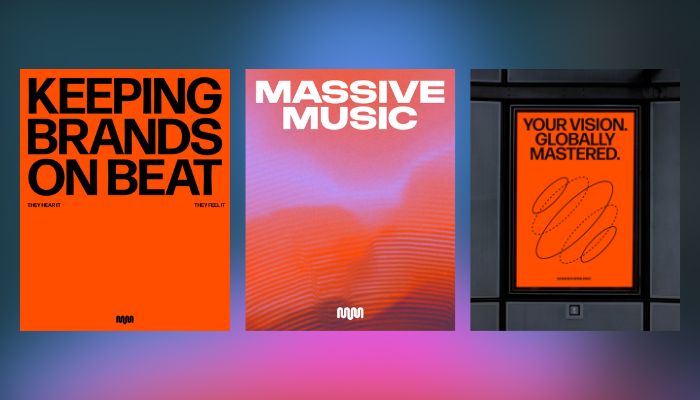
MassiveMusic, which has worked with brands for more than 25 years on sonic identities, original compositions and audio strategies, sought a refreshed identity to reflect its expanded infrastructure and licensing capabilities.

The redesign includes a new logo, colour palette and custom typeface, which PepsiCo said are meant to represent its values and its ambition to show greater cohesion between its corporate identity and its consumer-facing brands.
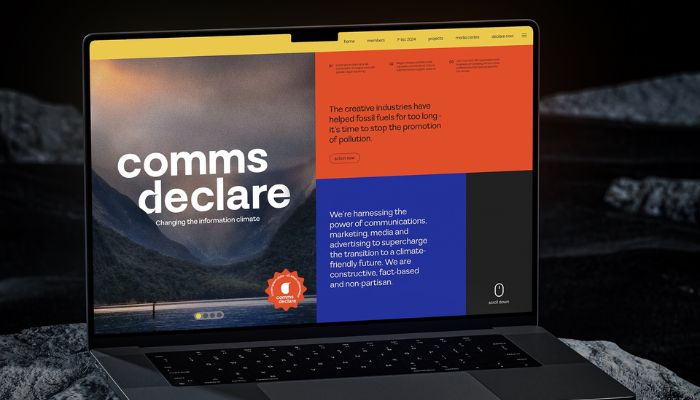
Australia – Comms Declare, the climate communications charity, has launched a new brand and digital offering as it expands its mission beyond advertising to include media and clients. Originally established as a pledge for agencies to refuse fossil fuel clients, Comms Declare has since grown into a prominent...

The firm said its approach integrates creative insight with media intelligence, aligning with the increasingly blurred lines between creative and media.
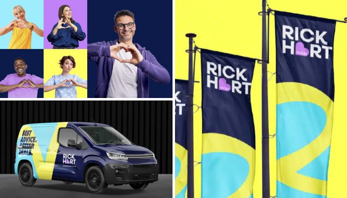
The business, once primarily known as a discount outlet, is seeking to highlight factors such as trusted advice, knowledgeable staff, a wide product range from leading brands, and competitive pricing.
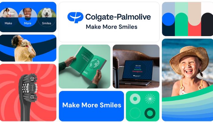
The company’s new tagline, “Make More Smiles,” serves as a call to action for employees to advance this purpose through their work.
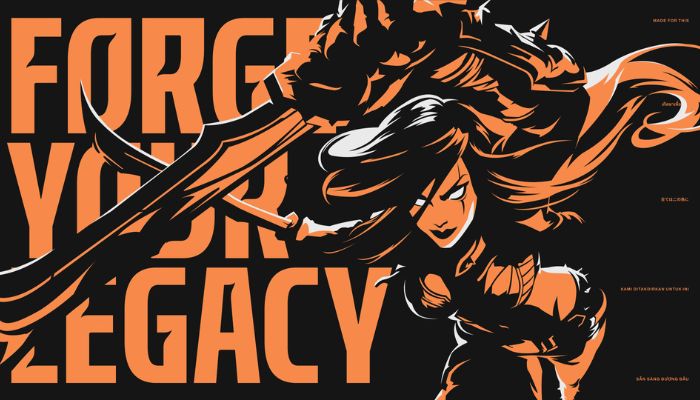
Australia – Brand and digital studio Koto Sydney has launched the new identity for Riot Games’ League of Legends Championship Pacific (LCP), a professional esports league uniting Asia Pacific’s diverse gaming scene and redefining the region’s role on the global stage. Last year, Riot Games announced...

The brand continues to champion a nurturing, innovative approach to artist management, cementing its place as a cornerstone of the Australian music scene. One Day is committed to elevating and amplifying the future of Australia’s new creative landscape, inspiring confidence in the next generation.
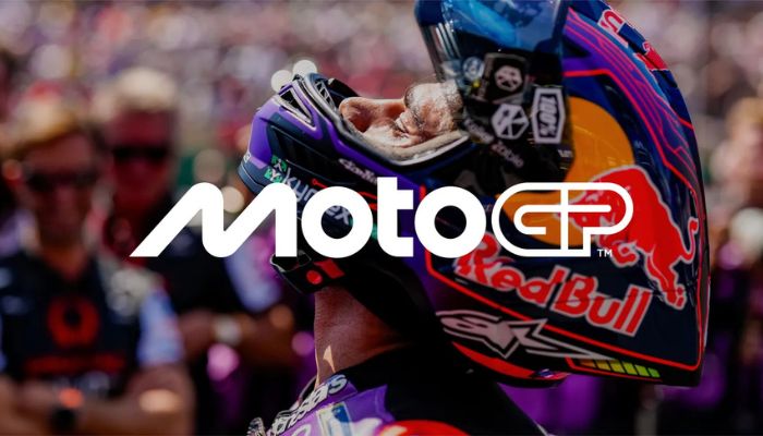
Crafted with independent design studio Pentagram, MotoGP states that their new identity is more than a logo but rather a complete evolution of the brand, including artwork, motion, typeface, visual identity and verbal identity designed to take this exciting sport on earth into a new era.
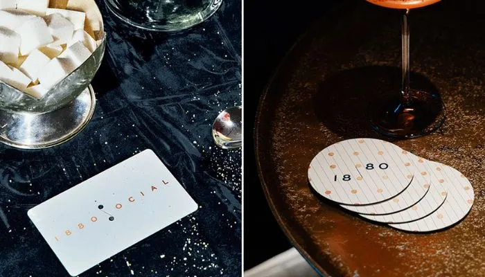
Brand practice Anak has unveiled the launch and new brand identity of social club 1880’s latest venture, 1880 SOCIAL, a dynamic lifestyle destination situated at Two Taikoo Place in Hong Kong.