As travel is fast coming back to its feet, Shangri-La, the global hospitality brand, meets this rebound halfway, amplifying its loyalty programme to now be called the new Shangri-La Circle

With an incredible feat to rebrand both the creative and the marketing of the programme, the hospitality company rightly tapped its agency partners to fuse creative and intelligent hands and bring this transformation to the table. For the programme’s digital marketing and communications, digital creative agency 8traordinary was brought on board to steer the wheel. 

Watch the full interview with 8traordinary’s Jeffrey Lim.

The remit of the agency comes out as our top story for the month of July. To further learn about the behind-the-scenes and the craftiness put into the digital campaign, we conversed with Jeffrey Lim, 8traordinary’s founder and managing director

The agency’s scope included creative content planning, social media strategy, influencer marketing, and community management. 

Influencer marketing had been a huge part of the campaign and to make this happen, the agency roped in influencers around the region such as Nathan Hartono, Lennard Yeong, Erwan Heussaff, Zahra Lari, Goh Jin Wei, and more than 150 other key opinion leaders across different countries to spread the news about the launch. 

On the criteria they used in selecting which KOLs, Jeffrey shared that they try not to focus too much on the usual metrics which are an influencer’s follower count and number of likes as these are quite achievable through paid media. What they looked into instead is the individual’s ‘authenticity’ and the motivation behind why people are looking up to the personality.

One of [our] key criteria, when we worked with Shangri-La Circle, is we want to look for [a] personality or [an] individual who is authentic, and we want to look at how can they use their passion and their authenticity to influence

Jeffrey Lim, Founder, Managing Director, 8traordinary

In line with Shangri-La’s main message of ‘Live the good life’, he also shared that they looked into tapping as much as a diverse group of influencers and not limit to the popular macro influencers, as ‘living a good life’ can mean differently for each person. 

“We want to showcase to the world that whoever you are and wherever you are…there’s a specific ‘good life’ that we at Shangri-La can present to you in its own unique way,” said Jeffrey.

The full conversation with Jefferey is now live on MARKETECH APAC’s YouTube and Spotify. In the interview, Jeffrey shared more about the challenges that came with developing the campaign as well as his expert insights into how brands can stand out in a period where there is overflowing content presented to consumers.

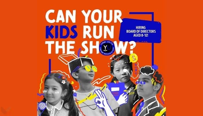
Singapore – Global food company Yummy United has announced a recruitment campaign to form its ‘board of directors’ that is composed of kids. This is in line with the food company’s rebrand effort for their cheese curd bar product Lakto in Singapore.

As a brand built for children, and now, by children, this marks the first of such recruitment for Yummy United in Asia, following previously successful iterations of the campaign launched in both Italy and Russia, since 2019. 

Through the campaign, selected individuals around 8 to 12 years old will go through 2 workshops worth S$1300 to learn business skills from real corporate trainers, applying their knowledge in the rebranding of Lakto as part of Yummy United’s offering, happening in March 2023.

Amongst these applicants, thirty to forty students will be selected for a closed door interview at Hustle — a Singapore-based side-hustle marketplace that consolidates services of local hustlers while offering skills-based workshops — before a final group of twenty students are selected to go for the programme.

The Italian “Board of Directors” who auditioned and took charge of the launch of the new line of products

Serene Lu, managing director for Asia-Pacific at Food Union, said, “It’s a common adage that children are our future, but more can be done to help them grow and hone their skills in a safe space. At Yummy United, we’re always looking for fresh opportunities to help curious minds learn professional theoretical concepts, supporting them to birth their creative ideas and into actual products that will be produced and sold.”

Successful students can expect to go through an immersive and educational training programme in August designed by Hustle, that engages the modern workforce and the curious with hands-on workshops for learning and upskilling. All trainers are qualified industry experts, so all students, young and old, will be in good hands! 

Of the twenty, four will be selected to make up the “Board of Directors”, consisting of a Finance Director, Creative Director, Public Relations Director, and a Marketing Director. With these roles, the board will be given the chance to take on interviews, design product packaging, calculate and forecast costs, and even curate social media content on the brand’s Instagram and Facebook pages. As a team, they will conceptualise and rebrand Food Union’s Lakto dairy product line, as part of Yummy United’s latest offering.

Students can get to learn new business concepts as well as hone their leadership skills from experienced veterans in various industries, such as Jeremy Foo, founder of Elliot & Co and Koh Cheng Guan, marketing director of WPR Asia.

“As a father myself, I am thrilled to be part of this innovative initiative to contribute to the development of our next generation of talents. This will be an unprecedented opportunity for them to experience work in the real world, and understand what some of their parents do. I believe this programme has been thoughtfully designed to engage the children in their learning and growth,” Foo said.

London, United Kingdom – Global pharmaceutical company GSK has unveiled an updated brand identity that symbolises how through the unity of science, technology and talent, people can all work together to get ahead of disease. This new identity was redesigned by brand consultancy Wolff Olins, which helped update the brand to reflect GSK’s new purpose, ambition, strategy, and culture.

Inspired by the striking imagery found in biosciences, the new identity, which retains the GSK name and its well-known orange logo, features numerous curved forms that evoke the highly adaptable nature of the human immune system, acting as a reminder of the constant need to evolve and adapt. Housed in a redesigned shape known as the ‘signal’, the new GSK logo always points the way ahead. The identity system flexes, adapts, and moves to engage audiences across all the digital, social and physical environments that the brand will appear in. 

Moreover, the brand new identity showcases the diversity of GSK’s people and partners, representing talent from across its influential worldwide network of GSK people, suppliers and innovative partners.

GSK said that this move follows its new Ahead Together purpose and growth ambitions, as well as the proposed demerger this year, which will see GSK become a company 100% focused on biopharma innovation, while its consumer business, Haleon, will start life as an independent leader in consumer healthcare.

Emma Walmsley, GSK’s CEO, noted that GSK is moving towards their most significant corporate change in 20 years with the demerger of their Consumer Healthcare business, Haleon. 

“GSK will now be purely focused on biopharma innovation, with bold ambitions for health impact, shareholder returns and as a company where people thrive. Our branding reflects our purpose: to unite science, technology and talent to get ahead of disease together,” said Walmsley.

Meanwhile, Emma Barratt, Wolff Olins’ global executive creative director, said, “Our ambition was to create a brand identity that signalled extraordinary adaptability – of the human immune system, of tech, of GSK’s people – so that the brand identity could work everywhere, and retain a feeling of constant innovation. But we had to balance this out with a need for warmth.”

David Stevens, Wolff Olins’ executive strategy director, commented, “What excited me most about all this was the desire to elevate GSK’s brand identity beyond the usual pharma brands and make a category-defining shift – towards something that would appeal to world-class talent at the cutting edge of science and technology.”

Through this rebranding, Wolff Olins has also developed a branding system that would work for everyone in the business. This includes close attention to accessibility was paid throughout every asset and application, and all assets have been tested for legibility both on-screen and in print, as well as a custom typeface by Face37 utilising ink traps for legibility was commissioned. The identity also contains a series of adaptable 3D forms enabling GSK to shape environments that suit all users.

Hong Kong – Formerly known as the Golden Circle, the rewards programme of leading hospitality group Shangri-La Group has recently been launched as the rebranded Shangri-La Circle. The group said the newly transformed programme aims to pave the way for deeper engagement with customers and transform the programme into being more than just a loyalty programme. 

WPP creative company Superunion was the one appointed to lead the refresh of its visual identity. Superunion was tasked with the creation of a new brand strategy, tone of voice and visual identity to reflect Shangri-La Circle’s new positioning as ‘Curators of the Good Life’, and to express an invitation to “a personal journey of discovery.”

The transformation of Shangri-La Circle follows the launch of Polaris, a new exclusive invitation-only elite membership tier, in December 2021, with the brand also created by the Superunion Asia team. The group said the creation of Shangri-La Circle is driven by the group’s commitment to innovation in how it rewards and engages with guests around the world. 

Benedict Gordon, CEO of Superunion Asia, said, “Shangri-La is an iconic brand, and the Shangri-La Circle reflects both the impressive heritage of the rewards scheme as well as the business’s forward-facing focus on creating an experience-led brand across every touchpoint. We wanted to stay true to the brand’s heritage by rooting the visual redesign in Asian culture and to bring to life the warmth of the brand in every interaction with members.” 

“This new identity reflects Shangri-La’s position as a global iconic brand and symbolises a revolution in how moments of discovery and curated experiences are designed,” Gordon adds.

The concept of ‘discovery’ is brought to life through a new, dynamic visual identity through an artistic reinterpretation of a compass that helps members navigate the world of Shangri-La experiences, including hotels, bars and restaurants, guiding them to discover their personal Shangri-La. Inspired by Asian calligraphy, the brand icon draws on the equity of the original Golden Circle marque, reinterpreted for a digital age, and subtly references the ‘Shangri-La ‘S” iconic letterform.

Superunion created a custom pattern inspired by Asian crafts like woodblock printing, porcelain, watercolour ink and rice paper to reflect the brand’s heritage in Asian hospitality and to create a sense of warmth and attention to detail. The colour palette draws on Shangri-La’s legacy but adds a bold yellow to reflect the evolution of the gold of the Golden Circle marque, while art direction guided a photography shoot intended to capture the good life. 

Superunion’s development of the brand’s tone of voice matches the warmth of the visual identity, to make members feel intrigued, engaged and welcomed across every customer experience. The brand will be demonstrated across a wide range of applications including the app, website, membership cards, welcome packs, gifts and amenities.

This brand was created by Superunion Hong Kong, with support from the Singapore and Shanghai studios. Meanwhile, Singapore-based creative digital agency 8traordinary was the one tapped to head Shangri-La Circle’s creative content planning, social media strategy & management, influencer marketing & management, and community management.

Hong Kong — Vitasoy, the iconic soymilk brand rooted in Hong Kong City for more than 80 years, is making a substantial move to evolve its branding by reviving its plant-based heritage to resonate with modern consumers’ desire for a healthier and nutritious lifestyle. Through dentsu international Hong Kong’s ‘Planting Goodness Every Day’ campaign platform, Vitasoy aims to represent its wide portfolio of plant-based products everyone is familiar with.

The Vitasoy brand has been planting its goodness in Hong Kong since the 1940s to serve affordable and plant-based soy milk for everyone. Their long commitment transcended and transformed through time to now a heritage that shall be rejuvenated to sync with the needs of contemporary consumers and to remind them that greater goods are achieved through daily small practices, such as consuming plant-based food and beverages every day.

The ‘Planting Goodness Every Day’ campaign visualized Vitasoy’s genuine and wholesome brand personality showcasing its portfolio of products including Classic, Calci-Plus and VitaOat, from its most iconic range of Vitasoy classic products to its functional line of Calci-Plus range, to its latest new product, VitaOat.

The new brand equity stamp is a branding mnemonic device that holds the various stories and product strengths, set in daily moments including social gatherings, workouts, and home cultivation.

David Kim, group CMO at Vitasoy International, said, “We continue to be poised for growth at all times, including the future. We are happy to reintroduce what we have cared about since the beginning as a tribute to our past and bring forward our heritage so as to build a better future with our consumers together.”

Meanwhile, Simone Tam, CEO of dentsu international Hong Kong, commented, “Vitasoy is our long serving client. Knowing the brand has a rich and devoted heritage, we are happy to revive it and modernize it, so the brand stays relevant and connected with the young generation through its wide range of plant-based products.

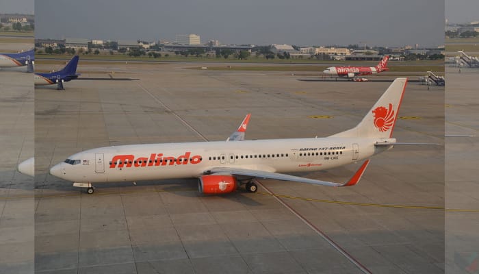
Kuala Lumpur, Malaysia– Airline holding company Lion Air Group’s subsidiary, Malindo Air, a Malaysian-based regional airline, has announced that it is now officially rebranded as Batik Air.

The rebranding exercise is in line with the Lion Group’s goal to establish a common identity for the full-service airlines within the group. With this approval in place, Batik Air now will be able to conduct improved business for seamless transfers, leveraging KLIA as a transit hub for the Lion Group of Airlines.

On the rebranding, Mushafiz Bin Mustafa Bakri, CEO of Batik Air, said, “With the rebranding exercise and the reopening of the borders taking place in the region, we are very excited for the opportunities presented to us for the potential growth of our airline and with the new brand, we will be able to offer fresh and new services.”

The exercise will be conducted in phases and Batik Air will communicate to its passengers and partners progressively during the rollout.

Bandar Seri Begawan, Brunei – Startup intelligence Flipidea has announced its rebranding endeavour as roiquant, in a bid to better position its brand in helping founders build strong competitive business and generate higher return on investment.

According to its CEO Paul Lee, they envisioned an affordable business intelligence solution built with intelligent quant systems to empower startup founders in order to help smaller companies (the ‘small boys’) build competitive businesses returning high ROI.

“This is why our new brand name roiquant, a combination of two words ‘ROI’ and ‘quant’, is derived to best align with our value proposition,” he explained.

Roiquant also announced that in its recent product launches, they have released a proprietary pitch deck analytics in beta mode, which leverages text AI technologies to analyse the commercial viability and fundability of a business.

“Customers can learn to create, distribute, and capture value for their target audience in a structured and tangible approach while building their fundraising pitch deck, such as easily get real-time analysis and feedback to improve value creation in their business, or innovate through business model reconfiguration to offer greater competitive advantages, and so on,” the company said in a press statement.

As part of the rebranding process, the company also recently announced that it is planning its first virtual pre-seed startup competition, powered by its roiquant solutions.

“With our equity-free prize money, we aim to groom world-class founders by turning their ambitious dreams into impactful realities that make the world a better place, and attract real potential pre-seed or seed investment from our partnering investors,” Lee concluded.

Massachusetts, USA — Multinational chain of ice cream and cake speciality shop Baskin Robbins has announced a refresh of their iconic brand’s logo, packaging, employee uniforms as well as a new tagline encouraging customers to “Seize the Yay”.

To celebrate the rebrand, Baskin-Robbins is launching a collection of limited-edition merchandise to honour the company’s 77 years of robust heritage. The exclusive items will be available for a limited time, beginning April 18, 2022. The collection includes clothing and other items that will encourage ‘yay seizing’ moments, such as bicycles and skateboards, available exclusively at their website (ShopBaskinRobbins.com).

Jerid Grandinetti, vice president of marketing and culinary at Baskin-Robbins, said that for more than 75 years, Baskin-Robbins has been the destination for celebrating the moments that matter most.

“Our new look and manifesto recognize the extraordinary role ice cream has played in our customers’ lives, along with our continued commitment to innovation and creating someone’s next favourite flavour. Small moments that spark joy often get taken for granted. We’re encouraging people to pause and celebrate any moment that brings happiness with Baskin-Robbins,” Grandinetti said.

In the true spirit of ‘’Seizing the Yay’’, the confectionary experts at Baskin-Robbins have also developed three new flavours available: Non-Dairy Mint Chocochunk, a brand-new non-dairy flavour that is a contemporary take on a well-known classic; Ube Coconut Swirl, a Philippines-inspired flavour made with real Ube and coconut flavours. Lastly, there is Totally Unwrapped, an iconic fusion of peanut butter and chocolate ice creams packed with fudge-covered pretzels, peanuts, and salted caramel swirl.

Singapore – Travel technology platform, Bakuun.com, has now rebranded to Bakuun. This rebranding strategy reflects both the evolution of the platform as well as its vision for the future. 

Along with this change in the company name, Bakuun has also launched new brand elements such as a logo refresh, a sleeker and cleaner typeface, and an updated primary and secondary colour palette, as well as a new website with a fresh look, featuring a new design and improved user interface. 

Marco Bacchilega, Bakuun’s CEO, shared that along with other major strategy changes, it has been in their plan to re-brand Bakuun and drop ‘.com’ from its name to make its branding catchier and easier to remember. 

“We are excited to introduce our shortened company name – Bakuun –because it reflects our evolution and adaptability in the current time,” said Bacchilega.

Bakuun said that it will be focusing on delivering end-to-end distribution solutions to increase automation, improve efficiency, and make sure that they remain commercially relevant.