Kuala Lumpur, Malaysia – Malaysian used car ecosystem myTukar Powered by Carro has officially announced that it is rebranding as Carro, signifying a move that will bring more of Carro’s cutting-edge technologies, products, and services to Malaysian customers. It has also tapped social media personality Phei Yong as its first brand ambassador.
This renaming exercise will officially see ‘Carro’ be incorporated across myTukar’s range of products and services, marketing materials and physical signages across Malaysia – a process that will take place across several months.
myTukar earlier kickstarted its first phase of rebranding in June 2022 and changed its corporate look, moving away from its turquoise and grey colour scheme to Carro’s signature orange for its signages and collaterals.
Since myTukar’s founding in 2017 at a shop lot at Glenmarie in 2017, the company has charted impressive milestones, including a US$30m investment from Carro to revolutionise and digitise Malaysia’s high-potential used car industry.
Moreover, myTukar has grown to be the first and largest online used car ecosystem in Malaysia, providing retail insurance, financing and after sales services, and has expanded to encompass 11 Retail Experience Centres, 27 Inspection Centres, 5 workshops and 2 refurbishment centres.
Fong Hon Sum, founder of myTukar and Carro’s CEO of International Marketplace said, “It has always been my dream and goal to transform the used car industry and to push for transparent, honest practices that will benefit our customers. Today, I’m so glad to announce that we achieved exactly that and more.”
He added, “myTukar’s amazing growth couldn’t have been possible without everyone who believed in our ambition and goals, and all the hard work that went into building it up. Now, I’m excited to unlock the potential in this market, and continue to offer unparalleled services to Malaysian drivers and families.”
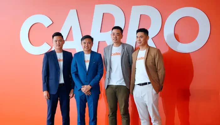
Meanwhile, Derrick Eng, CEO at Carro Malaysia, commented, “As part of a global brand, we’re laser focused on driving sustainable growth for the Group while continuing to deliver quality used cars that are As Good As New to Malaysians. I look forward to strengthening Carro as a brand within the country.”
He added, “We absolutely look forward to Phei Yong coming on board. With the success of the epic road trip, and Phei Yong’s popularity in Malaysia, we’re sure he’ll be able to bring something unique to the table, and help spread the message that a Carro Certified car is As Good As New.”