San Francisco – Job and company insight agency Glassdoor has refreshed its brand identity and product experience to emphasize the power of workplace conversations as well as fostering transparency within the workplace.

Developed in partnership with brand agency Koto, Glassdoor’s new rebrand showcases app and site updates that capture the core of the platform as a space for authentic and meaningful conversations about work experiences.

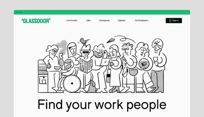
Glassdoor’s new visual identity and product design also coincides with its new brand focus of highlighting the relationships and community formed throughout one’s career, with vibrant and interactive visuals all throughout the platform depicting a healthy workplace.

Glassdoor CEO Christian Sutherland-Wong introduced the new features of Glassdoor in a video, focusing on ‘bowls’ which are sectors of interest and on new conversational options such as talking specifically between co-workers of a company, or conversing anonymously. 

Commenting on the rebrand, Deanna German, creative director at Koto, said “Our logo, typography, illustration, icons and unique brand tone reflect Glassdoor’s commitment to creating a healthier and more transparent workplace community”.

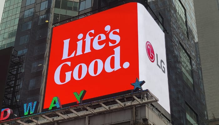
Seoul, South Korea – Multinational conglomerate corporation LG Electronics has announced a new brand direction and visual identity, which focuses on angling the brand as more ‘youthful and dynamic’ across its multiple customer touch points.

According to the company’s updated brand communication guidelines, LG outlined the new direction for the brand to be loved by customers across countries and generations, including Generation Z, and ultimately establish itself as an iconic brand.

Moreover, the updated brand guidelines reiterate LG’s core values of ‘Uncompromising Customer Experience,’ ‘Human-centered Innovation’ and ‘Warmth to Power a Smile.’

The new visual identity will see LG using also a more energetic LG Active Red color hue across all customer contact points. Also, various gradient elements in LG Active Red, white and black were also introduced, offering variety as they can be applied according to the unique characteristic of each product or service.

In the digital space, the company’s symbol will come to life, engaging customers with a new level of expressiveness. The brand symbol, composed of the letters ‘L’ and ‘G,’ can perform eight unique motions, including nodding, spinning and winking. With its new capabilities, the brand symbol can greet customers with a friendly smile or move along with background music on digital platforms in a variety of witty ways. 

Lastly, the company also designed a new typeface for its ‘Life’s Good’ brand slogan, which will be used more widely as a brand asset in product packaging. Said typeface have been inspired by shapes depicted by various LG products.

William Cho, CEO of LG Electronics, said, “Having a strong, consistent brand strategy enables us to better communicate our value proposition and unique identity, which harmonically blends innovation and warmth. Implementing the new brand strategy, LG aims to become an iconic brand that resonates with consumers transcending generations and locations.”  

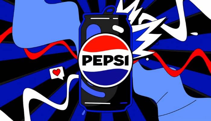
New York, USA – Popular soft drinks brand Pepsi has announced a new logo and visual identity for the brand, taking cues from its old branding encompassing its 125-year history. The new changes are part of the brand’s 125th anniversary, and will take effect first in North America later this year, and globally in 2024.

The new visual identity will also introduce an updated colour palette that uses electric blue and black to bring contrast, vibrancy, and a contemporary edge to the classic Pepsi colour scheme. Given the brand’s continued focus on Pepsi Zero Sugar, the design brings in the colour black, further showing the brand’s commitment to Pepsi Zero Sugar in the future.

Moreover, a modern, custom typeface will be used as well that reflects the brand’s confidence and unapologetic mindset; as well as a revamped signature Pepsi pulse evokes the ‘ripple, pop and fizz’ of Pepsi-Cola with movement.

The new design evolves the Pepsi brand to represent its most unapologetic and enjoyable qualities, and will span across all physical and digital touchpoints, including packaging, fountain and cooler equipment, fleet, fashion and dining.

Mauro Porcini, SVP and chief design officer of PepsiCo, said that their direction for designing brands is around telling a compelling and holistic story, adding that Pepsi is a shining example of a brand that has consistently reinvented itself over 125 years to remain a part of pop culture and a part of people’s lives.

“We designed the new brand identity to connect future generations with our brand’s heritage, marrying distinction from our history with contemporary elements to signal our bold vision for what’s to come,” Porcini said.

Meanwhile, Todd Kaplan, chief marketing officer at Pepsi, commented that the new visual system brings out the best of the Pepsi brand’s rich heritage, while taking a giant leap forward to set it up for success in an increasingly digital world.

“Pepsi is an iconic brand that is constantly evolving with the times, as it has been a staple in pop culture and disrupted the category for the past 125 years. We couldn’t be more excited to begin a new era for Pepsi, as this exciting new and modern look will drive brand distinction to show up bigger and bolder and help people find new ways to unapologetically enjoy the things they love,” Kaplan said.

Manila, Philippines – Local fintech Uploan PH has recently evolved as employee wellness platform SAVii Asia, mirroring the startup’s provision of financial empowerment to over 400,000 employees in the Philippines.

The SAVii platform provides financial education and mental health awareness training, as well as their financial services. Their services aim to enhance employee wellbeing and reduce workplace stress.

According to Liam Grealish, CEO and founder of SAVii Asia, their platform helps in building a resilient workforce that can maintain focus and engagement that redounds to the benefit of business.

“Employee well-being is threatened by financial demands heightened by the pandemic. We are a platform that delivers financial services to employees that other formal financial institutions are unable to service,” Grealish said.

He also added that there has been a ‘quiet revolution’ in employee behaviour toward financial products is taking place beneath the surface; preferable to receive services through their employers as an employee benefit deducted from their pay rather than going directly to suppliers outside of their company. This results in a more convenient and affordable consumer experience. 

SAVii had doubled their customer base during the pandemic; bringing them closer to their goal to transform the lives of its partners’ employees by reliably providing access to the financial power of their salary when they need it. HR departments is expected to benefit from the boost to employee well being which betters loyalty and engagement.

The evolution of the SAVii Asia brand follows a recent survey they conducted across 10,000 employees. In it, they found that 90% of working Filipinos prefer to access financial products through salary deduction. A SAVii spokesperson further stated that when the fintech startup started, 40% of employees did not access financial products through salary deduction, and that number is now down to 18%.

Islamabad, Pakistan – Daraz, the South Asia-centric e-commerce platform, has announced a new brand look for their company, following on the company’s significant progress from 2021.

Daraz, which was formed in 2015, allows SMEs in South Asia to grow their business online, whilst creating an immersive and personalised shopping experience for customers. One of the main drivers to refresh the brand is Daraz’s ambition to make e-commerce a key part of people’s daily lives across its five markets in South Asia – Pakistan, Bangladesh, Sri Lanka, Nepal, and Myanmar.

A key change in the new brand revamp is the new icon, which represents a package that is symbolic of how the e-commerce platform physically connects SME sellers to customers. At the center of the icon is an arrow that highlights the focus on progress and fast deliveries, but also resembles a ‘play button’ symbolising how Daraz is continually innovating to create a more dynamic content experience for users.

For Bjarke Mikkelsen, founder and CEO at Daraz Group, the launch marks an exciting step forward for the business, adding that the new brand look still represents the elements that have always been part of their DNA – progress, innovation, exploration, and discovery. 

“At the same time, it signifies a shift to a more personal experience that will allow us to create greater connectivity between buyers and sellers on our platform,” Mikkelsen said.

He added, “We recognise that to achieve this ambition we need to create more personal experiences, ensure that we deliver quality products and services at each step of the customer journey, and create new avenues of entertainment and engagement for our customers. This brand refresh will play a key role in helping us elevate and evolve our offering across these crucial areas.”

As part of the new brand look, Daraz is also consolidating all of its brands under the overall Daraz umbrella-brand to simplify the experience for customers. Daraz has also launched a new website, Daraz.com, that showcases the new brand and gives people a better understanding of who Daraz is and what it stands for.

Kuala Lumpur, Malaysia – Following the agency’s initial initiated transformation exercise in 2019 to adopt a more flexible and integrated approach for their business, digital marketing agency Lion & Lion has finally unveiled their new brand position and visual identity, focused on their new tagline ‘Made to Impact’.

The aforementioned tagline highlights the agency’s effect its work has on client brands, audiences and the industry as a whole.

Meanwhile, the new corporate colors of black and red evoke a sense of boldness that suggests the willingness to push boundaries and challenge conventions. These relate back to the Lion & Lion tagline, in which the agency aims to make a positive change in all of its activities, from elevating a client’s brand, to building an inclusive and supportive company culture.

Part of its brand repositioning revolves around the concept of them being an agency that emphasizes holistic strategic thinking, ideas-led solutions, and a flexible business model customized for the digital age.

Fredrik Gumpel, chief executive officer at Lion & Lion, explained that Lion & Lion’s decision to adopt a customizable service model and increase experience in managing regional scopes as well as capability investments, both people and technology, has given the agency a competitive edge that has led to a series of new client partnerships. 

“With technologies evolving at a fast pace, our role as a digital agency has ensured that we are in a position to take advantage of any developments in the communications industry. We have been getting more clients on a regional or global level over the past year, thanks to our expertise in navigating the digital and social space. Nevertheless, we maintain readiness for what the future may hold, especially in the fields of tech, commerce and communications, so we will always be at the forefront of the industry,” he said. 

The agency has recently won various accounts, including Minelab Electronics, L’Oreal Indonesia, KODAK Lens, Kellogg’s, and Carlsberg’s 1664 Blanc brand.

Lion & Lion said its new ‘creatively driven, digital-first’ value proposition as well as its delivery model has allowed the agency to broaden its client portfolio as well as secure a number of new wins both in their local markets, but even more across Southeast Asia, as several regional digital partnerships have been formed.

Meanwhile, Cheelip Ong, chief creative officer at Lion & Lion, commented that they are confident in their new service model and the trust their clients have placed in them. He added that their success drives them to push themselves even harder as they continue to evolve with the industry.

“Our way of working here at Lion & Lion allows clients the benefit of having a synergistic team of functional practice leads handling their business requirements across multiple channels and markets, with a digital-first framing. It also helps that we are experts in understanding the evolution of digital – from social, to e-commerce, to the potential opportunities brought forth by the metaverse, thereby giving us the knowledge to develop proactive and innovative strategies that are hyper-relevant for the present and future-ready,” Ong added.

Singapore – Singapore’s multicurrency e-wallet YouTrip revealed in a press announcement that it will be undergoing a brand rehaul, slated for early 2022. 

The advanced announcement comes as the fintech unveils its plans to establish an innovation lab in Singapore to fast-track its technology capabilities and product development. The fintech shared that the new lab will see its workforce double by 2022 which will be crucial in driving the development of a new suite of multicurrency products including the new brand identity. 

YouTrip’s brand proposition is to offer the best mobile financial services by simplifying foreign currency payments and offering the best exchange rates. With the new branding, the fintech aims to reflect its transformation from a travel wallet to a broader digital payments app that drives its mission of simplifying multicurrency spending. 

Together with a new brand debut, YouTrip will also be redesigned with new features such as a virtual card, an interactive exchange rates dashboard, and also YouTrip exclusive deals, as well as the ability to hold more popular currencies in the wallet.

YouTrip also revealed the launch of another product YouTrip Business, likewise to be released in early 2022. 

YouTrip Business is a new multicurrency corporate credit card aimed at helping companies of all sizes save money and time on cross-border payments. Compared to the consumer product, the new business card promises higher spending limits while transacting at the best exchange rates in over currencies, with credit terms offered to selected business account users. YouTrip Business will also enable companies to issue multicurrency cards to employees. 

Caecilia Chu, co-founder and CEO of YouTrip, commented that despite the travel standstill, there has been continued significant growth in overseas online spending which underscores the importance of cross-border payments for consumers and businesses.

According to YouTrip’s own cross-border e-commerce study for 2021, there has been an 84% year-on-year increase in online overseas purchases by Singaporean users from the period of July 2020 to June 2021.

Chu said, “With this shift in spending, our advancement in innovation to offer a wider suite of multicurrency is timely, and drives our goal of elevating the cross-border payment experience for our users in Singapore and the region. We are incredibly excited to embark on this next phase of our business growth and Singapore’s developed tech ecosystem provides the conducive conditions to propel this forward.”

She adds, “Singapore is a special place to us, being the first market where we introduced YouTrip to the world…we look forward to driving the next generation of cross-border payment innovations, and to help build a stronger pipeline of talents that will fortify Singapore’s position as a global fintech hub.”

Singapore – In commemoration of the agency’s celebration of 25 years in operation, Singapore-based public relations agency Asia PR Werkz undergoes a major brand revamp, including transitioning to a new name, APRW, which is an acronym of the agency’s name.

In addition to the shortened new name, APRW has also unveiled a new agency logo, which speaks to the agency’s new phase of growth and reflects its forward-looking communications approach. Said logo, designed by brand consultancy Evye in Singapore, captures the essence of the firm’s progressiveness while preserving a piece of history. 

Boldly inked, the APRW name represents the firm’s adventurous spirit in challenging new frontiers while placing increasing importance on digital and social media in the area of public communications.

Ginny-Ann Oh, director of APRW, who leads the rebranding efforts, shared that the rebranding has been a year-long exercise for them as the team came together to take stock and reflect on their identity and accelerate towards their goal of becoming the agency of choice in the countries they are in, and beyond.

“The new logo retains our signature orange in the form of a speech bubble, symbolizing our aim to spur inspiring and meaningful conversations and nurture the next generation of communications professionals. The orange embodies our long-held bold and vibrant spirit, and youthful energy that we will continue to carry as we venture into new territories,” Oh said.

Part of the symbolism that plays in APRW’s new logo is the way the letters are stylized. Most noticeably, the letter ‘W’ distinctly charges ahead at a dramatic angle, illustrating the continuous forward momentum of the firm in the years to come. The leading letter ‘A’ pays homage to the firm’s heritage and original logo by retaining the Serif font to evoke enduring tradition and trustworthiness established over the years. 

“Overall, the logo symbolizes APRW’s desire to continuously spark conversations and be at the forefront of the communications industry. It symbolizes the firm’s commitment to engage in meaningful and omni-channel conversations in the world we live in,” the agency said in a press statement.

Established in 1996, APRW has built a strong portfolio of clients across diverse areas like government, public affairs, FMCG, education, health, hospitality, travel and tourism. To date, the agency has also set its sight on the regional market, aiming to enter new markets including Malaysia, Thailand and Vietnam within the next five years. The firm is also currently in the final stages of a partnership discussion with one of Singapore’s leading universities.

“It is no mean feat for a local, independent agency to have grown to a team of 50 and counting, with the breadth and depth of expertise in communication across many sectors, in just 25 years. We have evolved with the changing times to develop new capabilities and service rising industries to remain at the forefront of the industry,” said Cho Pei Lin, managing director at APRW.

She added, “Despite the challenges that COVID-19 has posed, we continue to expand our professional networks. We are heartened by the support and trust that our clients have placed in us over the years. As we welcome a new era, we are excited to celebrate our 25th anniversary with our employees, clients, media friends and partners alike.”

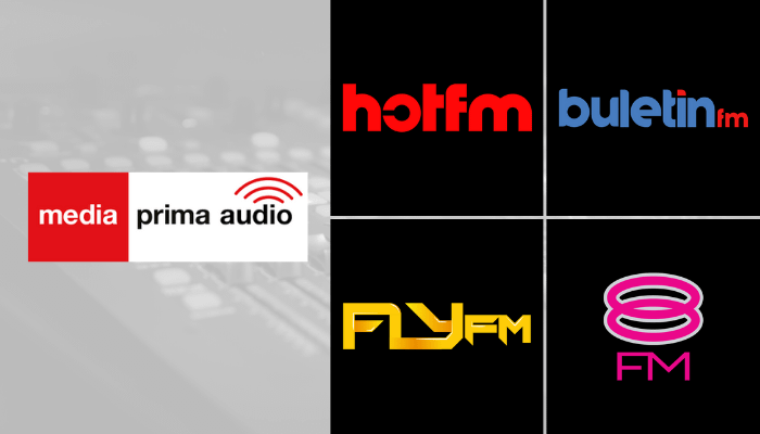
Petaling Jaya, Malaysia – Media Prima Audio (MPA), the radio platform of Malaysia-based media and entertainment company Media Prima, has announced a new slew of business revamps, including brand revamps and changes in content strategy implementation, following new leadership appointments set last June.

Two radio stations, namely Hot FM and Fly FM, are coming out with a “very new” and “very different” sound, complemented with refreshed logos, look and feel. Meanwhile, the other two radio stations, previously known as One FM and Kool FM, are now branded as 8FM and Buletin FM respectively. 

According to Nazri Noran, chief executive officer at Media Prima Audio, this marks the company’s first holistic rebrand in over 15 years and it’s all about allowing them to reinvigorate and strengthen its standing as a leading radio station in the country.

“Today we kick it off with on-air programming, new radio talents, fresh logos, and branding across our assets including digital, social and mobile. We are also thrilled with this new journey as it is also being supported by an extensive marketing campaign across all Media Prima group platforms,” Noran stated.

He also added that there will be changes as well in the talent lineups for all the radio stations.

“Our mission is to drive positive and beneficial changes to the company. Thus, the changes of the talent lineup are a part of the new strategy for the brands to appear relevant and competitive in the market. There are lots in store from today onwards for Hot FM, Buletin FM, Fly FM, and 8FM. Malaysia’s radio fans can expect to be thrilled and fall in love with radio all over again with this master brand overhaul,” Noran concluded.

In addition to these changes, MPA also announced the launch of a new mobile app brand called Audio+ which will be the home for all radio, digital and social content such as live radio, podcasts, videos, and many more. Instead of downloading a separate app for each station, all of the brands will now be parked under one easy and fresh app, Audio+. 

The app can be downloaded via Google Play, Apple App Store, and Huawei App Gallery. 

New York, USA – As adtech Criteo recently unveiled its plans on the future roadmap of the open internet, the company has also revealed its latest brand revamp, speaking to the company’s commitment to supporting a fair and open internet that enables discovery, innovation, and choice.

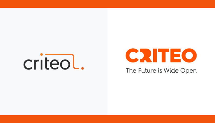
Part of the brand revamp includes a new logo, visual identity, and brand positioning called ‘The Future is Wide Open’. Criteo notes also that the new brand revamp speaks to the vast opportunity the company can capitalize on as it prepares for the future of advertising without cookies.

The new logo brings the two dots previously connected at the top right of the logo to the center of the new logo to better represent consumers and its customers, who are the centerpiece of the company’s product strategy to offer the world’s leading commerce media platform. In addition, the two dots now include open space, a nod to both discovery and openness as the company invites its audience in and balances a strong legacy, visualized with a bolder font, with modern capabilities. 

The visual changes were developed by Criteo’s marketing team, in partnership with creative and innovation agency, Technology, Humans And Taste (THAT), who consulted on the brand positioning. 

“The time is right for a new brand identity and rally cry, as we use our massive strength in data and technology to reestablish Criteo’s leadership within the advertising industry and set an optimistic tone for the future of the open internet, for everyone,” said Megan Clarken, chief executive officer at Criteo

Speaking about the tagline, Todd Parsons, chief product officer at Criteo noted that they are pertaining to the tremendous possibilities Criteo’s unique dataset presents for improving every consumer experience on the open internet. In addition, he notes that despite cookies going away, they view it as an opportunity to evolve their product strategy to deliver greater benefits than ever to consumers and to their customers.

Meanwhile, Kenneth Pao, executive managing director for Asia Pacific at Criteo, commented that Criteo’s brand revamp will push the company’s operations to continue to innovate their product and solutions to serve this diverse market, and are committed to working with their customers and partners who navigate the evolving challenges of the industry.

“We remain optimistic that we will transform experiences alongside our regional ecosystem with an ever-growing dataset. Ultimately, delivering greater values to our customers, and their consumers,” Pao stated.

To announce the new brand and share more details around its business transformation, Criteo held a virtual investor day, which discussed topics such as commentaries and presentation from the Criteo C-Suite team, strategies for their commerce media platform, and partner panel that discussed commerce media opportunities and consisted of key marketers and media owners across Criteo’s suite of solutions. 

Just this year, Criteo’s presence in the Asia Pacific has been bolstered with partnerships to infiltrate the APAC market. This includes their appointment of Httpool as official ad sales partner in India and Indonesia, as well as its partnership with Mediadonuts for their Vietnam market expansion.