
Singapore – Pokémon Center SINGAPORE, the city-state’s flagship Pokémon store at Jewel Changi Airport, will close temporarily from 1 April 2026 for a major localised revamp, the company announced on March 2. The renewal, the first of its kind outside Japan, aims to weave Singaporean culture into the...

Envato, the online community for digital creative assets and templates, has launched a new visual brand identity, signalling a strategic transformation following its acquisition by Shutterstock.
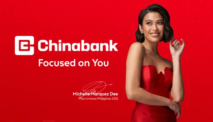
Chinabank’s reputation as a financial institution that understands its customers' needs in a dynamic environment. This is reinforced by the brand refresh campaign. ‘Focused on You,’ the bank's new tagline, reflects its steadfast commitment to serving and putting its clients' needs first. Its new jingle...

Razer Inc.'s fintech arm, Razer Fintech, and its B2B payments unit, Razer Merchant Services (RMS), announced it has rebranded as Fiuu as the company aims to power future payments of merchants worldwide.
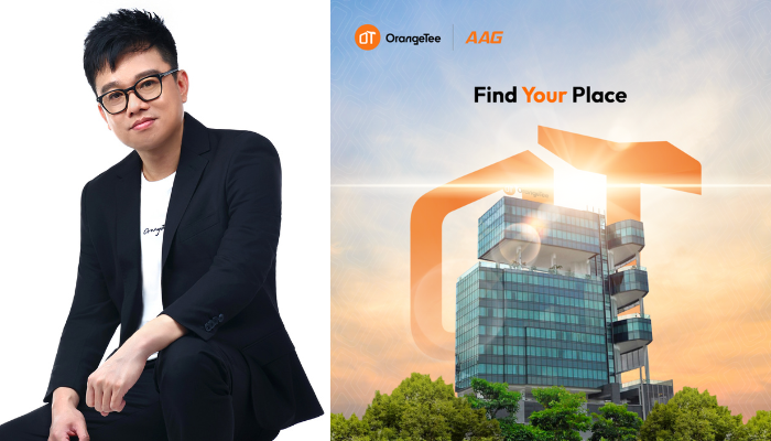
We recently sat down with Jon Tan, senior vice president and head of brand, digital marketing and communication at OrangeTee, to learn more exclusively about OrangeTee’s conceptualisation process on the brand refresh effort.
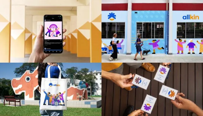
Community-based social service agency AMKFSC Community Services has unveiled a refreshed identity with the launch of a new logo and a new name, Allkin Singapore.

Unilever’s skin care brand Pond’s Skin Institute has partnered with advertising and PR agency Ogilvy Singapore for its new product launch campaign to unveil its elevated brand world.

Global hotel company Club Med is putting a strong emphasis on its lifestyle allure, transforming the concept of escapism into a destination through its latest advertising venture,named "That's l'Esprit Libre." This campaign not only refreshes Club Med's image but also emphasises its modern visual id...
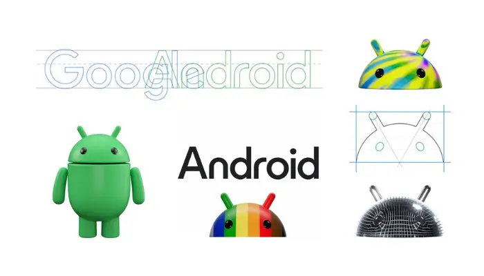
In a blog post by Jason Fournier, director of Android consumer brand management, the ‘bugdroid’ — the face and most identifiable element of the Android robot — now appears with more dimension, and a lot more character.
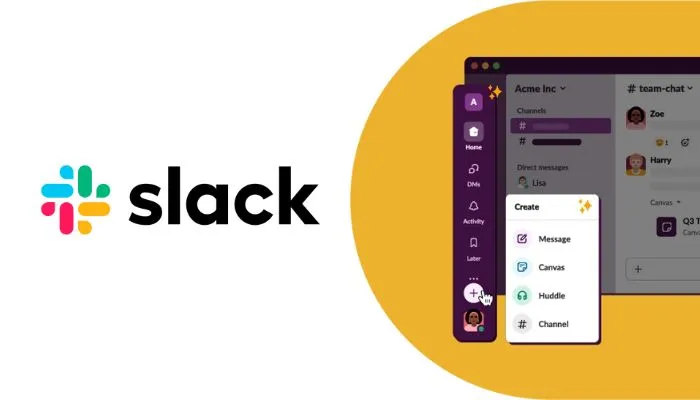
Global communication platform Slack reveals that it will roll out a completely redesigned interface and new user experience aimed at helping users stay organized, focused, and productive.
![[Study] Hong Kong consumers trust issue](https://marketech-apac.com/wp-content/uploads/2026/07/Study-Hong-Kong-consumers-trust-issue.webp)