Thailand – Pumpui has partnered with creative agency Yell Bangkok on a typography-led campaign designed to cut through visual sameness in the Korean-inspired food category, supporting the launch of its new product.
Facing increasing competition in the Korean-inspired food segment, Pumpui and Yell Bangkok opted to centre the campaign on typography, using it as the primary execution rather than relying on familiar visual cues.
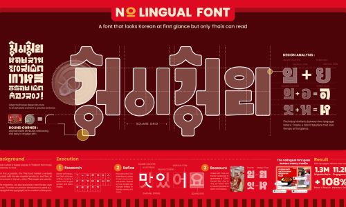
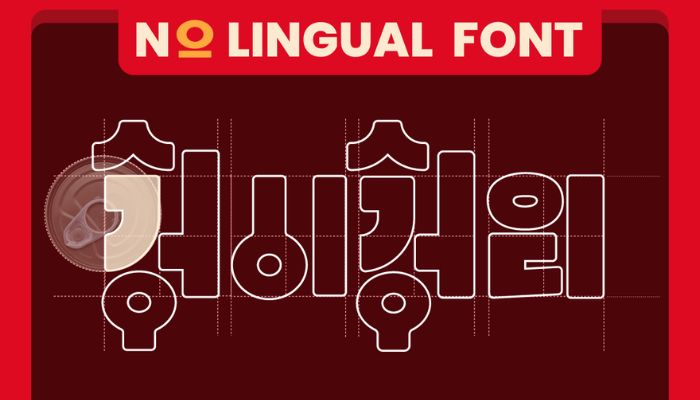
The approach led to the creation of Nolingual Font, a custom typeface positioned between two cultures. Designed to resemble Korean writing at first glance, the font is readable only in Thai. It was developed by breaking down Hangul into its grid system and basic forms, then applying those structural principles to reconstruct Thai characters with Korean-inspired strokes and curves. The result prompts viewers to pause and reconsider what they are seeing.
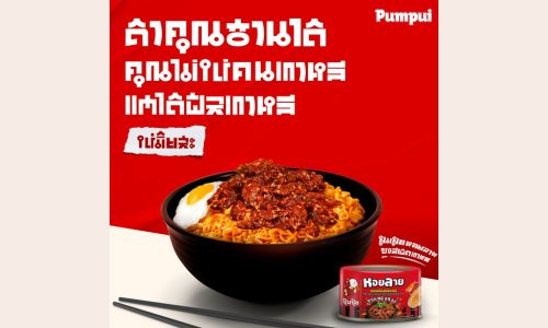
The typeface was rolled out across the campaign, including updates to Pumpui’s Facebook page featuring banners and posts set entirely in the Nolingual Font. Offline, the typography appeared on T-shirts worn by influencers in public spaces, extending the idea into physical environments and encouraging interaction.By positioning typography as the central medium rather than a supporting design element, the campaign aimed to drive engagement through interpretation and curiosity across both digital and real-world touchpoints, offering an alternative approach to standing out in a crowded category.
Chalermpol Bowonruttanapran, regional creative director at Yell Bangkok, said, “Korean-inspired food cues have become almost a visual language of their own in Thailand. We wanted to speak that language differently by turning typography into the idea itself. If people have to try to read it, they’re already interacting with the brand, and that’s where engagement begins.”