Australia – Envato, the online community for digital creative assets and templates, has launched a new visual brand identity, signalling a strategic transformation following its acquisition by Shutterstock.

Envato’s new brand identity features a refreshed look, an updated logo, and a redesigned website. Beyond a mere visual update, this rebrand represents a strategic transformation, poised to redefine Envato’s creative presence and enhance the overall product experience.

The rebrand involved extensive collaboration between Envato’s in-house creative teams and contributors from within the community. The new logo captures the essence of Envato and its creative spirit, incorporating the ‘Creative Spark’—a symbol of dynamism and energy—and the ‘Dynamic Dot,’ representing each individual’s unique contribution.

Speaking on the new logo, Arlyn Panopio, head of brand and creative at Envato, explained, “We had several designers sketching out logo directions over many rounds to craft our perfect mark. We wanted our logo to stand the test of time, and finding a design that felt current yet timeless was an iterative process of striking the right balance.”

Additionally, Envato adopted a brighter and bolder colour palette to reinvigorate the brand, infusing its visual identity with fresh, vibrant energy. The brand also revamped its sonic branding to better reflect its dynamic spirit.

Hichame Assi, CEO of Envato, said, “Bold, vibrant, and reflective of Envato’s spirit, this rebrand symbolises our evolution and unwavering commitment to supporting creatives. We’re excited to continue empowering our creative community and hope the refreshed Envato will inspire them to make their mark on the world.”

As part of the rebrand, Envato has also launched a new website featuring a modernised UI and enhanced UX. The revamped site offers a seamless creative journey, from sparking ideas to discovering the perfect assets.

Meanwhile, it will keep the same creative subscription but introduce a new toolkit to help users produce high-quality designs. 

Envato’s rebrand marks a pivotal moment in its growth, coinciding with the recent completion of its acquisition by Shutterstock. This timing is symbolic, representing both a fresh start and a significant milestone in the brand’s ongoing evolution.

Noelle Kim, chief marketing officer at Envato, said, “Those who’ve been part of our journey know how much heart and passion exists in the creative community we have cultivated. We wanted to evolve our brand to capture the feeling we hope to evoke in our community every time they interact with our brand and product: a sense of energy and a drive to do things differently. And we collaborated with our platform contributors Milos Mitrovic for the logo design and K. Sparks for our sonic branding to bring this to life.” 

Manila, Philippines – Chinabank has launched a brand refresh effort, as well as a digital campaign, to evolve the bank’s brand and image after 103 years. The goal is to make it more resonant and engaging for a new generation of clients. 

As part of a continuous introduction, the bank changed the signs at its headquarters and branch locations. It also made its brand-new jingle and advertisement, “Focused on You,” available on social media. Strategically positioned billboards at SM MOA Globe and EDSA-Magallanes showcased the brand’s first ambassador, Miss Universe Philippines 2023 Michelle Dee, who also happens to be a third-generation descendant of Chinabank’s founder family. 

Chinabank’s reputation as a financial institution that understands its customers’ needs in a dynamic environment. This is reinforced by the brand refresh campaign. ‘Focused on You,’ the bank’s new tagline, reflects its steadfast commitment to serving and putting its clients’ needs first. Its new jingle and online campaign both reflect this idea. 

With its ‘CBC’ monogram, the new logo represents simplicity and stability while giving Chinabank an impression of freshness, agility, and vibrancy. Advertising companies Yonder and TBWA had been appointed to design the new logo and creative aspects for the bank.

Aileen Vallesteros noted that the bank’s chairman, Hans Sy, and president & CEO, Romy Uyan, had a crucial role in everything from choosing the brand ambassador to creating the messaging and design.

Speaking about the brand’s revamp, Gerald Florentino, corporate relations group head at Chinabank, said, “Chinabank has been growing and transforming through the years, in step with the times and more importantly, in line with the changing needs and perceptions of our customers. We believe this brand refresh will develop the Chinabank brand in the right way and enable us to deepen existing relationships and connect with a broader market.” 

Meanwhile, Aileen Vallesteros, marketing communications department head at Chinabank, commented, “How you take the brand forward is vital to any company’s future success. Even if you’re already well established, you have to find fresh approaches to re-engage your loyal customers and build connections with new ones. Our ‘Focused on You’ campaign reinforces the brand’s strengths and makes Chinabank more relatable to the new generation of customers.” 

Malaysia – Razer Inc.’s fintech arm, Razer Fintech, and its B2B payments unit, Razer Merchant Services (RMS), announced it has rebranded as Fiuu as the company aims to power future payments of merchants worldwide. 

The company’s dynamic rebranding includes a new single name, logo, and identity as Fiuu. This new identity underscores the brand’s commitment to their goal of providing innovative payment solutions to merchants worldwide.

Fiuu introduces a vibrant identity that reflects a playful and youthful spirit, symbolising agility and the brand’s dedication to growth. This cohesive brand image symbolises the company’s growth and preparedness to tackle future challenges and opportunities.

Additionally, Fiuu’s brand motto, ‘Powering Future Payments’, also encapsulates the company’s aim of providing cutting-edge solutions and reflects the dedication to fostering trust and reliability in every transaction. 

Fiuu will operate as a standalone subsidiary of Razer Inc. moving forward, with the aim of empowering both businesses and individuals with their evolving payment needs. 

With a user-centric approach and a focus on advanced, cutting-edge technology, the brand remains dedicated to delivering a seamless and intuitive payment experience that elevates the way transactions are conducted. Fiuu will also work to ensure that their offerings stay at the forefront of the digital payment landscape, staying true to their commitment to innovation and security. 

As part of the rebranding, the company will also have leadership changes. Eng Sheng Guan becomes the new chief executive officer, taking over from Lee Li Meng, who will now become the executive chairman of Fiuu

Under Lee’s guidance, Fiuu has undergone remarkable expansion, witnessing a doubling of revenues over the last four years and achieving profitability in its operations.

Now taking over Lee, Eng brings with him an extensive experience of more than 25 years in the payments industry and leadership. His vision and dedication align with Fiuu’s commitment to delivering top-notch solutions and services, heralding a new chapter of growth and innovation for the company. 

Speaking on the rebranding, Lee said, “Our rebrand goes beyond just a name change; it embodies our vision to power future payments. We strive to create seamless and empowering payment experiences that propel commerce into a new era. With Southeast Asia’s digital economy booming and projected revenue set to hit US$295 billion by 2025, our commitment to innovative payment solutions gains even greater significance.” 

Meanwhile, on the appointment, he added, “This rebranding exercise marks a significant milestone for the company, which has grown significantly over the past few years, and it allows the fintech business to continue its path independently from the Razer brand, which is gaming-focused. I am proud of the achievements of the team, and I trust Sheng Guan will be able to take the company to greater heights with the continued support of our merchants and scheme partners.”

Singapore-based real estate enterprise OrangeTee has recently embarked on a recent brand refresh effort, the first of its kind for the brand since its inception in 2000. For the company, the new branding efforts puts highlight on its three key pillars – productivity, presence, and partnerships – to drive the company’s growth in the real estate industry.

We recently sat down with Jon Tan, senior vice president and head of brand, digital marketing and communication at OrangeTee, to learn more exclusively about OrangeTee’s conceptualisation process on the brand refresh effort, how it reflects both its desire to expand operations and its diverse stakeholders base, as well as how it evokes the “kampung” or compassionate and communal spirit.
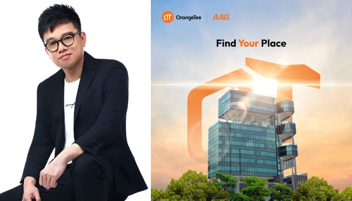
‘Find Your Place’

For Tan, the simple yet profound slogan ‘Find Your Place’ is the heart of the new OrangeTee brand: focusing more on resonating deeply with anyone who is navigating the complexities of the real estate landscape.

“Whether you are finding a place to call home, a strategic space for business expansion, or a platform for professional growth, the presence of a trusted partner to navigate the real estate journey is indispensable. Our renewed vision is to help everyone in the real estate journey, making it understandable and accessible to all. By empowering individuals to find their rightful place in the world, we aspire to enrich lives and redefine standards within the industry,” he explained.

He also added that the decision to embark on OrangeTee’s brand refresh stems from a deep-rooted commitment to staying ahead in an ever-evolving industry. For him, recognising the necessity to redefine their brand identity aligns them with the evolving needs and perceptions of their internal and external stakeholders.

“Through extensive consultations with key stakeholders, involving board members, management staff, and key agency leaders, coupled with a comprehensive whole-of-agency brand survey involving our agents and staff, we gleaned invaluable insights that formed the bedrock of our brand refresh. This inclusive approach seeks to foster buy-in from everyone close to the company, allowing us to discern their sentiments and aspirations for change,” he explained.

How the brand refresh efforts stresses importance of ongoing stakeholder engagement

Prior to the brand refresh unveiling, Tan said that he personally conducted a series of Brand Refresh briefings to engage their internal stakeholders, including agents, agency leaders, corporate management, and staff, facilitating a comprehensive understanding of their new brand direction.

“Our Brand Sentiment Survey revealed an impressive 97.6% alignment with our updated Vision, Mission, and Core Values amongst the attendees—an affirmation of our brand’s revitalised direction, compared to a mere 52.4% comprehension of our previous brand identity. Through these engaging briefings and surveys, we have ensured that every member of the organisation not only understands but also aligns with our refreshed vision, mission, and core values,” he said.

“By nurturing a culture where these values are not just espoused but embodied, we empower our team to effect meaningful change and “SEE” the true spirit of OrangeTee coming to life,” Tan added.

For him, the essence of OrangeTee’s core values lies not merely in words but reflected in our everyday actions. He explains that in OrangeTeeo’s brand refresh, they have transitioned from static nouns to dynamic action verbs, underscoring their steadfast commitment to actively embodying these values in the company’s daily endeavours.

“This brand refresh has underscored the importance of ongoing stakeholder engagement. It serves as a testament to the need for continual dialogue and interaction to refresh, reaffirm, and fortify our brand identity, ensuring that every individual within our organisation is imbued with a renewed sense of purpose as they find their place in the workplace,” he explained.

On standing out from the rest and embodying a sense of community

When asked how OrangeTee separates itself from the rest of the industry, Tan states that their differentiation strategy stems from a profound understanding of their stakeholders, particularly the agents and staff, who form the cornerstone of the business.

“Through extensive discussions and the brand survey, we’ve gleaned invaluable insights that have shaped our brand identity. These insights have guided our creative agency in developing meaningful proposals that have been exceptionally well-received,” he said.

Tan also added, “By capitalising on our distinctive brand name and iconic orange colour, complemented by a modern, dynamic, and edgy aesthetics, we are poised to stand out in a crowded marketplace. Our commitment to professionalism and trust, coupled with a deep-rooted sense of community and solidarity, sets us apart as a beacon of excellence in the real estate landscape.”

He also highlighted how the branding efforts highlights the company’s mission of embodying a sense of community, adding “At the heart of our brand refresh lies a profound sense of community and solidarity—a reflection of the “kampung spirit” ingrained in OrangeTee’s DNA. Our approach to this brand refresh is not merely cosmetic; it is a testament to our unwavering commitment to inclusivity and collaboration.”

For Tan, they have prioritised the engagement of all stakeholders closely associated with their brand, many of whom have been integral members of the OrangeTee family for years, considering it a second home. He further explained that by fostering a culture where every voice is valued and heard, they have forged a collective vision of growth and success.

“From engaging discussions to inclusive briefings and feedback sessions, we have provided a platform for every member of our OrangeTee family to contribute, participate, and thrive. In doing so, we not only reaffirm our dedication to accessibility and understanding within the real estate realm but also epitomise the essence of community—a place where everyone finds belonging and purpose,” he concluded.

Singapore – Community-based social service agency AMKFSC Community Services has unveiled a refreshed identity with the launch of a new logo and a new name, Allkin Singapore.

The new name ‘Allkin’, from the compound words ‘all’ and ‘kin’, represents the organisation’s spirit that embraces inclusivity, fosters togetherness, and kindles connections between employees, beneficiaries, and communities.

As a social service agency that serves people from all walks of life, the refreshed identity underscores Allkin’s identity and aspiration as an inclusive, forward-looking, and community-centric organisation that continues to work towards making a positive impact on communities.

Together with the new name, Allkin has also unveiled its brand new logo, which embodies the brand’s identity. With fresh blue hues and a splash of orange, the new logo is expected to evoke a feeling of trust, being grounded, hope, and optimism.

Meanwhile, the sparkle symbol incorporated into the logo represents the intersection of people, sparking new connections, ideas, and beginnings. The smile represents its welcoming, people-first nature, and the subtle ‘A’ is a nod to the agency’s history and legacy.

Allkin Singapore has tapped WPP’s creative company, Design Bridge and Partners, for their complete rebranding. The project was given in 2022, and the new name and logo were officially launched at Allkin’s 45th Anniversary Charity Dinner by guest-of-honour and patron Prime Minister Lee Hsien Loong.

Dr. Vincent Ng, CEO of Allkin Singapore, said, “To reflect our growth over the last 45 years and to reinforce our identity as an inclusive, forward-looking, and community-centric organisation, it is crucial for us to strengthen our identity to better encapsulate our renewed strategy, expanded scope of services, and geographical boundaries more accurately. We look forward to opening doors to new possibilities for Singapore’s social service sector by continuing to go above and beyond meeting the shifting needs of our society. Design Bridge and Partners were able to capture and bring to life this vision through Allkin.”

Meanwhile, Ambrish Chaudhry, head of strategy at Design Bridge and Partners, shared, “We take great pride in helping homegrown Singaporean brands reach their full potential. It has been a pleasure to work alongside the Allkin team, seeing them make a positive impact in the lives of Singaporeans every day. Our aim was to create an approachable identity that lives up to their ethos. The Allkin name alludes to their openness and willingness to serve the community as they journey beyond a family service centre. The visual identity brings in patterns sourced from the neighbourhoods they serve to make the brand feel fresh and familiar at the same time.”

Singapore – Unilever’s skin care brand POND’S Skin Institute has partnered with advertising and PR agency Ogilvy Singapore for its new product launch campaign to unveil its elevated brand world.

Pond’s new campaign with Ogilvy aims to revive the brand and breathe new life into it while finding ways to connect science with women around the world.

The skincare brand will undergo a complete redesign of its visual identity and brand essence. It will also onboard K-pop star Tzuyu from Twice as its new global ambassador. She will be instrumental in the brand’s reinvention as it invites women to discover how the science of Pond’s Skin Institute can make miracles happen for their skin.

With the tagline ‘Miracles Happen’, the campaign is set to unveil the transformative power of groundbreaking science and what it would mean for millions of Southeast Asian women.

The new campaign comes as POND’S announces the launch of its newest bright miracle product range, which features new formulations and the Nobel Prize-winning science of autophagy to boost skin’s ability to self-repair and achieve ultimate clarity and radiance.

This brand revamp and new campaign will commence in Indonesia and will cascade throughout Southeast Asia and the rest of the world into 2024 through a series of captivating videos, inspiring social media content, and arresting in-store designs.

Aanchal Sethi, global managing partner at Ogilvy Singapore and Unilever, said, “We tapped into the insight that despite their relentless pursuit, 9 out of 10 women struggle to bridge the gap to their desired skin. They believe it would take a miracle to achieve this skin. Today, we have the science to bridge this gap; the science to make miracles happen.”

Speaking on the campaign, Vandana Suri, global brand lead at POND’S Skin Institute, also shared, “At this pivotal moment for Pond’s Skin Institute, we are excited to showcase our longstanding heritage of skincare innovation while introducing the world to our unparalleled new Bright Miracle product range.”

“As we integrate the best of science and beauty, we couldn’t be more thrilled for our partnership with Tzuyu to invite people everywhere to experience the brand. From her unrelenting ambition, diverse talent, and unique craft to her warm personality and inspiring outlook on beauty, she is truly an icon who makes miracles happen,” she added.

Singapore – Global hotel company Club Med is putting a strong emphasis on its lifestyle allure, transforming the concept of escapism into a destination through its latest advertising venture,named “That’s l’Esprit Libre.” This campaign not only refreshes Club Med’s image but also emphasises its modern visual identity.

Club Med is rebranding with the tagline “That’s l’Esprit Libre” to reflect its heritage and global presence. Their new campaign addresses the social aspects of travel and vacation experiences by combining a stylish, lighthearted tone with a modern aesthetic.

Commenting about the brand’s revamp, Quentin Briard, Club Med’s CEO of marketing, digital and technologies, said, “With our complete creative overhaul, Club Med is entering a new era aligned with our premium and lifestyle positioning.” 

l’Esprit Libre means having peace of mind and living a different way of life that elevates and enhances the ordinary. “That’s l’Esprit Libre” highlights those special times when we truly unwind while on vacation, letting go of the stresses of everyday life to rediscover what really matters. It urges us to rediscover the easy joys and find contentment in the here and now.

Meanwhile, Jules Renault, director of Soldats Agency, said about the commercial, “It’s anything by a typical commercial. It’s meant to be like a celebration – playful and fun. There’s irony and attitude in the voiceover’s narration, addressing an audience that’s not gone on vacation yet.” 

Singapore – Android, the largest mobile operating system globally, has unveiled its recent brand revamp, which includes its iconic robot mascot more prominently by introducing a new 3D look.

In a blog post by Jason Fournier, director of Android consumer brand management, the ‘bugdroid’ — the face and most identifiable element of the Android robot — now appears with more dimension, and a lot more character. 

As a visual signifier of the brand, they wanted the bugdroid to appear as dynamic as Android itself.

“We’ve also updated the robot’s full-body appearance to ensure it can easily transition between digital and real-life environments, making it a versatile and reliable companion across channels, platforms and contexts,” he said.

Meanwhile, their new visuals draw inspiration from their material design to complement the Google brand palette, as well as be adaptable. The refreshed and dynamic robot shows up where Android connects with people, community and cultural moments, and additionally reflect individual passions, personality and context.

“While we’ve added more curves and personality unique to Android, the new Android stylization more closely mirrors Google’s logo and creates balance between the two. We hope these small but significant updates to the Android typeface will better communicate the relationship between Android devices and the Google apps and services people already know,” he added.

Over the past decade, the Android brand has undergone several updates to modernize its look and feel and evolve with the needs of our community. In 2019, for instance, they changed their logo to be more accessible and easier to read. In addition, they have also updated the naming convention for Android releases from fanciful (e.g., Android Lollipop) to simple (e.g., Android 14), making subsequent releases clearer and easier to understand globally.

Singapore – Global communication platform Slack reveals that it will roll out a completely redesigned interface and new user experience aimed at helping users stay organized, focused, and productive. 

The redesign is expected to roll out in the coming months and will feature a more intuitive layout and better organization to finish work faster. To go into specifics, the new design helps users navigate through channels and conversations easily, focus on what’s important and knock out distractions, and find essential tools faster and easier for a more simplified experience. 

The redesigned Slack features easier navigation of channels and messages across multiple workspaces. The sidebar will become a default ‘Home’ view, with those in the Enterprise grid having the ability to view channels from every workspace, all in Home.

Another prominent feature introduced with the new design is the dedicated pages for a more focused view. With this, notifications will be housed deeper within this view, so users will have more control over when they want to work and when they’re ready to collaborate with the team.

Slack’s new design also emphasizes the importance of having useful tools one click away. With the revamped design, a new ‘create’ button will allow users to start new messages, channels, canvases, and huddles. And a new “more” button is introduced for simpler access to workflows and apps without friction.

Noah Weiss, chief product officer of Slack, said that, “We know millions of people start and end their workday in Slack, so we took great care to ensure these improvements make it a more productive and pleasant home. The new experience helps teams stay better organized, focus on what’s important, and quickly access a growing set of tools in Slack.”

Other than the highlighted features, Slack will also introduce hover functionality to monitor activity quickly, device-specific updates, and new themes.

Australia – Golf Australia has unveiled its new brand revamp, symbolising the evolving essence of golf as an increasingly inclusive sport that embraces various forms of play, aiming to inspire a greater number of Australians to participate in the game.

The new Golf Australia logo unites the game’s historic and modern facets through an abstract modern monogram that symbolises its essential components. The design strategy and execution were delegated to Australian design agency SE Creative, while FutureBrand continued to serve as an advisor.

Speaking about the new logo, James Sutherland, CEO at Golf Australia, expressed, “We’re incredibly excited about launching the new look for Golf Australia. It reflects a contemporary image that is consistent with the rapidly changing perceptions about golf as sport for all.”

He added, “Golf is big, and it’s getting bigger. Our participation base is not only growing but becoming younger and more diverse. People of all backgrounds and ages are flocking to the game – some in traditional forms as members and on course, but also significantly in alternative formats such as simulator golf, driving ranges and mini-golf.”

“That shift in behaviour is why the Australian Golf Strategy outlines the notion of ‘’all golf is golf’. Anyone can be a golfer, and we believe that these recent brand changes will complement and positively reflect on the direction and bigger picture aspirations for our sport,” Sutherland said. 

Meanwhile, Ben Maguinness, design director at SE Creative, said, “In its most simplistic form, Golf is not a complicated game. It is ‘a sport for life and fun for all.” 

He explained, “As a result, we have created a logo that is aligned to the Australian Golf Strategy, one focused on growing its core, that represents golf in all its forms and connects the old guard with the fresh faces of the game.” 

Rich Curtis, CEO of FutureBrand Australia, commented, “Golf is changing as it broadens its appeal across all playing formats and skill levels: because all golf is golf. This all-inclusive outlook has provided both the insight and the inspiration to define the brand strategy for Australian Golf.

He added, “By centring playfulness at the heart of the game and connecting all the different ways in which golf can be played – both for the challenge and the joy – the brand strategy and brand architecture together set the platform for Golf Australia and the PGA of Australia to guide a connected experience that will continue to help golf grow.”