Hong Kong – Superunion, the creative company under WPP, marks its 20-year anniversary in China by announcing the launch of its new office in the city of Shenzhen. Its founding clients will include Tencent, Riot Games, Vivo and Vanke Nantou City, and will be led by Monica Lee, chair of Superunion Asia, and Maggie Chien, business director at Superunion.

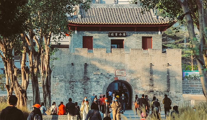
The company’s recent works for their Chinese business include partnering with Riot Games to celebrate the 10th anniversary of League of Legends China, and the creative transformation of Nantou City, known as the ancient city of Xin’an and located at the heart of Nanshan District in Shenzhen.

“As the company’s footprint and expertise expand, it is becoming a business not constrained by a specialism, instead acting as a creative partner for the region’s and the world’s biggest businesses across multiple sectors, helping them create meaningful value and change for their audiences and society,” Superunion said in a press statement.

Speaking about their new office in Shenzhen, Lee underpins the technology and innovation in the Greater Bay Area, which will become the region’s version of ‘Silicon Valley’. She added that they have a ‘laser-focused’ vision to build their presence among these new tech companies, who are looking to stamp their name not only in China, but globally.

“They now account for more than 25% of the new tech businesses in the region, and that number is still growing. The common theme with these businesses is their ambition to embrace new ideas. They are no longer looking for traditional agencies who offer standard services – they want partners who can grow with them, and we are perfectly positioned for this,” she stated.

Meanwhile, Benedict Gordon, CEO at Superunion Asia, commented that clients no longer see them as constrained by a specialism, but as a partner that can help them with a wide range of needs in order to create meaningful value and change for their audiences and society.

“Our ethos revolves around being a revolutionary creative company and the Greater Bay Area (GBA) is very much where many of China’s revolutionary creative businesses are born, providing incredible opportunities for us in areas like technology, AI and biotech. Superunion is the first brand company to have a presence across all of Greater China’s major geographies, including Beijing, Shanghai, Hong Kong and now Shenzhen, so this is an exciting and symbolic milestone for us,” Gordon explained.

He added, “Brands now understand and embrace this change and especially in a post-pandemic world, want to make an impact. Businesses really succeed when they integrate business goals and ambitions with a clear brand strategy that they bring to life. This is where Superunion has really come into its own and where we see the opportunity for further growth, globally.”

Hong Kong – In retrospect to celebrating the game’s gameplay in China for a decade now, multiplayer online battle arena video game League of Legends has launched a new campaign alongside brand agency Superunion, which evokes memories of the game’s players in the country, who have been active now for a decade.

Called aptly as the ‘Annie-versary’ campaign, the title plays on one of the game’s well-known characters known as Annie, a child mage known to possess pyromantic abilities. Furthermore, the character has become of increasing importance to League of Legends players as a valuable and iconic champion.

Said campaign was developed using the insight from Riot Games that gamers love finding Easter eggs and the feeling of being truly part of a gaming community. It uses memes, secret words, and insider jokes, piecing them together to follow a protagonist’s 10-year gaming journey with League of Legends, sharing the wild ride with the gaming community.

Justin Kuo, head of creative, China Entertainment at Riot Games, said, ”Superunion has been the ideal partner for the campaign, as they truly understand the passion that our players have for our games and have helped us create a campaign that reflects the transformative power of being part of the gaming community.”

The film launched at the grand opening celebration event at Hangzhou Olympic Sport Centre and will be featured across all social media platforms and broadcast media.

Meanwhile, Maggie Chien, business director at Superunion China, commented, “It’s been an honor working with Riot Games China, with this particular project aligning perfectly with our creative revolution spirit. We worked as one global Superunion team to complete Riot’s 10th ‘Annie-versary’ film that integrates an impactful plot with top-notch visualizations, designed to evoke memories for all League of Legend gamers over the last 10 years.”

Hong Kong – Nantou City, the ancient city of Xin’an located at the center of Nanshan District in Shenzhen, has announced its complete brand overhaul, as part of its effort to build a cultural landmark in the Greater Bay Area (GBA).

Nantou City is positioned as the capital of Eastern Guangdong and the cultural origin of Hong Kong and Macau. It strives to be the melting pot of design, culture, and creative industries.

According to Nantou City, after Vanke, the town developer and city service provider, took over the renovation of the city, it has evolved into a landmark location embedded with four major parts – cultural and creative retails, trendy art experiences, and high-quality and innovative F&B, as well as cultural residencies.

The rebranding, which will be managed by creative brand agency Superunion, includes strategic brand, experience, and communications planning, alongside a total revamp of visual identity.

Nan Huang, the general manager of Shenzhen Nantou City’s Renovation Project, shared that their aim is to activate Nantou City, bringing out the best in both Chinese traditions and modern creativity, organic and sustainable development vitality to the town. 

“As we see the Greater Bay Area continue to thrive and develop, our goal is for Nantou City to retain its original architecture, which is reminiscent of Lingnan/Cantonese styles from the Ming and Qing dynasties but injects modern elements to build the city toward a young and collaborative melting pot,” said Huang.

Meanwhile, Maggie Chien, Superunion China’s business director, commented that it is both exciting and challenging to curate a brand strategy and positioning that addresses the delicate balance between maintaining the history and making it relevant for contemporary times, and the Vanke team has demonstrated astonishing execution and sensitivities in revamping the old city.

“We want to reveal that hidden charm of Shenzhen Nantou City and build an innovative and consistent visual system that communicates the city’s values. In our view, Nantou city is not just a historical landmark that you visit once, but a place that you want to come back to time and time again, to relax, to stay, and to grow with. Instead of commercializing, we want to build the city into a sustainable cultural center and integrate it with the local lifestyle,” said Chien.

The city’s new brand revamp is set to be revealed at the end of 2021.

Thailand – Following the merge of two of Thailand’s mainstream banks, TMB Bank and Thanachart Bank (TBank), the two have launched their official brand identity as the new TMBThanachart Bank. 

In 2019, the plan to merge was officially announced, where completion had been awaited for 2021. Now that the banks have finally unified, it unveils a brand identity that is a true fusion of each of the banks’ original and standalone brandings. 

The banks’ original brandings prior the merge

Also to have the moniker ‘ttb’, the merger was fulfilled to bolster their banking and financial service offerings to customers, with a purpose to be Thais’ top partner in achieving financial well-being.

Developed by global brand agency Superunion in Thailand, ttb’s brand identity combines TMB’s blue branding and TBank’s orange hue trademark. The branding is simple yet fresh, bearing the letters ‘ttb’ and specifically as that, in small capitals. 

Kanchana Rojvatunyu, the appointed chief marketing officer of the new TMBThanachart Bank, commented, “Our mission is to help people achieve better financial well-being that enables our customers to reach financial freedom and achieve their life goals.”

TMBThanachart Bank will also carry the brand slogan ‘Make REAL Change’. Superunion said that it will signify the bank’s objective to make a positive impact on people’s lives, providing the right solutions to help customers save, invest and spend smarter and eventually, support them to achieve financial stability.

Prachawan Ketavan, Superunion Thailand’s director of strategic planning, shared the concept behind the brand and said the team leveraged on the colors which proved to be very important to both banks. Ketavan said they maintained this element but refreshed them with brighter tones, “providing a balance of stability and dynamism” which also reflects the nature of the new business. 

The connected letters, meanwhile, Ketavan continued, aims to send across the feeling of freshness and being approachable, something fit “for the next digital era of banking in Thailand.”

“As the financial landscape in Thailand continues to evolve, we’re proud to have worked with ttb at such a pivotal point in their history. The brand is fresh and dynamic and reflects both their ambitions and what their customers deserve,” said Ketavan.

According to Dan Ellis, managing creative director at Superunion, the logo and all the foundational assets of the brand were created with a process called ‘Dimensional Branding’. 

Ellis said, “We think about every dimension of the brand, how would it feel, sound, move, speak, respond, interact and importantly stand out in the hearts and minds of Thais.”

TMBThanachart Bank has also released an official film to share the story of the new logo. In it, the bank depicted the coming together of the two entities, which it shows to be borne out of passion and determination. 

Fresh from the merge, ttb has released one of its first offerings, the ‘ttb reserve’; a privilege program that is catered to high-wealth customers, specifically those with over 30 million baht, to provide them deposit, investment, as well as insurance services in preparation for retirement

Singapore – To best serve the funneling of advertising dollars spent on digital campaigns, brand agency Superunion has created a web browser extension for Tabfund to empower research and development endeavors by raising research funds.

Tabfund is a web browser extension service that funnels advertising dollars to power global research projects through non-invasive advertising impressions, collected every time a new tab is opened online.

Users who install the browser extension can have the option to donate their ‘tabs’ to preferred research projects across three major areas: Health (COVID-19), New Tech & Environment. As donations are collected from all corners of the globe, real-time data is processed by the platform, allowing people to see the collective impact as it happens for immediate visualisation, as well as receiving a quarterly personal impact report.

Created in collaboration with a team of researchers, Filipa Pinto, Leonardo Machado and Henrique Cardoso, and the Superunion team, Tabfund is designed to address the flawed research funding model and raise awareness of research today.

In a promotional video, they have stated that one of the primary reasons they launched Tabfund was to shed light on the importance of research funding. They stated that despite the significance of research and development, it doesn’t get as much funding resulting in a lot of projects not materializing due to lack of funds.

“The digital platform challenges the preconceived notions of research and reframes it as a place of play, imagination and optimism. The mechanism and technology that Tabfund is leveraging is free from complexity. It’s simple to join and easy to use, becoming an integral part of our daily lives online,” Tabfund said in a press statement.

On its website, it also stated that one of its primary partners is the Institute for Research and Innovation in Health at University of Porto in Portugal, where entitled in its partnership benefit the installation of a laboratory area devoted exclusively to the detection, study and advancement of new solutions to tackle COVID-19 and future emerging pathogens.

Meanwhile, entitled in Superunion’s partnership with Tabfund is to freshen, restructure and consolidate its brand strategy and design. Both companies have shared the belief Tabfund’s mission and its unique place is a fundamentally important idea and solution in today’s society. This shared understanding also encompassed the acknowledgment of the important role that clear and appealing communication has in raising research.

Singapore – Singapore telco provider MyRepublic has announced a new brand revamp, with a core brand message of being more relatable with customers, driven by customer-centricity, a greater focus on attributes which customers expect from telecommunications service providers today.

Conceptualized together in partnership with branding agency Superunion, the new rebranding stems from a study of 750 customers by both companies to evaluate current brand perception as well as key customer consideration factors and features. Findings from the customer survey guided the overall brand discovery process and informed MyRepublic’s brand positioning as ‘People who get people’.

Initial social media posts from MyRepublic bearing the new brand revamp.

The new visual identity sees a refresh of MyRepublic’s brand assets, with elements such as the core purple color being optimized for a screen-first approach, in line with changing digital consumption habits, which will be gradually rolled out across all of MyRepublic’s brand assets and sub brands. The bold simplicity of the identity cuts through a cluttered category and sets up the brand for expansion of its business footprint. 

According to Enning Yow, head of creative studio and insights at MyRepublic, they hope that this new identity captures the MyRepublic spirit – smart and more than a little geeky, but always approachable and friendly.

Other visuals from MyRepublic, with ‘quirky’ statistics from the aforementioned research with Superunion.

“Through this exercise, we wanted to iterate our commitment to delivering quality services that are reliable and customer-centric. It was a great experience working with Superunion to create a strategic platform and visual identity for the brand that we could meaningfully own,” Yow stated.

Meanwhile, Danley Stone, executive client director at Superunion, commented that the heart of the rebranding endeavor was a customer-centric extensive research, on which they sought on the question of why MyRepublic shares a special bond with them as customers.

An OOH campaign by MyRepublic on an MRT station.

“It simply came down to their unique culture; these are smart, fast-moving, genuine people who truly care about their people. The new identity embraces that sentiment and sets up MyRepublic as a breath of fresh air within the category.” Stone stated.

MyRepublic’s brand revamp coincides with the company’s recent update of their telco services, specifically their new self-serve SIM card activation service. This offers customers greater flexibility and a more seamless sign-up process with enhanced security. Starting in May this year, new mobile customers who receive their SIM cards via mail will be able to track their package in real-time via MyRepublic’s delivery partner throughout the process. 

“Our mobile service enhancement and brand refresh are part of a larger, ongoing commitment to place our customers’ evolving needs and preferences at the heart of our brand and business. We are who we are today because of our customers, and our ability to bring meaningful value to them will be critical for our continued success,” said Lawrence Chan, managing director at MyRepublic Singapore.

The brand revamp has been showcased through an integrated campaign that launched in March 2021, appearing across MRT stations as OOH advertising and digital channels.