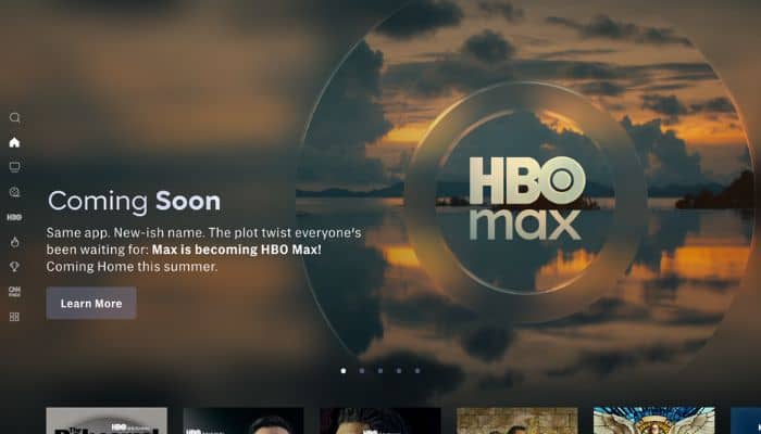
USA – Warner Bros. Discovery (WBD) revealed that its flagship streaming service, Max, will be rebranded as HBO Max this summer, marking a strategic return to the iconic HBO brand for its streaming service to emphasise quality and distinctiveness in content.

The rebrand was announced during WBD’s Upfront presentation at Madison Square Garden, where JB Perrette, president and CEO of streaming, and Casey Bloys, chairman and CEO of HBO and Max Content, outlined the rationale behind the change.

The return to the HBO name reflects the company’s ongoing strategic adjustments, which prioritise high-performing content and audience preferences based on consumer data and viewing trends.

“We will continue to focus on what makes us unique – not everything for everyone in a household, but something distinct and great for adults and families. It’s really not subjective, not even controversial – our programming just hits different,” said Perrette.

“With the course we are on and strong momentum we are enjoying, we believe HBO Max far better represents our current consumer proposition. And it clearly states our implicit promise to deliver content that is recognised as unique and, to steal a line we always said at HBO, worth paying for,” added Bloys.

Warner Bros. Discovery’s streaming business has seen a significant turnaround, improving profitability by nearly $3 billion over two years and adding 22 million subscribers in the past year. The company attributes this growth to a strategic focus on high-performing content—such as HBO programming, recent films, docuseries, select reality shows, and original content—while scaling back on lower-engagement genres. The shift also reflects evolving consumer preferences, with viewers increasingly seeking quality over quantity in streaming content.

David Zaslav, president and CEO of Warner Bros. Discovery, said, “The powerful growth we have seen in our global streaming service is built around the quality of our programming. Today, we are bringing back HBO, the brand that represents the highest quality in media, to further accelerate that growth in the years ahead.”

Kuala Lumpur, Malaysia – Andaman, the first-of-its-kind master-planned island in Penang and Malaysia by Eastern & Oriental Berhad (E&O), has recently embarked on a rebranding journey alongside IMAJEN, with the aim of strengthening the Andaman brand and expanding its name to the international market. 

Set against the allure of island city living in Penang, Andaman is a 760-acre reclaimed development that’s presented as E&O’s boldest vision yet. The island is built upon the acclaimed success of Seri Tanjung Pinang, a coveted affluent address within the city of George Town where over 20 nationalities call home. 

“To elevate Andaman’s presence on the global stage, E&O appointed us as the lead branding agency, entrusting us to shape a notable brand identity that reflects Andaman’s world-class charm and esteemed vision,” the agency recently told MARKETECH APAC.

To lead in communicating this vision, E&O looked to IMAJEN with an 18-month branding agreement. With IMAJEN at the helm of branding Andaman, the agency looks to establish Andaman’s positioning in Penang and raise its value as a world-class destination. These efforts include concept development, key visual design, development of the brand book, website revamp, and art direction.

Through in-depth research, the agency told MARKETECH APAC that they quickly recognised that Andaman would face competitors with similar positioning as “first-of-its-kind” master-planned island developments.

“To set Andaman apart, we delved deeply into its essence, uncovering core values that reflect its unique promise of sustainability, liveability, connectivity, and community,” the agency added.

This then led to a bold repositioning of Andaman as “the most liveable curated island” — a standard of excellence that only E&O, with its legacy of quality and craftsmanship, could truly deliver.

“By highlighting Andaman’s focus on liveability and thoughtful design, we crafted a distinctive identity that resonates more authentically with the target market, setting it apart as an exceptional, world-class destination,” the agency further explained.

Aside from shaping Andaman’s identity, IMAJEN is also currently working on developing the brand direction for the subphases in the island. Each project bears its own distinct offerings and unique lifestyle experience, appealing to different target markets. This includes The Lume – an elegant condominium built on the idea of quiet luxury, and Maris – a sleek waterfront residence in Andaman’s Gurney Green commercial district that targets the younger, aspirational community. 

“We have long admired the E&O Group and their projects,” tells one of the Directors of IMAJEN. “By elevating the Andaman brand, we are hopeful that it will also benefit its subphases and fortify E&O’s name not just in Malaysia, but the rest of the world.” 

Singapore – Coda, a digital content monetisation company, has refreshed its brand to demonstrate its focus on its partners’ growth. From ‘Coda Payments’, the company has updated its name to ‘Coda’, reflecting its intent to go beyond payments and gaming.  

The rebrand highlights Coda’s aim to focus on driving opportunities for its partner’s growth globally. More than its focus on payments and gaming, Coda is also championing success for its partners. 

With its new tagline, ‘Customize. Maximize. Monetize.’, Coda is reinforcing its commitment to its partners, allowing them to customise solutions, maximise efficiencies, and monetise content.

Through the rebrand, Coda positions itself as a catalyst for growth, helping businesses with commerce solutions. Additionally, the new identity strengthens its connection to its flagship sub-brand Codashop and its parent brand.

Consequently, Coda has revealed its new website, donning its new logo. Aligning with its brand identity, the website features a modern design that emanates a confident and conversational tone.

“Our new brand reflects how far we’ve come and where we’re heading. This isn’t just a cosmetic change. It’s a statement of intent. We stand out as a partner who is delivering customized solutions and maximizing growth for our partners. Our brand now reflects this,” Claire Weston, chief marketing officer at Coda, said.

Vietnam – Biti’s Hunter has tapped Dentsu Redder for the launch of “Buoc Toi” (Step Forward), a bold rebranding campaign that captures the emotional journey from fear to exhilaration, represented by the courage to step into the unknown while empowering the audience to overcome self-doubt. 

Through the campaign, Biti’s Hunter embraces a contemporary identity as a sneaker-led lifestyle brand that is a symbol of Vietnamese progress and self-expression, allowing it to resonate with the aspirations of young Vietnamese. 

Centered on “stepping into the unknown”, the campaign used emotional storytelling inspired by the aspirations and challenges of young Vietnamese to resonate with the target audience.

The brand’s decision to undergo a rebranding and repositioning effort by embracing a more contemporary approach aligns with the aspirations and raw emotions of young Vietnamese. It is captured by visualising an individual’s journey that goes from fear and doubt when embarking on something new, to a realisation and eventually an exhilaration knowing that it is something that he/she can now do – a metaphor for the emotions of the generations of today and tomorrow that are questioning their place in Vietnam’s future. 

Biti’s Hunter emerges as a rallying call—empowering them to push boundaries, make history, and shape culture. With a striking new identity, the brand aims not just to stay relevant, but to own the emotional moments where boldness and progress ignite.

To showcase Biti’s Hunter first streetwear collection, Dentsu Redder created a visual narrative that blends contemporary fashion with the rich, vibrant essence of local Vietnamese culture. This approach not only introduces the collection but also highlights the gritty, authentic vibe of the brand.

Phu Le, marketing manager at Biti’s Hunter, said, “For the past decade, Biti’s Hunter has inspired people to take pride in their roots. As we evolve with the progress of our country and people, we will continue to motivate and empower Vietnamese people to believe in the limitless possibilities of where they can go. With “Buoc Toi”, Dentsu Redder has powerfully delivered a story that has helped Biti’s Hunter own the moments where emotions are born.”

Meanwhile, Livio Grossi, group ECD at Dentsu Redder, commented, “The best brands make you feel something. With Biti’s Hunter’s new identity, we are not just showing you change; we’re inviting you to experience it. We have had an endearing journey with Biti’s Hunter’s over the years and are very proud to be able to deliver this meaningful campaign to launch a new and stronger phase for the brand.”

Singapore – Global media intelligence company Onclusive has announced that it has fully integrated Digimind into the company and will rebrand as Onclusive Social. Said milestone marks a significant enhancement in Onclusive’s ability to provide comprehensive media monitoring and analysis solutions to clients worldwide.

Through this, the integration and rebranding strengthen Onclusive’s social media monitoring, insights, and analysis capabilities on a global scale. Moreover, clients will benefit from a more comprehensive, AI-driven approach to media intelligence across all major social platforms under a unified brand.

This integration will also provide clients with the tools they need for a complete view of their media presence and performance, encompassing earned, owned, and shared media landscapes.

In addition, the integration of Onclusive Social’s technology, which leverages advanced AI solutions and machine learning, significantly enhances Onclusive’s ability to deliver global social media listening and in-depth analysis. This move solidifies Onclusive’s position as a customer-rated leader in social media listening software, as recognized by G2.

Said integration and rebranding efforts are part Onclusive’s ongoing strategy to offer a complete suite of market-leading global media monitoring, measurement, and management solutions to PR, communications, and marketing teams, helping them to continually prove and improve their value.

Clients of both Onclusive and Digimind will also be able to access an expanded set of tools and capabilities under the unified Onclusive brand. The integration also means that clients can now work with a single provider for all their media intelligence needs, from traditional media monitoring to advanced social listening and analysis.

Rob Stone, CEO of Onclusive, stated, “The full integration of Digimind as Onclusive Social represents a pivotal moment in our mission to provide the most comprehensive media intelligence solutions in the industry. By bringing Digimind’s cutting-edge social listening capabilities under the Onclusive brand, we are uniquely positioned to offer our clients unparalleled insights across all media channels with a seamless, integrated experience.”

Meanwhile, Digimind Co-Founder Patrice Francois commented, “Rebranding as Onclusive Social is more than a name change; it’s a testament to our full integration and shared vision. As Onclusive Social, we’re excited to bring our advanced social listening and intelligence capabilities to a broader client base, helping organisations make more informed decisions based on comprehensive media insights.”

Manila, Philippines – Local food business group Figaro Coffee Group has announced that its board of directors has approved the change to rebrand as Figaro Culinary Group, according to a recent stock disclosure statement by the company on the Philippine Stock Exchange.

According to the disclosure statement, said rebranding has been determined that it is in the best interest of the company to change its corporate name to better reflect its strategic vision and broaden its brand identity. 

“The proposed new name (Figaro Culinary Group) will outline the company’s commitment to quality and innovation as it expands its offerings to include a wide range of culinary products and experiences,” the company said.

Figaro Coffee Group consists of the coffeehouse chain Figaro Coffee, pizza chain Angel’s Pizza, Taiwanese food chain Tien-Ma’s, kebab shop Koobideh Kebabs, and gourmet coffee chain Cafe Portofino.

The group’s most popular brand is Figaro Coffee, a chain founded in 1993. As of this writing, the coffee chain has 90 outlets worldwide, including in Qatar, Saudi Arabia and Papua New Guinea.

Manila, Philippines – The Ninoy Aquino International Airport (NAIA) has released a new logo and website following the recent takeover of San Miguel-led New NAIA Infra Corporation (NNIC), the new private operator for said airport.

While the website is still incomplete, users can expect dedicated pages to flight information, flight tracking, list of airlines servicing NAIA, as well as special pages for airport transport, dining, shops, and other airport amenities.

Moreover, there is also a dedicated ‘Bagong Bayani’ page on the website, which NNIC described as a special hub featuring inspiring stories about overseas Filipino workers (OFWs), one of the country’s biggest workforce exports.

“The launch of our website and social media pages is part of our commitment to open communication and transparency,” said Ramon Ang, president and CEO of NNIC

Aside from San Miguel Corporation, NNIC also include the Incheon International Airport Corp, with both aim to transform NAIA into a ‘world-class airport’.

It is worth noting that NAIA’s new operator also comes in light of continued public outcry over the lack of sanitary and operational initiatives from the airport to maintain its image. For local PR leaders, they note that marketing and advertising efforts are ‘band-aid solutions’ for NAIA, and instead the airport should focus more on improving their operational measures to gain more trust from the public–both local and international.

India – Hilton Shillim Resort & Spa has officially been rebranded as ‘Dharana,’ a luxurious new identity that emphasises wellness and conscious living, crafted in collaboration with the brand consulting firm Landor.

Dharana’s new brand identity revolves around ‘The Journey to Conscious Being,’ encouraging guests to embark on a personal voyage of self-discovery and growth. The brand’s wordmark draws inspiration from natural sounds, capturing a sense of harmony that embodies the tranquil experience awaiting every visitor at Dharana.

Dharana is a luxury retreat set amidst the tranquil Shillim landscape, spanning 350 acres of the scenic Sahyadri mountains in Maharashtra. Formerly known as Hilton Shillim Resort & Spa, Dharana provides a serene sanctuary dedicated to relaxation and mindfulness.

Landor’s crafted brand for Dharana is a retreat that offers a bespoke journey nurturing mind, body, and soul while fostering a deep connection with nature and promoting mindful living.

Speaking further on Dharana’s new brand identity, Ronita Mukerjee, executive director for client services at Landor India, said, “Our objective with the new brand identity for Dharana was to explore the concept of well-being through a vibrant, engaging, and unique visual representation that embodies a transformative journey, harmonising the body, mind, and spirit. The narrative of the brand centres on the theme of ‘The Journey to Conscious Being,’ which highlights wellness as a continuous evolution, offering various pathways at Dharana.” 

Meanwhile, commending Landor for crafting the new brand identity for Dharana, Gavin de Souza, managing director at Writer Realty, said, “We are incredibly proud of the exceptional work done by the team at Landor in shaping the new brand identity for Dharana. The design perfectly encapsulates our vision for Dharana as facilitating holistic well-being, where guests can immerse themselves in nature and experience personal growth and rejuvenation.” 

“The intricate details in the design reflect our commitment to providing a tailored wellness experience for each guest, nurturing a deep connection with the ecosystem and the true essence of nature. We believe this new brand identity truly reflects Dharana’s prestige as a luxury wellness brand, offering our guests a perfect blend of peace, tranquillity, and interconnectedness,” Souza added. 

Hong Kong – Hospitality group Wharf Hotel has announced a comprehensive rebrand for hotel brand Marco Polo Hotels. The brand, named after the eponymous Venetian merchant, has its brand transformation stemmed from a strategic vision focused on addressing the evolving behaviour of guests and the addition of numerous enhancements.

Located in gateway cities like Beijing, Hong Kong, Jinjiang, Wuhan, Xiamen, Cebu, Davao and Manila, the refreshed Marco Polo Hotels brand is designed to inspire guests to embark on a journey of discovery whether for business or leisure.

At the heart of the rebranding is a new series of pillars — Enrich, Connect and Responsible — that help define the essence of Marco Polo Hotels, a new visual identity, as well as a Viva Magenta brand colour to resonate with the brand’s warm, vibrant and uplifting personality.

The brand’s new visual identity and colour palette will be deployed in stages to consumer-facing marketing materials and hotel collateral throughout 2024 and into 2025. The refreshed look is the beginning of a comprehensive enhancement plan, which includes the group’s first two rebranded properties – Prince Hotel, Hong Kong and Marco Polo Wuhan.

Changes are expected to be progressively introduced at the other properties in the next few years, including investments in the interiors, as well as improved guest experiences.

Thomas Salg, president at Wharf Hotels, said, “We revisited our brand to ensure the rebranding and enhancements will better reflect the ethos of our namesake and address the increase of bleisure travel in Asia Pacific. Today’s and tomorrow’s guests are looking for more than just a place to stay; they want inspiring experiences in the form of sights, sounds and tastes – both inside our hotels and out. What we set out to accomplish definitely showcases our commitment to creating a holistic guest experience and lasting value for our stakeholders.”

Kuala Lumpur, Malaysia – TBWA\Kuala Lumpur has partnered with Bask Bear on a daring endeavour – to rebrand their whole identity and launch a new mascot who brings life and meaning to their motto, ‘Taste the Confidence.’ 

With over 150 outlets across Malaysia and 500,000 app members, Bask Bear is as loved and accessible as the big players in the market, both online and offline. But they wanted to do something bold and distinctive to edge out the competition.

The rebrand was designed to reinforce the flavour and delight experienced in every bite and sip. Bask Bear needed a distinctive character to convey this message to the masses. And so, Brader BLE was born, drawing inspiration from the brand’s existing logo featuring the Malayan Sun Bear. 

Despite being the smallest species of bear, it has the longest tongue in the bear family and can stretch its tongue 20-25 centimetres long. This ability of its comically long tongue is one that exudes ultimate confidence. 

Starting with in-store murals and canvases of Brader BLE quotes, paired with retail packaging and in-store makeovers that taught customers how to B.L.E (Bite, Lick, Enjoy), Bask Bear set out to have as many eyeballs on the new campaign as possible. 

Launching it with a catchy music video featuring Brader BLE as the hero, Brader BLE defeats the enemy of confidence, “Fear”, with a twirl of his elastic tongue while twerking and dabbing to the beat.

Tay Kai Wei, head of brand at Bask Bear, said, “B.L.E is my eating ritual when I’m slurping and enjoying toasties and a good cup of coffee. It stands for ‘Bite, Lick, Enjoy’. Just three steps! Super easy to remember.”