Singapore – Southeast Asian digital solution partner Intrepid has recently announced its integration with its 10 Ascential digital commerce sister brands and rebranding to form a single, global brand known as Flywheel.
This integration marks a significant brand transformation and underscores Flywheel’s commitment to evolving with the dynamic digital commerce landscape, promising sustainable growth in the world’s vast and complex digital marketplaces.
Through the integration, Flywheel incorporates the unique capabilities of 11 brands, which were all under the Ascential Digital Commerce umbrella, allowing for comprehensive services ranging from media and retail, managed and self-service to consulting and retail insights.
Furthermore, this combination of companies also amplifies Flywheel’s client list, with clients carrying over from previous brands, notably having over half of 2022’s top 100 publicly listed companies by revenue.
As an integrated brand, Flywheel offerings include AI-powered ad optimization to ensure maximum reach and conversion, advanced analytics and machine learning provide clarity on market trends, as well as automation and bespoke consulting to help brands navigate the intricate media landscape.
Jasper Knoben, chief executive officer of Flywheel SEA, said, “I am excited for this next chapter as we become Flywheel. This evolution will allow us to tap into our global network, expertise and technology much more effectively, allowing us to accelerate partnerships and bring more sophisticated technology and a wider range of services and capabilities to South East Asia, to deliver even better outcomes and offer more competitive advantages for our clients.”
Meanwhile, Duncan Painter, chief executive of Flywheel, commented, “The retail world is fiendishly complex and ever changing. But the goal of each brand remains the same – to use all the available data and the best technology to drive sales and scale profitably. Today we enter a new chapter. With our unique capabilities and expertise, close marketplace partnerships, and unrivalled data sets, the new Flywheel empowers brands to not just adapt but thrive in the rapidly evolving digital landscape.”
Tag: Rebrand
Singapore – Singaporean beverage brand, Yeo Hiap Seng (Yeo’s), has launched an integrated brand campaign, unveiling a new brand platform called ‘Refresh What Matters’, with global agency Forsman and Bodenfors as the rebrand’s creative lead.
Yeo’s and Forsman and Bodenfors integrated brand campaign features new vibrant packaging, new product films, and the ‘Drinkable Garden’ exhibit, which explores new brews and partnerships, culminating in an eventful brand activation.
The Yeo’s Drinkable Garden installation, in collaboration with Gardens By the Bay, commemorates the brand’s legacy with an experiential brand activation, centred around Yeo’s signature drink– Yeo’s Chrysanthemum Tea.
The exhibit aims to take audiences on a multi-sensorial journey through a contemporary garden, with a motif centred around chrysanthemums and lush foliage. The exhibit is also heavily inspired by three different Yeo’s chrysanthemum brews namely, Yeo’s Chrysanthemum Tea, the newly launched Snow Chrysanthemum Tea and a Rose-Infused Chrysanthemum brew that tell the story of the exceptional quality and craft behind each drink.
Visitors will have the opportunity to gain insights into the unique benefits across a variety of chrysanthemums and get a glimpse into the intricate craftsmanship that goes into making Yeo’s products and what sets them apart from other brands in Asia.
Also on site will be the special edition Yeo’s signature chrysanthemum tea, that commemorates the centenary of Singapore’s founding Prime Minister, the late Mr Lee Kuan Yew, and to celebrate his legacy as Singapore’s “chief gardener” and his visionary role in transforming Singapore into a green city. The commemorative Yeo’s packs are not for sale, and will be distributed in educational settings around Singapore.
Ong Yuh Hwang, CEO of Yeo Hiap Seng, said, “Our Yeo’s Drinkable Garden is a reflection of the core values of our signature drink – real chrysanthemum flowers filled with aroma and flavour, brewed in its purest form with no compromise on taste – a true celebration of the best of our heritage combined with creativity and innovation.”
Meanwhile, Gary Lim, group creative director at Forsman & Bodenfors Singapore, commented, “When you think of Chrysanthemum tea, you think of Yeo’s. It’s a flavour from a brand almost all of us in the region have tasted and loved from a young age. We partnered with Yeo’s to ‘Refresh What Matters’ in every sense, bringing audiences on an immersive and inspiring journey to experience the brand in the most refreshing way.”
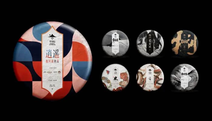
Shanghai, China – WPP global design agency Design Bridge and Partners, has partnered with Kungfu Pu’er Tea, a producer of fine tea in Yunnan, to refresh its brand positioning, identity and packaging design system.
The partnership resulted in a new brand positioning and design system created by Design Bridge and Partners, which reinvents Kungfu Pu’er Tea as a wellness lifestyle brand made for ‘urban knights’ and designed for a new generation.
Furthermore, the rebrand aims to connect contemporary audiences with the ancient tea-drinking tradition. The new branding specifically celebrates the notion of tea as the “antidote” to the overwhelming, fast-paced lifestyle of modern society.
With the brand statement, ‘drink with the world and live a transparent heart’, the visual identity is inspired by the spirit of Chinese martial artists and kung fu warriors, a symbol of living life with a pure heart dedicated to others.
The swordsman logo of Kungfu Pu’er tea has also evolved from the traditional Chinese Wuxia knight to a contemporary marque, and the visual language for packaging and communications is formed as an artistic reinterpretation of Chinese traditional watercolor paintings, calligraphy, sculpture, rice paper and seal carving textures, reaffirming the spirit of ancient Wuxia knights and tea culture in the brand expression.
Kungfu Pu’er’s new identity will be adopted across communications and sales channels, and products with the new look and packaging are now on sale on TMall and JDMall stores.
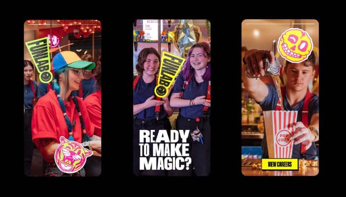
Australia – Funlab, Australia’s largest recreational experience provider, has launched its reimagined masterbrand identity and architecture, developed in partnership with FutureBrand Australia.
The new identity and architecture span Funlab as the masterbrand and eight of its consumer-facing experience brands, including Holey Moley Golf Club, Strike Bowling, Archie Brothers Cirque Electriq, Hijinx Hotel, B. Lucky & Sons, La Di Darts, Juke’s, and Red Herring, across 38 locations.
Funlab’s new masterbrand brings together a reimagined brand strategy, ‘exclamative’ brandmark, vibrant colour palette, expressive photography, shape-shifting patterns, and distinctive hand-drawn illustrations in order to communicate Funlab’s purpose as a creator of fun and magic experiences.
According to agency FutureBrand, Funlab is on a strong growth trajectory and so the masterbrand revamp is meant to provide the business with a clear and evocative employer brand to help it attract talent that has the right mindset to be ‘Motherfunners’, its name for its employees. The masterbrand also aims to connect the customer experience and facilitate customer cross-shop and loyalty.
Funlab Chief Marketing Officer Oonagh Flanagan said,“Funlab started more than 20 years ago in Melbourne and has grown to what it is today: Australasia’s largest fun provider via eight experience brands and 38 locations. We needed a masterbrand strategy, identity and experience that not only celebrates our infectious philosophy of fun, but also puts our people at the centre of everything we do and establishes the platform for our significant expansion plans”.
“Our new Funlab masterbrand does this, connecting our family of experience brands, as well as enabling their individual power and expression, to enable cross-selling between multiple brands and opening up the many different worlds of fun to our guests. We are thrilled to be launching our new branding to our loyal, fun-loving customers and the world at large,” Flanagan added.
Funlab appointed FutureBrand Australia in 2021 to redesign its brand architecture and enable Funlab as the masterbrand to better connect with its family of experience brands.
FutureBrand Australia CEO Rich Curtis commented, “Leading with our try-buy-use approach to our clients’ products, our team loved the uninterrupted access to multiple Funlab venues and experiences as we immersed ourselves in the process of reimagining their brand strategy, architecture and identity.
“Our goal was to amplify the magic in Funlab and use this to reimagine its expression through design and language – by elevating the power of the Funlab brand as the driving force that creates and sustains each of its consumer experience brands for the world to enjoy,” Curtis added.
Funlab’s new brand strategy and identity are also adopted internally, with an update across all assets, documents and systems, as well as the launch of a revised Funlab website for consumers prior to a full redevelopment. According to the agency, over time, the new Funlab identity will be further rolled out internally and externally.
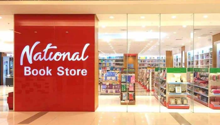
Manila, Philippines – Iconic local bookstore National Book Store has recently faced backlash from netizens after it suggested in a recent tweet a short name change called ‘Nash’, an allude to the rising popularity of ‘conyo’ lingo in the country, or the use of shortened mix of Tagalog and English words in daily conversations.
On September 19, the official Twitter account of NBS posted a tweet saying ‘Call me National, Nash for short’.
Following the tweet, a large majority of local netizens have criticised the proposed name change, with many saying they hope they don’t push said name change.
In addition, the tweet sparked complaints from various netizens complaining about NBS’ services, with some complaining about the store’s lack of school supply amenities, high price mark-up on books sold in physical stores, as well as the poor ventilation and display of several of the bookstore’s branches.
In a response given to Philstar Life, a spokesperson for National Book Store said that the brand’s commitment to providing customers with quality products and service remains unchanged no matter what they name the store.
“Regardless of how they call us – NBS, Natio, or Nash – we remain committed to providing an ideal shopping experience in all of our branches nationwide. We also wish to express our gratitude to all of our customers who returned to their back-to-school shopping at National Book Store, especially after 2 long years without face-to-face classes,” the spokesperson said.
The National Book Store was formally established in 1942 by Socorro Cancio-Ramos and José Ramos. It has 230 branches nationwide, and is the largest bookstore chain in the country.
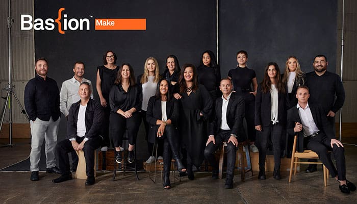
Sydney, Australia – Bastion’s production house Bastion Films has rebranded as Bastion Make to reflect its newly expanded production capabilities, including an in-house production studio with more than 30 on-site craft specialists offering clients cost-effective, 360-degree content and campaign delivery.
The creation of Bastion Make further cements Bastion’s new world agency model – one business with many services, deep expertise in each one, and wide thinking across the breadth of the communications spectrum providing clients with a ‘one-stop’ streamlined offering.
With this, in-house craft experts with deep expertise in motion, digital, studio and print will be working in tandem across all production disciplines to deliver integrated, end-to-end campaigns, and content delivery for Bastion and direct clients. The upgraded studio also allows all editing, grading, and VFX to be done internally in Bastion Make’s post-house, creating efficiencies for clients.
The in-house team includes two editors/shooters, two digital producers, a supervising producer, EP of digital, a print producer, a finished artist, animators, production company producers, traditional agency producers, and animation producers.
Further boosting the new 360 model, Bastion Make has also announced the senior appointment of Galadriel Roussos as executive producer for Sydney. A seasoned EP, Roussos brings deep expertise gained through over 20 years of experience working in broadcast, networks, and events, including four years at Foxtel.
As part of the national model rollout, Bastion Make has also built a team in Melbourne, with an EP – Kaelene Morton leading the charge, editor – Dave Wade, and producer – Ravenna Bouckaert, accessing the centralised production and post studios and craft experts to deliver 360 campaigns for Melbourne-based clients.
Jacqueline Archer, Bastion Make’s managing director, shared that the team is now big enough to execute 360 campaign solutions in-house while retaining the fluidity and agility to still work as a collaborative delivery group.
“Best in class craft and quality execution is at the heart of what we do. Because our experts are in-house, we can deliver integrated solutions that are insight-driven, impactful and cost-effective with ease. Clients don’t need to talk to ten different departments. They talk to one, whatever their content and production needs,” said Archer.
Meanwhile, Jack Watts, group CEO of Bastion, said, “Out of the wide range of services we provide to our clients, content production in all its forms is the one thing every client responds saying they need more of, and delivered in a faster, better model. This is what has driven our significant investment in people and both physical and digital infrastructure to rapidly expand our capabilities.”
Bastion Make is also currently expanding into the other Bastion markets of New Zealand and the USA.
Sydney, Australia – To celebrate the organisation’s 30th anniversary as a university and 55 years as an educational institute, The University of Southern Queensland (UniSQ) has unveiled a new brand strategy, including a new purpose and proposition, logo, and visual identity. This rebrand was developed in collaboration with brand agency Houston Group.
The new brand strategy, ‘look and feel’, reinforces the pathway to excellence proposition that UniSQ stands for, and supports the organisation’s ambition to become Australia’s leading regional university, in a highly competitive marketplace.
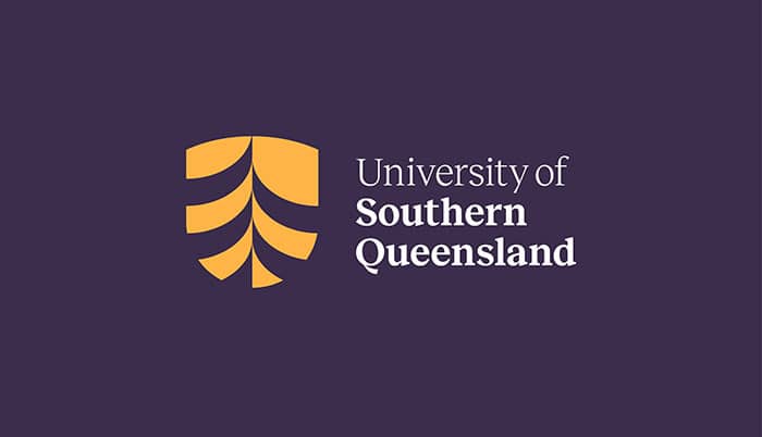
Moreover, central to the new look and feel is the adoption of a new abbreviated moniker: UniSQ – rather than the traditional USQ. The new look will be carried across every touchpoint. Meanwhile, the shield logo features the Bunya pine tree (synonymous with Southern Queensland), representing growth, strength, and journeys, which was inspired by the ancient journeys of the many First Nations communities that gathered for the Bunya Festival, celebrating the harvest of the Bunya Nut.
Houston has also crafted the stylised Bunya pine logo to resemble a robust progressive journey rising through the middle of a strong University shield. The four branches of the Bunya pine represent the four UniSQ learning hubs, which are Toowoomba, Ipswich, Springfield and online, and the dark plum and gold primary colours take inspiration from the Toowoomba sunset and environment.
Stuart O’Brien, CEO and founder of Houston, said the challenge was to create an all-encompassing brand proposition that matched the University’s strategic direction to deliver outstanding education experiences and outcomes.
“All brand elements have been created to match the new strategic direction of UniSQ, it not only creates a clear differentiation for the university, but a purpose that students and employees can stand behind and a brand that future students can love, feel part of and instantly recognise,” he explained.
Meanwhile, Shawn Walker, pro vice-chancellor (Engagement) at UniSQ, noted, “Our refreshed brand strategy and new brand represents a new chapter for the university; it clearly supports our mindset for change and innovation and has the capacity to resonate with our stakeholders.”
Australia – Australia’s independent agency, The Wired Agency, has now rebranded to WiredCo. This rebranding includes a new name, which comes with a new logo, branding, and website.
WiredCo.’s purpose is to move digitally and humanly by specialising in strategy, insight and creative for content, social, and search, as well as placement and partnerships. Its key clients include Pizza Hut, Assembly Label, Indeed, Chatime, Maurie & Eve, and Viking Cruises, amongst others.
Angela Hampton, founder and managing director at WiredCo., commented that the change symbolises a new chapter for its business, as it has grown from a two-person gig just a few years ago, to an incredibly connected and talented 32-person business.
“Our updated brand and name reflects a maturing of our agency and of who we are – we’re connected, and we move brands digitally, humanly,” said Hampton.
Meanwhile, David Kennedy-Cosgrove, managing partner at WiredCo., said “We wanted our new brand to better represent what we now do as an agency. Our legacy is performance marketing, and our fastest-growing service line is now creative and content. We are taking on bigger and better brand work so we needed a brand that also played to this strength.”
Additionally, WiredCo. shared that it has experienced a record 70% compound annual growth rate in revenue over the past five years and with this year looking to exceed all records for the business, several roles are open at the agency, including social media executive (on-page), digital performance account manager, digital designer, and social media specialist (off-page).
Facing a tough talent market, WiredCo. has also recently launched its own recruitment drive called, Recruit your Mates where $10,000 per role is up for grabs for anyone who recommends successful placements, totalling $40,000.
Kuala Lumpur, Malaysia – Advertising agency FCB Malaysia has rebranded as FCB SHOUT, five years after Shaun Tay, co-owner & chief executive Officer, and Ong Shi-Ping, co-owner and chief creative officer acquired FCB’s operations in Malaysia and become 100 percent local owners and operators.
Following its transformation into Malaysia’s challenger agency, the company has developed in all areas, including its brand identity and clientele. This has led to the creation of The Shout Group, a creative holding company, and the renaming of its FCB-affiliated ad agency as FCB SHOUT.
Among FCB SHOUT’s clients are RHB Bank and Resorts World Genting, as well as global and regional names such as Domino’s and Darlie. The agency’s impressive client portfolio is an indication of its success since the buyout, which includes homegrown brands such as RHB Bank and Resorts World Genting as well as global and regional names such as Domino’s and Darlie.
There has also been a significant increase in profits for the Group after the takeover of the agency. The Shout Group’s most lucrative year was 2021, despite the two-and-a-half years of Covid-19 pandemic lockdowns and economic turmoil.
Reflecting on their initial plans during the early days of the buyout, Tay said, Shi-Ping and him both decided that a measured approach that they focused on is creating the fundamental groundwork of a sustainable, reputable agency was more important than having their ‘names on the door’ from the get-go.
‘So we adopted a best-of-both-worlds approach where we leveraged FCB’s equity in Malaysia at the same time injecting our No Plan B attitude and distinctive, feisty personality to reshape our business, client by client and talent by talent to achieve our goal of becoming a challenger agency,” Tay said.
Tay elaborated, “The group’s focus is on talent growth. Let’s just say that as a people-before-profit organisation. We’ve always believed in investing in talent. The sort of talent who is ambitious, looking to shake things up whilst also realising that sustained growth requires effort and personal dedication to incubate. The leadership team we’ve assembled is the embodiment of this belief. They have proven their mettle time and again and are invested in the agency – just as how we are invested in their growth… Because when they win, we win. Our people are the very core of who we are and will continue to be the driving force that enables our growth and expansion plans.”
“As seasoned operators who own the business and aren’t in a rush to sell out, we have our industry’s greatest asset – we have time,” Tay adds.
Commenting on how the group’s vision has shaped the agency, Shi-Ping shared that they had put themselves in a very unfamiliar place when they took ownership of the agency. Even though they decided to keep the FCB name, they became very much a start-up company overnight, where everything had to be rebuilt from the ground up.
“While that may seem like a daunting and unfavourable situation to many, we actually saw it as an opportunity. With all the old legacy accounts exiting prior to the buyout, it gave us a chance to reset our reputation, enabling us to better connect with like-minded clients who had the same challenger mindset. In addition, we created the foundations of the agency by handpicking generational talents who share the same vision as us to take on leadership roles. Fast forward to today, the combination of the people that we have and the clients who believe in us has shaped the agency into what it is known as now – the #1 locally-owned creative shop in Malaysia.” Shi-Ping said.
He added, “We have all the pieces in play – ability, ambition, and the accolades – to make The Shout Group and FCB SHOUT not just a common fixture in our market but soon, a louder presence on a larger stage.”
Singapore – Travel and leisure e-commerce platform, Klook, has launched its first end-to-end brand identity, aimed at signalling its commitment to powering the travel ecosystem from customers, travel operators, and partners. This comes at a pivotal time of change in the travel industry as the company gears up to champion a new future of travelling in 2022 and beyond.
The new brand identity, which was created in partnership with global brand agency Superunion, invites people to experience everything with optimism, joyfulness, and enthusiasm. At the heart of the new brand identity is the company’s refreshed brand purpose, ‘To inspire and enable more moments of joy’, reaffirming its pledge to revitalize the travel industry.
Moreover, the rebrand also features an all-new Klook icon, new wordmark, typography, colours, illustrations, and icons. Customers can also expect a more interactive and immersive user experience on the platform, with new rich media formats such as motion graphics, short-form videos, and more exciting content, including travel guides, live streams, and vlog reviews.
Marcus Yong, Klook’s vice president of global marketing, shared that the rebrand marks a fundamental shift in how they engage with their customers, and it means pushing the boundaries and constantly introducing new ways to deliver joyful experiences across all touchpoints of their brand.
“With travel gradually resuming, there is no better time than now to introduce everyone to a new Klook and assist customers in reimagining how they travel in this new environment,” said Yong.
Meanwhile, Ambrish Chaudhry, Superunion’s managing strategy director for Singapore, commented that they are very excited to have played a part in Klook’s rebrand journey.
“Now more than ever, people recognize the positive impact that overseas travel and local experiences have on our psyche. Klook’s exuberant new brand expression is a celebration of these moments and the joy they provide,” said Chaudhry.