Wellington, New Zealand – New Zealand state-owned bank and financial services provider Kiwibank has launched its first major brand overhaul, with the aim to reflect ‘modern’ Kiwi culture.

The new brand identity includes a new logo, which was inspired by the te ao Māori concept of a thriving Aotearoa, expressed through the native harakeke plant. It also includes new digital channels and a physical network, which includes agency services and business banking hubs, making it the largest physical network of all banks in the country, and will see updates and upgrades over the next few months.

Kiwibank has also launched a new brand platform, featuring a line-up of some of the most inspiring and innovative Kiwis, including Allbirds, Dawn Aerospace, UBCO, Emirates Team New Zealand, and Banqer, as well as pop duo sensation, Broods – all leaders in their respective fields and making a positive impact on Aotearoa and the world. It highlights the work each brand is doing in its industry to lead the way in creating a better world and celebrating what it means to be a Kiwi.

The campaign has been produced by creative advertising agency Special and will be distributed across television, radio, digital, out-of-home, and social, alongside media agency OMD, while the identity change was led by Kiwi design specialists ThoughtFull.

Moreover, Kiwibank has also launched ‘Co-own’, an alternative option to traditional homeownership where Kiwis can team up to get on the property ladder sooner. This seeks to help enable more Kiwis with their homeownership dreams.

Steve Jurkovich, Kiwibank’s CEO, shared that when they looked at their brand, they wanted to understand what it meant to thrive and reflect on how modern Kiwis see themselves and their culture today.

“After 20 years in business and as we look ahead at the change the bank is undertaking, it is the right time to better reflect the bank we are today and the ambition we have for the future for our customers, communities and country. Kiwibank has ambitious plans for the future and is investing substantially to become the bank of choice for even more Kiwis. We are two years into a five-year transformation that will see us continue to grow and support Kiwi, balancing purpose and performance to make Aotearoa better off,” said Jurkovich.

Meanwhile, Simon Hofmann, Kiwibank’s general manager of brand and marketing, noted that they are in the process of changing thousands of customer touch-points from the website and digital tools, customer communication and social channels, to the app and ATMs. 

He further shared that their physical stores are being reimagined, as they are launching a new brand ‘Local for Kiwibank’ across their network of 100 partner sites which offer express banking services.

“The brand platform and campaign reflect what it means to be Kiwi, featuring Kiwi brands that are modern, game-changing, and passionate. Kiwibank is proud to be the bank that is helping Kiwi thrive and ‘This is Kiwi’ demonstrates our purpose – Kiwi making Kiwi better off,” added Hofmann.

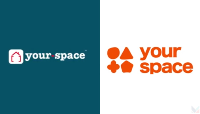
India — your-space, an Indian student housing brand, reimagines the brand in line with the evolution of the student lifestyle and living experiences. The new brand identity embraces the universal transition and showcases the four foundation pillars of the brand- Comfort, Health, Safety and Community.

The rebranding activity is set to manifest the new brand spirit with a comprehensive overhaul and launch of your-space’s new website and mobile application, amongst other touchpoints. The rebranding process has solicited a complete redressal of the brand’s digital and physical touchpoints to embody the new brand image that is both sincere and welcoming to the student community.

Shaunik Sachdev, CMO of your-space, said that their spaces accommodate a large student community that is very inclusive, diverse and well informed and each has their own requirements to lead their most productive student life with us. Sachdev added that this is what he believes your-space is, a space for everyone and a place that nurtures collaborative living.

“your-space has a responsibility to cater to each and every one of the students and give them a holistic community experience in their home away from home. The rebranding activity was driven by the need to stay relevant to the student community. We’ve carefully revamped our brand image to reflect the brand’s ethos of student comfort, health, safety and community of your-space,” Sachdev said.

On the rebranding, Neelanjan Dasgupta, creative director for brand strategy of RepIndia, said, “This was a great opportunity for us to work together with your-space team and create something that is more in line with the brand’s vision.”

Dasgupta added, “It has always been a place that didn’t just restrict itself to providing housing to students, but also giving them a sense of community and safety as they move away from their home to make a new one for the first time. And our design ethos and the new logo have kept exactly that in mind. With a tonality that is in tune with the ever-expanding student community, the new branding gives that right mix of fun, comfort and convenience that appeals to students and parents alike.”

your-space has tripled the size of its business over the last two years and is on track for its fiscal year projections to accommodate 75,000+ members of the student diaspora across cities in India by 2025. As a part of their initiative to build India’s first student community, your-space recently launched its Community App. The community provides the your-space members exclusive access to curated experiences and deals amongst other community benefits.

Singapore — WPP and The&Partnership’s joint venture, global media network m/SIX, has announced a significant refresh to its brand identity with a change of name to mSix&Partners. The brand refresh also includes a new ownership structure: ‘Best of both Worlds’, as well as a new agency positioning: ‘Further, Faster’.

Following their strengthening of global leadership structure earlier in the year and significant growth during the pandemic, the agency’s new name of mSix&Partners is designed to better reflect the unique ‘Best of Both Worlds’ ownership structure that has galvanized its rapid expansion and strengthened its partnership with its people, clients and other agencies within the WPP network.

The agency has also demonstrated significant growth over the last two years, increasing total billings by 31 per cent, due to new client wins including PUMA in the Asia Pacific region and many more in other markets.

Jack Swayne, managing partner and global CEO of mSix&Partners, said that as a business, they are doubling down on partnership. Swayne added that partnership has allowed them, their clients, and their people to adapt to change in the past and will be even more important as they lean into a continual change in the future.

“Our name must reflect who we are and who we want to be, an agency that is at the forefront of data, tech and media and knows how to connect that to brand experience, comms and unique ways of working; mSix&Partners does that perfectly,” Swayne said.

Dan Whitmarsh, strategy partner and global CSO of mSix&Partners, commented on the new agency positioning, saying, “Further, Faster is the primary benefit our clients feel from working with our unique partnership. Whether the goal is a transformation of their agency model or understanding of how to drive full-funnel effectiveness, we take our clients further in achieving this, faster than anyone else.”

This new positioning brings together all of mSix&Partner’s capabilities across media and commerce, measurement and technology with their well-proven expertise in developing bespoke, integrated multi-discipline teams, often embedded alongside their clients’ marketing operations.

Swayne further commented on the agency’s new brand identity, sharing “mSix is a unique agency: no-one else can combine the agility and entrepreneurial spirit of an independent with the scale of investment in media, tech and talent that only WPP can bring. Our exciting new identity and positioning will be applied across the entire mSix&Partners global network of 49 offices across 41 countries.”

Singapore — Conversational engagement services company Gupshup has unveiled its new brand identity, which was launched at the Mobile World Congress in Barcelona. The new brand identity comprises fresh logo colours, revised brand look-and-feel, an updated website, and a new company ethos: “One-on-one. With everyone”. These changes come amidst Gupshup’s global expansion.

The company said the new branding reinforces the company’s vision of transforming the future of B2C conversations and commerce through conversational engagement.

According to Gupshup, its efforts into conversational engagement have led to triple-digit business growth, with 44,000 customers overall. The technology company has raised US$340m in the last 12 months, made two key company buyouts in the last six months and expanded into 30+ countries across five continents.

The new tagline “One-on-one. With everyone” aims to highlight Gupshup’s brand promise of creating AI-powered, personalized, one-on-one conversations on messaging and voice channels, for businesses and their millions of consumers, across marketing, commerce and support workflows.

The brand refresh has retained key components of the brand. Gupshup has kept the salient feature of the original logo namely the </> symbol embedded in two chat bubbles, which it says is a symbol of Gupshup’s role in pioneering and evolving the concept of programmable messaging. Gupshup believes that with a refreshed colour palette, the overall design language signifies how conversations are intuitive and natural, and how they have become the digital backbone of brand-to-customer interactions.

Beerud Sheth, co-founder and CEO of Gupshup, said, “This new brand identity is an evolution of our core vision. We remain committed to helping businesses engage one-on-one with consumers, at scale, through conversations that are both real and human. We are doubling down on our focus to help more and more businesses drive deeper, personalized conversations with their consumers across the world.”

Singapore – Global security intelligence company LogRhythm has unveiled its new brand identity, which is designed to represent its commitment to helping security operations centres (SOCs) close workforce gaps, increase knowledge of new attacks and techniques, and navigate an ever-changing threat landscape with confidence. 

LogRhythm, which has a presence in Singapore, Australia, Hong Kong, and Malaysia within APAC, brings together the complete technology to improve security posture. It combines a comprehensive and flexible security operations platform, technology partnerships, and advisory services.

The new logo recognises LogRhythm’s value, which is not rooted in technology alone, but is both analogue and digital; a mix of people, expertise, and know-how that allows the company to best apply technology to customers’ most pressing security concerns and challenges. It also connotes being in rhythm with the company’s customers, colleagues, and partners. Moreover, the wave signals LogRhythm’s commitment to adapting to the ever-changing threat horizon to keep customers protected in the face of uncertainty.

Cindy Zhou, LogRhythm’s chief marketing officer, shared that LogRhythm gives customers the upper hand by proactively identifying threats and the technology to defend against them.

“The people who work at LogRhythm are cyber advisory and technology allies to our customers. This brand identity supports our new technology offerings coming in 2022 that align with the mission we have always had, to ensure our customers are ready to defend against today’s top threats,” said Zhou.

LogRhythm said that the rebrand is the first of many changes to come in 2022, including a fresh visual look, an upcoming cloud-native platform, and a new outlook that reflects the company’s vision and evolution.

International marque Rolls-Royce has announced that it has taken measures to further resonate with its younger clients, specifically a revamp of its brand personality.

The company said that since it has introduced its edgier Rolls-Royce car model, Black Badge in 2016, it has attracted a younger demographic of clients, with clients showing to have an average age of 43. 

A different visual aesthetic and language, one that would “encapsulate the brand’s presence and standing as a true house of luxury” are the company’s main goals for the brand, and it has appointed UK-based design firm Pentagram to accomplish the reboot.

Rolls-Royce Chief Executive Torsten Müller-Ötvös said,  “As the marque’s digital presence increases, there has never been a more important time for the visual language of the company to reflect our standing as [a global] luxury brand.”

New brand colors

From textural wooden brown and graphite-colored hues, Rolls-Royce will now be donning a deep, majestic tone of purple. 

According to Pentagram, although the former colors of the brand showed its artisanal origins, the palette confined the identity to the past. 

“The desire was to seek a more expressive, luxurious colour palette, one appealing to both male and female clients, one with a future vision,” said Pentagram. 

The purple color named Purple Spirit will now become Rolls-Royce’s signature color, on which a metallic Rose Gold will be thrown in as a complementary hue. 

The Noir imagery which surrounds Rolls-Royce’s Black Badge range is also said to be punctuated anew by bursts of color, reflecting each model’s launch specification, illustrating the nature of the model as the brand’s edgier version.

Monogram and typeface

The company said that the double ‘R’ monogram will retain its original form but will be replaced on collateral. 

Meanwhile, the wordmark ‘Rolls-Royce Motor Cars’ as found presiding above the door of the marque’s establishments, was found to be corporate and unrepresentative of the marque’s standing as a luxury brand.

Pentagram is said to have sifted through typography pegs in the marque’s archives from the 1930s before ultimately using an art-deco style as the basis from which to envisage a new wordmark.

The words ‘Motor Cars’ have now been reduced in size, with the emphasis reverting to Rolls-Royce. Meanwhile, special significance has been paid to the letter ‘R’, to provide additional stability and prominence to this important character in the Rolls-Royce script.

For the brand’s typeface, on the other hand, the design team has chosen Riviera Nights, which stems from the same family of the brand’s previous font Gil Sans Alt, but now with additionally crafted and beveled letters.

The Spirit of Ecstasy

Amid the brand’s revamp, the marque’s emblem, The Spirit of Ecstasy, which has graced the prow of Rolls-Royce motor cars since 1911 has been decided to be given more attention due to its instantly recognizable and modern symbolism of British luxury. 

A wholly new visual treatment of the emblem has been created, called The Spirit of Ecstasy Expression where a visual with “an ethereal yet tech-like feeling” will be depicted. 

Akin to a silken fabric, The Expression will adopt a fluid form and a feel of versatility. An innovative digital tool that uses coding has been developed by Pentagram to enable The Expression to be used on any surface, from projection to embroidery, as well as to printing to engraving.

It will now be in both physical form at the marque’s global establishments and in digital form, and will start becoming a staple element of the marque’s visual language.