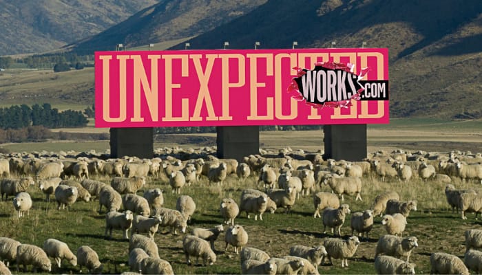
Auckland, New Zealand – Global advertising agency DDB has recently unveiled its latest brand positioning in demonstrating its mantra of ‘unexpected works’. The catch? The campaign is launched via a billboard which is placed on an isolated sheep farm in New Zealand.

The billboard is located in the small town of Garston, where the human population is about 100 and the sheep population amounting to about 40,000. The billboard features the web address www.unexpectedworks.com, which leads users to the homepage of DDB toshowcasesome of their best-known campaigns globally.

Despite the ‘antithetical’ nature of the campaign launch, DDB aims to drive the message of creativity as being the most powerful when it is unexpected. This is evident in the rich plethora of campaigns the agency has worked with, from creating a broadway musical for their client Skittles, to working alongside Reporters Without Borders and sandbox game Minecraft to creating a censor-free library for journalists.

“We took this opportunity to evolve the DDB Network and refine what makes us special, relevant, and successful in this new world. Unexpected Works is our commitment to doing the best work of our lives and I’m confident it will carry us into the future while staying committed to our legacy. I’m excited to see our network come together to bring Unexpected Works to life,” said Marty O’Halloran, CEO at DDB Worldwide.

Meanwhile, Ari Weiss, chief creative officer at DDB Worldwide, commented that the formula for creating breakthrough creative work that drives business results is timeless.

“It’s how we bring that formula to life that changes on a daily basis. We’re not reinventing the wheel here. We’re simply putting more focused language around a truth that anyone who has ever worked at DDB can feel in their bones: Unexpected Works,” Weiss added.

The campaign was first unveiled to DDB Worldwide’s 10,000-strong staff around the world during their first-ever all-staff conference held virtually.

For Aditya Kanthy, CEO and MD at DDB Mudra Group, the term ‘Unexpected Works’ is not just merely a tagline but rather a promise to their clients, culture, and colleagues in a world that has been altered by the pandemic.

“Two words that mean, the best idea is the one you never saw coming and is effective. So, whether it’s a billboard in the middle of a sheep paddock in New Zealand or work like Stayfree’s Project Free Period which triggered conversations at scale around two taboo topics – sex work and menstruation, creativity is most powerful when it’s unexpected,” Kanthy concluded.

Singapore – Singapore telco provider MyRepublic has announced a new brand revamp, with a core brand message of being more relatable with customers, driven by customer-centricity, a greater focus on attributes which customers expect from telecommunications service providers today.

Conceptualized together in partnership with branding agency Superunion, the new rebranding stems from a study of 750 customers by both companies to evaluate current brand perception as well as key customer consideration factors and features. Findings from the customer survey guided the overall brand discovery process and informed MyRepublic’s brand positioning as ‘People who get people’.

Initial social media posts from MyRepublic bearing the new brand revamp.

The new visual identity sees a refresh of MyRepublic’s brand assets, with elements such as the core purple color being optimized for a screen-first approach, in line with changing digital consumption habits, which will be gradually rolled out across all of MyRepublic’s brand assets and sub brands. The bold simplicity of the identity cuts through a cluttered category and sets up the brand for expansion of its business footprint. 

According to Enning Yow, head of creative studio and insights at MyRepublic, they hope that this new identity captures the MyRepublic spirit – smart and more than a little geeky, but always approachable and friendly.

Other visuals from MyRepublic, with ‘quirky’ statistics from the aforementioned research with Superunion.

“Through this exercise, we wanted to iterate our commitment to delivering quality services that are reliable and customer-centric. It was a great experience working with Superunion to create a strategic platform and visual identity for the brand that we could meaningfully own,” Yow stated.

Meanwhile, Danley Stone, executive client director at Superunion, commented that the heart of the rebranding endeavor was a customer-centric extensive research, on which they sought on the question of why MyRepublic shares a special bond with them as customers.

An OOH campaign by MyRepublic on an MRT station.

“It simply came down to their unique culture; these are smart, fast-moving, genuine people who truly care about their people. The new identity embraces that sentiment and sets up MyRepublic as a breath of fresh air within the category.” Stone stated.

MyRepublic’s brand revamp coincides with the company’s recent update of their telco services, specifically their new self-serve SIM card activation service. This offers customers greater flexibility and a more seamless sign-up process with enhanced security. Starting in May this year, new mobile customers who receive their SIM cards via mail will be able to track their package in real-time via MyRepublic’s delivery partner throughout the process. 

“Our mobile service enhancement and brand refresh are part of a larger, ongoing commitment to place our customers’ evolving needs and preferences at the heart of our brand and business. We are who we are today because of our customers, and our ability to bring meaningful value to them will be critical for our continued success,” said Lawrence Chan, managing director at MyRepublic Singapore.

The brand revamp has been showcased through an integrated campaign that launched in March 2021, appearing across MRT stations as OOH advertising and digital channels.

Singapore – Instarem, a cross-border payments platform, has launched a new brand identity, as well as a new mobile application catered to users in Singapore.

The rebrand involves a new logo, redesigned website, as well as the launching of a consumer debit card called ‘Amaze’ for users within the year.

With the new rebrand, Instarem seeks to go beyond just enhancing consumer remittances globally, to move towards being the change-driver for the complexities around global payments – empowering its customers to do more with their money in an intuitive, transparent, and cost-effective manner.

According to Yogesh Sangle, global head of Instarem, Instarem’s rebrand aligns with the new consumer initiatives to be rolled out in Singapore in coming months, as the company moves beyond digital remittances to becoming an all-in-one app for consumers.

“We see the future of Instarem as becoming an essential part of our customers’ everyday lives, offering them the most convenient option for money transfers. Our new identity reflects our belief that money should not be disconnected – it should be simple – and our enhanced offerings bring this belief to life. Our new look better represents who we are today – current, innovative, and global,” Sangle stated.

He added, “Our new mobile app provides increased usability for Singapore users that makes it easier for them to navigate and manage their transfers from anywhere in the world. Singapore customers can also expect a new and improved Instarem experience through the launch of a consumer debit card, which allows them to consolidate all their spendings in one.”

Instarem currently operates in six continents and over 100 markets, including markets in APAC such as Australia, Singapore, Hong Kong, Malaysia, and India.

Singapore – Food and grocery delivery platform foodpanda has announced a revamp to its brand identity across Asia, spanning 400 cities and 12 markets.

The brand identity revamp accentuates foodpanda’s brand color pink across its visual designs, which is also enhanced alongside the prominence of the signature panda logo.

The same visual approach applies to foodpanda’s marketing initiatives both online and offline, for instance with rider- and partner-related branding, foodpanda retains its bold, instantly identifiable ‘fun pink’, but expands its palette to include more complementary colors.

According to Reinald Chee, head of creative at foodpanda, the emphasis on the color pink is rooted in the company’s desire to keep the brand color recognizable by millions of customers across Asia. Furthermore, Chee added that the brand revamp highlights the various personalities of the brand: “friendly, caring, smart, and that little bit rebellious – not afraid to change the status quo or take risks.”

“Our aim has been to create a design language that’s as seamless as our transaction process. At the end of the day, brand identity is all about making a more enjoyable experience for everyone,” Chee stated.

Meanwhile, Idan Haim, vice president of growth and marketing at foodpanda hopes that the brand revamp will help build a solid foundation of the company in terms of customer experience.

“Foodpanda’s refreshed identity reconsiders all customer touchpoints with the brand, connecting the technology behind our app and website with our millions of users’ everyday experiences, from our iconic rider bags and jackets to packaging, marketing campaigns and the app itself,” Haim stated.

Foodpanda-Brand-Identity-Revamp-Asia-2

Aside from the brand identity, foodpanda has also revamped its user interface homescreen, dubbed the ‘bento’. The new interface allows users to seamlessly choose the foodpanda service they need – food delivery, self pick-up, shops or pandamart – while making it easier to explore top restaurants and promotions available in their location.

The brand refresh comes at a time when foodpanda continues to expand its business verticals beyond food delivery, into quick commerce (q-commerce), including grocery delivery via pandamart cloud stores, and through partnerships with leading shops and convenience stores.

“We analyzed every touchpoint with our service, from the app to the rider box. Using thorough insights about the user journey, we envisioned a design direction that could bridge the gap between our tech and the real-life experience of millions of customers,” Chee added.

Foodpanda’s brand refresh will be progressively introduced across all online and offline platforms from April 2021. The refresh has started in Singapore, Bangladesh and Cambodia, and will be launching in Hong Kong, Japan, Laos, Malaysia, Myanmar, Pakistan, the Philippines, Taiwan and Thailand in the coming weeks.

Singapore – In an appeal to encourage more people from the younger generation to donate blood for a better cause, the Singapore Red Cross (SRC) has revamped the look of its existing mascot, ‘Blood Buddy’, or more commonly known as ‘BB’.

Officially launched back in 2005, ‘Blood Buddy’ has traditionally been recognized as a physical mascot at malls, mobile blood donation drives, and outreach activities run by SRC.

The revamp of the mascot stems from SRC’s objective to engage the youth and advocate blood donation with a consistent brand voice. With a refreshed image that reflects its adorable and lively personality, ‘Blood Buddy’ is well-positioned to connect with young and potential donors who are at the early stages of their blood donation journey. 

“We also recognize the importance of inculcating the habit of giving blood from a young age, and we hope to encourage youth to adopt blood donation as a lifestyle. This is where Blood Buddy will be a lively and relatable voice of encouragement for those getting started on their blood donation journey,” said Prakash Menon, director of the Blood Donor Programme at Singapore Red Cross.

The revamp also comes in line with the organization’s ‘One More Step’ campaign, which encourages potential donors to take small, incremental steps towards the eventual goal of being a regular blood donor who donates at least twice a year. Through the campaign, ‘Blood Buddy’ serves to empathize with the physical and emotional concerns all blood donors have and to showcase the small steps one can easily take to give blood and help save lives.

“Over the years, we’ve observed that many potential blood donors are deterred by prevailing misconceptions towards blood donation. Through ‘One More Step’, and with the help of Blood Buddy, we want to dispel these concerns and at the same time remind people of the power of their individual actions. Each of us can contribute in our own way to create a culture of good, by taking the next step in our blood donation journey,” Menon added.

As part of the ‘One More Step’ campaign, SRC will introduce a series of activations including videos and comic strips to engage potential donors on social media. Members of the public may also win SRC memorabilia by participating in a giveaway from February 7 to March 8, where the public must submit photos of ‘Blood Buddy’ as seen in buses island-wide.