Singapore – Integrated communications network WPP has officially launched its new global design company, Design Bridge and Partners. The new firm is a result of a merger between Design Bridge and Superunion, which was announced in 2022. 

The two complementary companies come together with a vision to fundamentally redefine the role of design “for a new era,” positioning it at the forefront of business growth and social change through consumer, business and experience design. 

John Morris, formerly CEO of Design Bridge, will serve as Group CEO, and Jim Prior, who was previously CEO of Superunion, will become the new company’s chairman. Meanwhile, Mark Budden will pick up duties as chairman for Asia-Pacific. 

“We fundamentally believe that design is one of the most powerful tools in business, and yet it’s historically been underutilized. As Design Bridge and Partners, we’re on a mission to change that, and simultaneously help shape the future of organizations worldwide by unleashing the full power of design,” said Morris. “For us, it’s not just a matter of what design is, but also what design can do, for brands, businesses, people and the planet —and the role design can play in answering the fundamental questions of the world today.” 

Budden added, “We believe that design is the singular thread that can unify any brand, able to create distinct meaning inside every moment, interaction and customer touchpoint. At Design Bridge and Partners, we’re helping brands across sectors harness this incredible power and simultaneously redefining the role of design in our world at the same time.” 

WPP shares that Design Bridge and Partners is uniquely positioned at the leading edge of design to address client challenges. It will be pulling together top talent from across its 850-person strong network operating in 12 countries to help “unlock potential” for brands, businesses, and people alike.

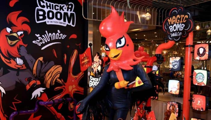
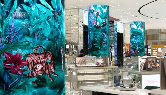
In Asia, Design Bridge and Partners currently has studios in Singapore, Hong Kong, Thailand and China with clients such as Diageo, HSBC, Tencent, Colgate-Palmolive, The Coca-Cola Company, Trust Bank, Resorts World, Unilever, Mondelēz and Shangri-La in their remit. 

Alexandra Cerruti, the managing director for Singapore, Southeast Asia, and India, said, “With a team of 100 people united under the same roof in Singapore and growing satellites in the region, we are now this powerhouse of design and can expand our partnerships with top clients in the region but also recruit the best talents.” 

The company boasts centres of excellence in strategic locations such as New York, London, São Paulo, Amsterdam, Singapore, Madrid, Berlin, and Shanghai. It will be offering brand strategy, identity, experience, and brand guardianship, which will include graphic, motion, digital, physical, and communication design. 

“It’s no secret that our world is at a tipping point, globally tied together and yet fragmented in ways which we might not have imagined previously. Design will not only help answer the big questions, how we progress as people, as businesses, but ultimately help to create both harmony and connection as well,” added Morris. 

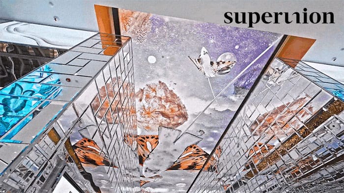
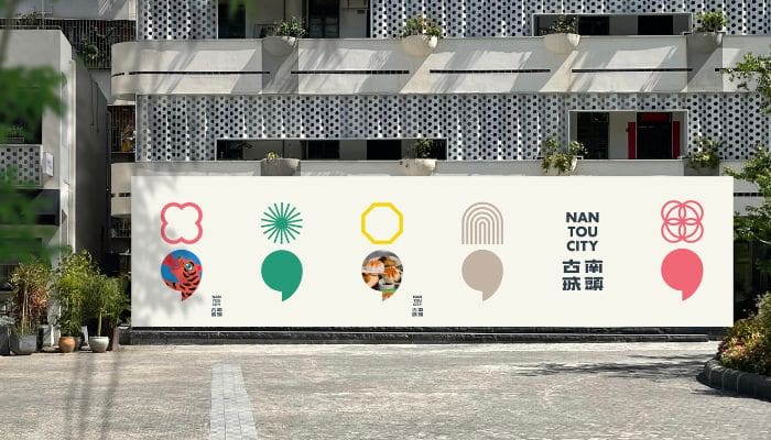
One-half of the merger, Superunion, had been responsible for the brand management of top brands in the region prior to being consolidated into the new firm. These include Shangri-La Group, World Table Tennis, Trust Bank, and even taking after the branding of cities such as Shenzhen’s Nantou City. 

Thailand – WPP creative company Superunion has partnered with Minor Food’s The Pizza Company, Thailand’s largest restaurant group, to develop a dynamic new identity for its Chick-A-Boom pop-up stores and home delivery offer. 

The new brand’s symbol, a non-binary mascot, ‘Chickira’, is created to celebrate the inclusiveness and diversity of contemporary Thai youth culture and to express the story of a brand where ‘everyone is welcome’.

Chick-A-Boom, known for its flavourful sauce and crispy fried chicken, has launched 15 pop-up stores across the country in an experimental ‘shop-in-shop’ format with The Pizza Company of Minor Food, sharing the space within the nationwide branches and complementing the pizza menu.

Superunion said the launch of the supercharged Chick-A-Boom brand and unconventional mascot, ‘Chickira’, was a deliberate move to disrupt the saturated fast food category dominated by Western brands. The design of Thailand’s first non-binary mascot, ‘Chickira’ aims to celebrate the diversity integral to contemporary youth culture as they shake their way into the hearts and minds of the Thai nation.

Superunion led the concept and name creation, brand identity, mascot and in-store experience design.

Kittichet Sathitnoppachai, AVP of Marketing at Minor Food, said, “We tasked Superunion with developing a brand and mascot that is big, bold and utterly unforgettable and it’s safe to say they delivered that in spades. The new brand identity along with ‘Chickira’ has worked perfectly in-store and equally translates seamlessly into the digital space as we look to expand our presence.”

Sathitnoppachai added, “Thailand has a vibrant and vocal LGBTQ community, and a reputation for its awareness of gender, inclusivity, and equality. Chickira was created to ‘ruffle feathers’ in the fast food category and change the game among traditional fast food mascots, most of which are predictable, male and tired.” 

Korrakot Kulkraisri, senior brand strategist at Superunion Thailand, commented, “The fast food landscape in Thailand has taken an enormous hit from the pandemic. Brands not only need to constantly present themselves online and provide seamless in-store experiences, they also have to actively reach out to customers in ways that are meaningful to their lives.”

Kulkraisri added, “Superunion’s core purpose when building brands is to find ideas that create positive and impactful change, and we are proud to bring this energetic brand and larger-than-life ‘Chickira’ to Thailand – a symbol of openness, inclusion, fun and love.”

Singapore – Standard Chartered Bank and FairPrice Group have recently launched their new digital bank for Singapore, Trust Bank, and WPP creative company Superunion has been tapped to lead its overall branding. 

Trust Bank, known as Trust, is a digital bank designed to offer easy-to-use and transparent banking experiences with a launch of products that include a credit card, a savings account, and family insurance. Backed by a unique partnership between Standard Chartered Bank and FairPrice Group, it brings together a leading international bank and a leading national food retailer, with more than 200 years of combined experience serving the everyday communities of Singapore. Superunion was tasked with creating a new inclusive brand, visual identity, and brand experience to reflect the new bank’s role “in the fabric of the nation and the lives of its people.” 

Superunion said the new brand is designed as a ‘love letter’ to everyone who calls Singapore home, celebrating the everyday lives and spirit of the people who come together to build a brighter future for the country. The brand is inspired by the idea ‘a digital bank for the everyday us’, and is designed to reflect the approachable and accessible nature of the bank. 

According to Superunion, the wordmark in lower case is an expression of trust as the foundation of today’s banking and indicates the bank’s aim to be more in tune with customers through a clear, down-to-earth banking experience. 

To develop a unique illustration style for the bank’s communications, the agency worked with typographer Raymond Burger and illustrators Soh Eeshaun and TYC Studios. The added signature icon of the letterform ‘T’ in two blocks is inspired by Singapore’s building architecture – designed using its iconic pastel colours. Created in two core colours, the blue captures the bank’s stability and security, while the purple is a symbol of optimism and a nod to the national flower, Vanda Miss Joaquim. 

Scott Lambert, Superunion’s creative director, said, “It’s been a privilege to partner with the Trust Bank team to create a new revolutionary digital bank in Singapore. Banking, as an essential aspect of everyday life, needs to be simple, accessible and easy for the end customer to use. The Trust Bank aims to deliver that experience by demystifying banking and empowering local people. We brought this to life within the brand through collaboration with employees and leaders across the entire business.’ 

He added, “Superunion wanted to show that Trust Bank is a brand that truly understands what it means to call Singapore home. We are proud of a brand platform that inherently delivers against the needs of Singaporeans through deep insight around what it means to live, work and spend here.” 

Meanwhile, Kelvin Tan, CMO of Trust Bank, commented, “Working with Superunion to build the Trust Bank brand was both a strategically and creatively-inspired experience. They took the time to immerse in our consumer insights and corporate ambition – and coupled with their creative expertise, a brand that speaks to the diverse needs of consumers in Singapore was born! Having trust deeply rooted throughout the collaborative journey, from strategy development through to visual identity, means we all had a hand in creating this new brand for all of us in Singapore.” 

Trust was officially launched on 1 September 2022. The bank brings several market-first innovations to Singapore, including banking only through the app with integrated rewards and spend trackers, as well as the first-to-market numberless credit card, which also combines a credit and debit card, removing the need for users to own multiple cards.

Supporting the launch of Trust is an omnichannel brand campaign by IRIS Worldwide and Havas Media with the tagline ‘The digital bank for the everyday us’, which will be delivered across TV, print, digital, out-of-home and creative in-store activations at FairPrice Group retail stores. 

Singapore – WPP creative company Superunion has unveiled its proprietary design technology which enables brands to create innovative digital experiences and build meaningful connections with their audiences. This new offering includes generative design and metaverse experiences, in addition to established motion design expertise.

The new creative technology service was developed by the Superunion Asia team across APAC and China studios, led by Jessica Tan, Superunion’s digital director for Asia, and Paola Demichelis, Superunion’s digital designer. By applying technology and digital art, and connected to data, the tools enable brand owners to generate limitless creative assets in record time, within the parameters of their brand identity, giving them creative control, and a platform to express their creativity, over their own brand.

Moreover, the tool has been put to use by multiple Superunion clients to ensure brand innovation and coherence after the creation of brand guidelines. After defining the brand rules with the client, Superunion codifies what makes the design unique, creating a set of design rules. These are then built into a series of algorithms and codes to build bespoke software, along with the UI and UX interfaces integrated into the final tool.

The generative design tool is also complemented by the launch of the Superunion metaverse offer for clients looking at the next generation of digital experiences to engage their employees and external audiences through gamification and creative possibilities of Web 3.0.

With Superunion expanding its portfolio of services, the company will be able to act as a creative partner for the world’s biggest businesses across multiple sectors and geographies.

Tan shared that creative technology is a core aspect of their Superunion proposition, along with digital-first brand creation and the exploration of the opportunities of the next generation of internet experiences. 

“We believe in handing power to our clients and their creative teams, and our creation of these expansive systems enables this. Clients can use the design rules of their brand and create an almost never-ending suite of assets to suit any need over time and let their own creativity free. This is where Superunion has come into its own and where we see the opportunity for growth, globally,” said Tan.

Meanwhile, Ambrish Chaudhry, Superunion’s managing strategy director for Asia, said that their creative technology offer has already changed the way they think of branding and design at Superunion. 

“It’s helped us to think screen -first, be agile around [the] adoption of our work and to play an even more consultative and partnering role for our clients. The opportunities are truly boundless and if client response is something to go by; then we are well poised to write the next chapter of brand and product identities for some of the largest businesses globally and in Asia,” said Chaudhry.

Hong Kong – Nantou City in Shenzhen, China has unveiled a new brand identity conceptualised alongside agency Superunion. The new branding aims to ‘activate’ Nantou City, bringing both Chinese traditions and modern creativity, as well as sustainable development and vitality to the town.

Nantou City, also known as the ancient city of Xin’an, has evolved into a landmark location embedded with four major parts – cultural and creative retail, trendy art experiences, high-quality and innovative F&B, and cultural residencies.

The core idea behind the brand refresh ‘Collide to Create’ positions Nantou as a place of contrasts and a meeting point for people and ideas to come together. The brand tagline ‘為每一種想像而來’ translates to ‘a place for every imagination’ which led to the central creative idea of the semicolon, with its literal function of connecting independent clauses or ideas leading to a more symbolic meaning: Nantou as a focal point connecting individuals, ideas and cultures.

Maggie Chien, business director at Superunion China said: “Using this iconic visual metaphor, we created a whole design language for Nantou City across a range of physical and digital applications, from website to wayfinding. Nantou City is not just a historical landmark that you visit once, but a place that you want to come back to time and time again, to relax, to stay, and to grow with. Instead of commercialising, we want to build the city into a sustainable cultural centre and integrate it with the local lifestyle. 

Meanwhile, Huang Nan, general manager of Shenzhen Nantou City Renovation Project, commented, “As we see the Greater Bay Area continue to thrive and develop, our goal is for Nantou City to retain its original architecture but also embrace contrast; old versus new, tranquillity versus energy, simplicity versus intricacy. It is an expressive yet harmonious place, encouraging the organic and sustainable growth of all beings. We feel a new identity encapsulates this sentiment whilst being engaging and memorable.”

The branding endeavour was first announced in August 2021, where Superunion will be responsible for the strategic brand, experience, and communications planning, alongside a total revamp of visual identity of the city.

Hong Kong – Formerly known as the Golden Circle, the rewards programme of leading hospitality group Shangri-La Group has recently been launched as the rebranded Shangri-La Circle. The group said the newly transformed programme aims to pave the way for deeper engagement with customers and transform the programme into being more than just a loyalty programme. 

WPP creative company Superunion was the one appointed to lead the refresh of its visual identity. Superunion was tasked with the creation of a new brand strategy, tone of voice and visual identity to reflect Shangri-La Circle’s new positioning as ‘Curators of the Good Life’, and to express an invitation to “a personal journey of discovery.”

The transformation of Shangri-La Circle follows the launch of Polaris, a new exclusive invitation-only elite membership tier, in December 2021, with the brand also created by the Superunion Asia team. The group said the creation of Shangri-La Circle is driven by the group’s commitment to innovation in how it rewards and engages with guests around the world. 

Benedict Gordon, CEO of Superunion Asia, said, “Shangri-La is an iconic brand, and the Shangri-La Circle reflects both the impressive heritage of the rewards scheme as well as the business’s forward-facing focus on creating an experience-led brand across every touchpoint. We wanted to stay true to the brand’s heritage by rooting the visual redesign in Asian culture and to bring to life the warmth of the brand in every interaction with members.” 

“This new identity reflects Shangri-La’s position as a global iconic brand and symbolises a revolution in how moments of discovery and curated experiences are designed,” Gordon adds.

The concept of ‘discovery’ is brought to life through a new, dynamic visual identity through an artistic reinterpretation of a compass that helps members navigate the world of Shangri-La experiences, including hotels, bars and restaurants, guiding them to discover their personal Shangri-La. Inspired by Asian calligraphy, the brand icon draws on the equity of the original Golden Circle marque, reinterpreted for a digital age, and subtly references the ‘Shangri-La ‘S” iconic letterform.

Superunion created a custom pattern inspired by Asian crafts like woodblock printing, porcelain, watercolour ink and rice paper to reflect the brand’s heritage in Asian hospitality and to create a sense of warmth and attention to detail. The colour palette draws on Shangri-La’s legacy but adds a bold yellow to reflect the evolution of the gold of the Golden Circle marque, while art direction guided a photography shoot intended to capture the good life. 

Superunion’s development of the brand’s tone of voice matches the warmth of the visual identity, to make members feel intrigued, engaged and welcomed across every customer experience. The brand will be demonstrated across a wide range of applications including the app, website, membership cards, welcome packs, gifts and amenities.

This brand was created by Superunion Hong Kong, with support from the Singapore and Shanghai studios. Meanwhile, Singapore-based creative digital agency 8traordinary was the one tapped to head Shangri-La Circle’s creative content planning, social media strategy & management, influencer marketing & management, and community management.

Hong Kong — China Duty Free International, one of the established luxury goods operators in China, has commissioned creative company Superunion to create a visual digital experience for its new flagship opening in Macau. Dubbed ‘The Surreal Island’, the project is made up of large-scale digital displays set within the retail space at the Grand Lisboa Palace, Macau.

Superunion, a company under the WPP umbrella, will create content for digital screens that include ceiling displays and wall panels to be displayed in the Macau flagship store. The company worked in collaboration with Peru-based surrealist illustrator, Paolo Torres. Together, they created a poetic world inhabited by characters and scenes, designed through a whimsical combination of retail products and magical creatures.

Different scenes unfold from the art project; a tiger tote stalks the rainforest and a Venus statue built of lipstick sits at the centre of a lake whilst porcelain whales dance in the sky. Each of these narratives was illustrated and brought to life in motion, designed to seamlessly exist alongside the store’s daily life. The scenes are highly intricate, with day and night cycles that reveal new discoveries through every view.

Louisa Luk, senior designer of Superunion, said that the project has been a truly collaborative effort that spanned across time zones and continents, involving creatives both internally and externally from Hong Kong, Singapore, Bangkok, Italy, London and Peru.

“The China Duty Free team gave us an invaluable opportunity to flex our skills beyond branding into experience design – culminating in a fine blend of creative tech, illustration, art direction and cinematography. This immersive and dreamlike space speaks to the vibrancy of experiences and culture in Macau, setting up the flagship as a true destination for luxury shopping,” Luk said.

Meanwhile, Miuling Lau, senior marketing manager of China Duty Free International, commented, “Macau is known for its larger-than-life attitude to experiences, having established its identity as a casino city in the last 15 years. Our hope is that we are able to transport our guests to another world as soon as they step into our store and that this project marks the beginning of an otherwise expansive brand world for Surreal Island, where we can break out of the original retail context into other platforms and experiences.”

Singapore – Travel and leisure e-commerce platform, Klook, has launched its first end-to-end brand identity, aimed at signalling its commitment to powering the travel ecosystem from customers, travel operators, and partners. This comes at a pivotal time of change in the travel industry as the company gears up to champion a new future of travelling in 2022 and beyond.

The new brand identity, which was created in partnership with global brand agency Superunion, invites people to experience everything with optimism, joyfulness, and enthusiasm. At the heart of the new brand identity is the company’s refreshed brand purpose, ‘To inspire and enable more moments of joy’, reaffirming its pledge to revitalize the travel industry.

Moreover, the rebrand also features an all-new Klook icon, new wordmark, typography, colours, illustrations, and icons. Customers can also expect a more interactive and immersive user experience on the platform, with new rich media formats such as motion graphics, short-form videos, and more exciting content, including travel guides, live streams, and vlog reviews.

Marcus Yong, Klook’s vice president of global marketing, shared that the rebrand marks a fundamental shift in how they engage with their customers, and it means pushing the boundaries and constantly introducing new ways to deliver joyful experiences across all touchpoints of their brand.

“With travel gradually resuming, there is no better time than now to introduce everyone to a new Klook and assist customers in reimagining how they travel in this new environment,” said Yong.

Meanwhile, Ambrish Chaudhry, Superunion’s managing strategy director for Singapore, commented that they are very excited to have played a part in Klook’s rebrand journey. 

“Now more than ever, people recognize the positive impact that overseas travel and local experiences have on our psyche. Klook’s exuberant new brand expression is a celebration of these moments and the joy they provide,” said Chaudhry.

Hong Kong – To welcome the Year of the Tiger, Superunion, the creative agency under WPP, has created its new online game that plays on the use of words.

The new game features a ‘tiger machine’, which is inspired by the Chinese name for a slot machine, that generates a unique ‘lucky cat’ design for each player – attracting good fortune for the agency’s clients, teams, friends, and family. 

When the tiger’s paw is pulled, the ‘tiger machine’ randomises a design – head, body, and plaque – each coming from a different original artwork, to make a unique combination of colour and pattern. Custom tools allow the players to art direct their own background, creating a personalised festive greeting to download and share with friends and family.

Superunion said that the 18 original 3D artworks were created by its teams across Asia, including Thailand, Singapore, Beijing, and Shanghai, as well as Shenzhen, and Hong Kong.

Tim Brown, Superunion’s creative director for Asia, believes that the Lunar New Year is a great opportunity to come together and work on something fun, to put a smile on people’s faces – something everyone needs more than ever. 

“We wanted to create an interactive, sustainable and shareable way to celebrate the Year of the Tiger. Wishing you all good luck for the year ahead – Kung Hei Fat Choy,” said Brown.

Players can visit Superunion’s website to play the game and create their own Tiger greeting.

Singapore – World Table Tennis (WTT), the global table tennis competition, is launching with a new brand identity spearheaded by brand agency Superunion. The new identity aims to capture new audiences, attract new partners, and inspire sports fans and consumers to play and enjoy the game. 

WTT, created by the International Table Tennis Federation (ITTF), has seen that table tennis was only taken seriously as a competitive and commercial sport in a few countries, hence, wants to change this. 

With a fresh gradient visual creative, Superunion said it developed the new brand in a way that would change the way the world sees table tennis, to position WTT in the center stage, and bring its elite athletes, thrilling events, and exhilarating entertainment to the global audience. 

Inspired by WTT’s vision to show table tennis in a different light, Superunion’s creative strategy was to reverse the audience’s viewpoint by showing the game from the ball’s eye view, capturing the energy and skill of the game and allowing the audience to see table tennis from a new, unique perspective – literally. 

The identity design mirrors sports photography, capturing how each player focuses on the ball in motion. It follows the movements of the spinning ball at a break-neck speed, playing out the drama, precision, skill, passion, and mental agility that the players bring to the table. The whole new look speaks of ‘uncompromising confidence’ – whether that’s the new iconic black table or the redesigned theatre of play.

The World Table Tennis Cup Finals will be held in Singapore from 4 December to 7 December. 

Last June, Superunion was also the agency behind the official branding of TMBThanachart Bank, the recently merged banking institution in Thailand.