Australia – Brand and digital studio Koto Sydney has launched the new identity for Riot Games’ League of Legends Championship Pacific (LCP), a professional esports league uniting Asia Pacific’s diverse gaming scene and redefining the region’s role on the global stage.
Last year, Riot Games announced a professional Asia Pacific league for League of Legends (LoL), a multiplayer online battle arena game, aimed at strengthening the region’s competitive presence. While the APAC region has long been a key player in global esports, its role within the League of Legends competitive ecosystem has been in need of clearer definition.
The newly launched LCP seeks to address that gap. More than just a new league, LCP is positioned as a platform to build fandom, elevate regional competition, and bring together communities from across Asia Pacific — spanning cities from Vietnam to Singapore and Tokyo to Taipei.
To support this vision, Riot Games collaborated with Koto Sydney and its APAC PubSports team to develop a brand identity that reflects the region’s cultural diversity and competitive spirit.
Melissa Baillache, creative director at Koto Sydney, said, “From the start, Riot made it clear this was about building pride and momentum and giving fans a brand that belongs to them. Over the past year, we’ve immersed ourselves in the region’s culture and worked side by side with Riot’s APAC team to create a system that reflects what makes this region unstoppable: its people.”

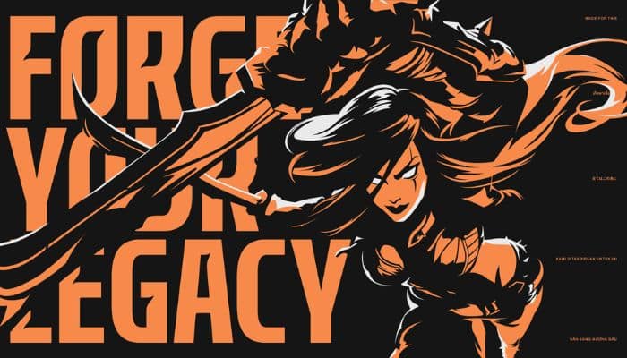
Koto was responsible for the full development of the LCP brand, including strategy, design, tone of voice, and visual identity. Central to this is the brand platform ‘What We’re Made Of’, intended as both a message of unity and a declaration of intent for APAC’s place on the world stage.
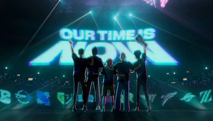
The LCP brand was designed to be versatile across digital and physical environments — from teaser communications and arena visuals to player statistics and broadcast graphics. Its visual centrepiece is ‘The Pinnacle’, a molten 3D emblem featuring five pro players locked together, symbolising regional unity and ambition. A modular graphic system inspired by the game’s in-map lanes supports consistent visuals across multiple platforms.


The tone of voice for LCP is guided by three principles — raw, energised, and focused — aimed at creating immediacy and emotional connection across channels such as social media, broadcast graphics, and marketing campaigns.
Supporting this is a custom typeface called LCP Ignite, designed for flexible, multilingual use to engage audiences across diverse markets. Koto also developed a comprehensive design system, including hundreds of brand assets and templates for everything from pre-match hype and live stats to post-game analysis. These assets are intended to ensure consistent execution and scalability across seasons.
Gerald Torto, senior strategy director at Koto Sydney, shared, “The goal with LCP was to frame the league not just as a competition but as a cultural force. The energy and sentiment captured in the idea ‘What We’re Made Of’ is a fitting platform. It gives APAC an unapologetic and proud voice that looks ahead to an exciting future. This became the driving force behind everything we created, from architecture and positioning to verbal and visual identity.”