Singapore – Go-Ventures, an investment firm focused on the Southeast Asia region, has announced its rebranding effort to Argor, signaling the firm’s strategic direction and independence as it targets high-growth start-ups across the region.

The Argor rebrand was made possible by WPP’s Design Bridge and Partners, and is underpinned by the brand message ‘genuine performance, representing the firm’s mission to be truly authentic in its commitment to founders and investors.

The new brand name ‘Argor’ – derived from the words “ardor”, “rigor” and “Go” – was created by Design Bridge and Partners to convey the dynamism, transparency and relentless pursuit of excellence that Argor encapsulates in its mission to support Southeast Asia’s fastest-growing companies. The name has been brought to life through a new logo – a bold and sleek wordmark – crafted to reflect Argor’s determination to always create impact in everything they do.

Moreover, a fresh, distinctive and contemporary colour palette and combined typeface have also been designed to serve as a manifestation of the brand. The dark green colours throughout the identity deliver on trust, experience and gravitas while the light blue indicates Argor’s openness towards different partnerships and experiences. Injecting a distinct pop of vibrance to the colour palette is bright orange, which represents the brand’s tenacity and the bold ambitions they have set sight on. The fonts, Canela Text and Archivo, a modern and sophisticated combination, have been chosen as the brand’s typography to be used across all brand communications.

Lastly, Argor’s new photography style will further enhance its brand mission. Abstract images establish them as a strong but quiet force, capturing the trails of impact they leave behind, whilst environmental imagery can be used to tell the brand story and mission, focusing on unique perspectives and capturing the alluring charm of Indonesia’s landscapes. People’s photography will be natural and relatable, showcasing its collaborative spirit and attention to detail.

Ambrish Chaudhry, head of strategy at Design Bridge and Partners, said, “It was a privilege to support Argor in its journey to re-establish its identity at a time of strong growth for the brand. Together we have built an exciting and refreshing identity that captures its commitment to founders and the investor community, maintains its important connection to GoTo and bakes authenticity and passion into its very DNA.” 

New York, USA – Tremor International, the parent company managing the combined demand-side platforms (DSP) Amobee and Tremor Video, the supply-side platform (SSP) Unruly, and the CTV ad server Spearad, has endeavoured into a major rebranding. 

Adopting the new name, Nexxen, the unified branding direction will encompass all of the company’s key business units. Moving forward, products will be called, Nexxen DSP, Nexxen SSP, and Nexxen Ad Server. Furthermore, the latter two – its SSP and Ad Server platforms – will go to market collectively as Nexxen CTRL.

Nexxen bridges the buy- and sell-sides through a single, cohesive video- and CTV-focused platform, that aims to enrich every stage of the campaign lifecycle with advanced and exclusive data, including automatic content recognition (ACR) data. Each pillar of the company’s technology stack is aimed at effectively addressing industry challenges, minimising waste, and maximising media spend and revenue across premium content and scaled targeted audiences. 

Following the integration of Amobee earlier in 2023, brands, agencies, and media companies will be able to leverage Nexxen for discovery, cross-platform planning, activation, measurement and optimisation.

“Nexxen embodies our vision for a robust and flexible horizontal platform that can be tailored specifically to meet our partners’ needs by enabling effective video campaigns across all screens, with a specialisation in CTV. This new chapter is grounded in delivering meaningful value, capitalising on the collective strength of our technology, data and services to work in the ways that are most impactful to brands, agencies and publishers,” said Ofer Druker, CEO of Tremor International. 

“As we look to the future, Nexxen is well-positioned to drive superior outcomes, through advanced audience discovery and planning tools with cross-platform capabilities that ensure incremental reach in converged linear and Connected TV, unique and exclusive data sets including ACR, and powerful, dynamic data-driven creative,” added Druker. 

Moving forward, the company shared that it also intends to change the listed Tremor International Ltd. parent company name to Nexxen International Ltd., subject to a shareholder vote at its upcoming Annual General Meeting.

Georgia, United States – In collaboration with Jones Knowles Ritchie, Grey, VMLY&R, and Landor & Fitch, Minute Maid, one of the world’s largest juice brand, has launched its first-ever global rebrand anchored by a refreshed visual identity and global campaign.

‘Filled with Life™’, the brand’s first global marketing campaign, will feature the new look alongside messaging that invites consumers to ‘slow down and refresh’. The campaign will also feature an end-to-end experience that varies by market, including TV and digital out-of-home advertising, online video, social media content, and on-ground experiences. 

There will also be on-pack QR codes, which will direct its consumers to challenges, promotions, and other engaging content.

According to the release, the new visual identity is accompanied by a warm and lively colour palette inspired by the bright tones of fresh and ripe fruit. Moreover, the softer and more natural typeface aims to breathe new energy into the familiar Minute Maid expression paired with dynamic and asymmetric visuals.

“The brand is enjoyed by many worldwide, but the brand experience can vary depending on where you encounter it,” said Rapha Abreu, global vice president of design at The Coca-Cola Company. 

Abreu added, “We felt the Minute Maid family was due for an elevation to the icon it truly is. With this move, we are thinking about our brand holistically – developing a flexible global design system centered on what makes Minute Maid unique – and defining and evolving our distinctive assets so that they can be adopted locally to connect with consumers around the world.”

Katalin Czigler, global brand strategy director at Minute Maid also said, “We know from consumer research that drinking juice is about more than just the taste; it’s about hydration, nourishment, indulgence and more.”

She added, “The experience people get from drinking Minute Maid makes them feel good. Minute Maid wanted to bring that to life visually and in our communications worldwide. This perfectly reflects our brand mission to help anyone, anywhere and at any time, feel alive, which is needed now more than ever.”

Singapore International food company Yummy United has initiated Asia’s first-ever Kids Board of Directors (BODs) via its inaugural launch programme held in Singapore. The launch is in partnership with Food Union to rebrand its existing frozen cheese curd snack line, Lakto. 

For the rebranding effort, children aged eight to 12 years old were called for an opportunity to be mentored on finance, marketing, creative execution, and public relations via its recruitment campaign last July.

The programme placed the kids in control and spearheaded a business with guidance from industry professionals. Through the process, the kids obtained a deeper understanding of the functions of managing a business.

Among the 20 shortlisted director trainees mentored under the Yummy United Training Programme were the previously announced Kids Board of Directors, namely nine-year-old Lucas Lim, creative director; eight-year-old Ashley Shannon McGovern, public relations director; ten-year-old Eliana Yazdi, marketing director; and 11-year-old Chloe Oh, finance director.

The four young Kids BODs worked together to conceptualise the rebranding of Lakto. The refreshed packaging for Lakto was designed and hand-drawn by the creative director and the strategic planning process for communications was led by the public relations director. 

Meanwhile, the marketing director took charge of the content-creating process for Yummy United’s official social media pages while the financial strategies and account operations were overseen by the finance director.

The newly refreshed Lakto packaging, fully designed and curated by the four Kids BODs, is now available at supermarkets and convenience stores around Singapore.

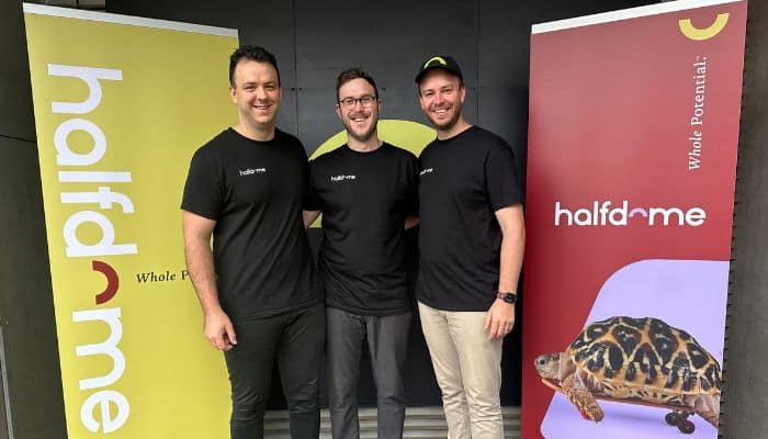
Australia Independent media agency Half Dome has announced a new brand positioning centred on the agency’s promise to unlock the ‘Whole Potential’ of its clients and people. The rebrand comes as the agency celebrates its growth and sixth year of operation.

The brand refresh includes a complete update of the company’s visual identity and brand assets, as well as the development of a new website in partnership with digital agency Straight Out Digital, plus a new, expanded Melbourne office later this year.

Moreover, the new brand positioning reflects the agency’s commitment to attracting and retaining clients and people who share a ‘challenger mindset’.

“Working with clients in the marketing space for our whole existence, Half Dome has a sound understanding of what constitutes a strong brand strategy and brand campaign. We have invested heavily in a rigorous process which engaged leaders in the strategy and creative fields to ensure that we practiced what we preach,” said Half Dome’s co-founder and Head of Product, Will Harms.

He added, “Where we have landed, with our promise to clients and staff of unlocking their ‘Whole Potential’, is both a celebration of what we are already doing, whilst simultaneously providing the necessary ambition which will fuel our product and culture growth over the coming years.”

Joe Frazer, co-founder and head of growth at Half Dome, also explained, “‘Whole Potential’ is a rally cry to attract like-minded clients and individuals; our research indicates a sentiment in the market from clients that they could and should be getting more from their agencies. Our unique positioning sits at the intersection of holding groups, independent agencies, and consultancies – drawing on the best parts of each.”

Half Dome also engaged external brand consultants Untangld and creative agency By All Means to assist the agency to develop its positioning and new brand identity. The discovery process included extensive interviews with staff, clients, the industry, and external partners for more than nine months.

James Needham, strategy director of Untangld, said, “Half Dome is often perceived as a ‘hot indie start-up’, when the truth is it’s a genuine alternative to the big boys. It was a pleasure working with them on a strategy for the business built around ambitious growth and real authenticity.” 

Meanwhile, Mat Cummings, managing partner of By All Means, commented, “We love working with the Half Dome team on client projects, so to be given the opportunity to bring the By All Means creative skills to the Half Dome brand was a project we couldn’t wait to take on. The challenge, as with any good brand, is bringing to life the truth via inspiring stories and visuals, and communicating what’s in it for all stakeholders, all the time future-proofing the brand.”

Half Dome is an Australian-owned full-service media agency established in 2017, which delivers services across paid media planning and buying, SEO and performance creative production, and works with challenger brands across all markets in Australia.

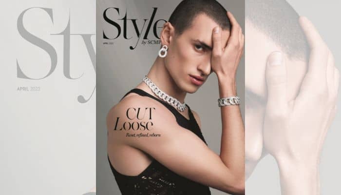
Hong Kong The South China Morning Post, the Hong Kong-headquartered global news company, unveils its all-new Style by SCMP, a rebrand of its flagship Style publication known for curated and insightful global luxury and lifestyle content through an Asian lens. 

Style by SCMP hails the advent of an inclusive luxury experience that values knowledge, access and connectivity, a dynamic perspective that moves away from purely symbolic representations of exclusivity and wealth, marking a new era of South China Morning Post’s role in the conversation on discerning and intelligent luxury. 

The revamped Style by SCMP also weaves responsible luxury, entrepreneurship, innovation, women leadership, wellness, and philanthropy topics into its coverage of the latest trends in fashion, watches and jewellery. 

“The slanted letter ‘l’ is evocative of the slash (/), which is prevalent across the creative community. This places the brand’s stake in a multi-hyphenate-driven milieu, and highlights the versatility of roles and viewpoints which make up today’s luxury market,” says Vincenzo La Torre, chief editor of Style by SCMP.

Kevin Huang, chief operating officer of South China Morning Post, also commented, “The South China Morning Post is dedicated to nurturing communities that bring together brands and influencers who are united by their pursuit of knowledge, wellbeing, betterment and fulfilment, where the affluent and influential can be the heroes and heroines of their own stories.”

Style by SCMP publishes ten issues a year and is distributed with the South China Morning Post, counting luxury hotels, hair salons, wellness spas, and airport lounges amongst its key distribution locations.

Singapore – Global brand publishing agency Green Park Content (GPC) has recently rebranded to Greenpark, with its rebrand effort focused on purpose and performance-driven content.

The new update comes in line with the agency’s goal of gearing up for hyper-growth of its business, talent, and clientele in the global market, as well as being able to help more brands explore and fully embrace their purpose through its data-driven, omnichannel approach to drive quality consumer engagement, spike conversions, and achieve commercial objectives.

Parallel to its rebranding effort, Greenpark’s innovation and strategic diversification now extend to the latest in artificial intelligence. Its generative AI creative solution enhances content output while delivering time and cost savings for clients. By marrying state-of-the-art marketing tech with human expertise, Greenpark cements its status as a brand publishing pioneer—and a purveyor of award-winning content.

Moreover, the agency has also built a dedicated insights division integrated with its established SEO expertise to drive impactful strategies across search and social to deepen cross-platform audience insights.

For Sven Lung, founder and CEO at Greenpark, the rebrand effort aims at strengthening their competitive brand proposition.

“By leveraging our creative, strategic and technical expertise to double down on purposeful content that makes a difference in people’s lives, we can help more brands live their purpose through digital channels to drive quality engagement with consumers, higher conversions and achieve commercial objectives,” Lung said.

He added, “As a business culture, we strive and act together in our ambition to make a positive impact for the people and brands we serve, we do everything with kindness at the core – these are the values that guide us at Greenpark.”

Kuala Lumpur, Malaysia – With its commitment to promoting gender equity, digital-first agency Lion & Lion has rebranded itself to be called ‘Lion & Lioness’ for the entire duration of international women’s month. This is to celebrate the said designated period of honouring women, with the brief name change also coming with an empowering tagline, ‘Roaring for Equity’; and a new logo to boot showing a lion and lioness.

With a team that is currently consisting of 60% female, Lion & Lion emphasised that the agency is taking meaningful steps to establish a network that values and recognises the contributions of its female staff whilst creating a more effective team that can better serve the clients.

Some of these efforts include introducing two initiatives for the support of female employees such as creating a ‘priority room’ in the Kuala Lumpur office to give a comfortable space for upcoming mothers who need a private area to breastfeed or rest and an alarm keychain that can be used in times of danger.

This Women’s Month, Lion & Lion also gives a spotlight to its female leaders or ‘lioness’ from the different departments of people & culture (HR), traffic, media planning, and in-house marketing & communication team who play significant roles in operating internal processes and client servicing. 

These female executives include regional head of people & culture Mawar Mustaffa; client services manager Julia Michelle Boudville; media lead Rafeah Siron; and senior marketing manager Menuka Vejasegaran.

The special rebranding comes with an on-ground celebration at the Kuala Lumpur office on 8 March where all employees, regardless of gender, can enjoy the team building and engaging activities.

As an agency that aims integrate data and creativity, Lion & Lion continues to drive efforts in providing impactful solutions for clients. Earlier this year, it expanded its offerings by launching a film production studio to connect its integrated creative, social, and digital experience solutions.

Sydney, Australia – Independent creative agency Now We Collide launched a new campaign unveiling digital employee experience company Azuronaut’s new name, Cocentric.

The rebranded Cocentric aims to improve the digital employee experience in order to ‘bring people and tech together to unite and connect the workplace’. It is also set to launch today across the UK, Europe, Australia, and New Zealand with a redesigned website, and digital and social media presence.

Global brands like Kerry Group, Populous, Pladis (McVitie’s, Godiva), and The White Company have already partnered with Cocentric to improve their employee communication and collaboration strategies.

In its rebranding efforts with Cocentric, Now We Collide overhauled the company identity by creating a new company wordmark, which is a play on the words collaborate, communicate, and centric.

The agency also created a new logo, style guide, and brand strategy for the company. It also refined and defined Cocentric’s core company values, mission, vision and purpose.

“Our approach to the digital employee experience is unique and our rebrand as Cocentric reflects this, clearly differentiating us from the competition. The rebrand has already been embraced by our employees and stakeholders and we’re excited to see it go live,” said Regan Collins, Cocentric’s founder and CEO.

Cocentric COO Brett Secole also comments, “Our business had evolved hugely over the last few years and the relaunch as Cocentric represents an expression of our huge growth, providing our clients, employees and wider stakeholders real clarity on our strategy moving forwards.”

On collaborating with Now We Collide for the rebranding, Rhea Hokayem-Conway, head of marketing at Cocentric said, “We reviewed a number of proposals as part of the pitch process and Now We Collide immediately stood out due to the calibre of their work, their insights led strategy and their understanding of the challenges we faced.”

She added, “Everything was very collaborative from the outset, this has enabled us to get the very best out of the partnership with them, and we’re looking forward to working closely with them in future as we continue to roll out marketing plans”

Keir Maher, CEO and managing partner at Now We Collide also said, “Cocentric is a dynamic company on the move, with a market-leading mindset and that sits perfectly with our approach. As a team we were totally aligned from day one on the challenges and where we needed to get to. It’s always a great experience to work with businesses with similar values on collaboration, embracing change, challenging conformity and our ambitions for the future. The result speaks for itself with a much clearer brand look, feel and sound.”

Kurt Toohey, creative director at Now We Collide explained, “The visual identity and brand framework firmly sets Cocentric apart in their category and gives the team a solid foundation to build on as the brand continues to evolve. Along with a new name, we developed a simple, yet strong wordmark, brand symbol, refreshed colour palette and layout system.”

Toohey added, “Animated versions of the brand symbol and wordmark were also created, with the symbol variations subtly alluding to the brands purpose to ‘unlock the best in people’, with the silhouette of a lock forming before transforming into the open ‘C’ shape.”

Prior to the collaboration with Cocentric, Now We Collide was also tapped by digital transformation firm TMX to manage its brand strategy.