Australia – 
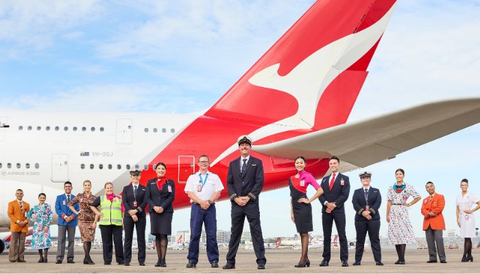
Qantas has announced plans to redesign its uniform for the first time in over a decade, as the airline moves forward with its fleet renewal program, ongoing customer investments, and preparations for the upcoming Project Sunrise initiative.

For this project, Qantas has announced it is searching for a new Australian designer to lead the redesign of its uniform, a significant move aimed at updating one of the most important visual representations of the airline’s brand.

Placing its workforce at the core of the redesign, Qantas will survey its 17,500 uniformed employees to help shape the development of the new uniform, which will reflect the airline’s future direction.

The new uniform design will coincide with Qantas’ ongoing fleet investments, including more than 100 aircraft on order across the group over the next decade, alongside significant upgrades to its existing fleet.

Vanessa Hudson, group CEO of Qantas, said, “We have ambitious plans for the future, and transforming the way we reflect the brand is critical to that. Our uniform represents the Qantas spirit all over the world. With a vast and growing international and domestic network, a historic fleet renewal program underway, and the final frontier of global aviation just around the corner, it’s time to define a new look for our people that reflects where we are heading.” 

Qantas will announce the new uniform designer in the coming months, with plans to debut the redesigned uniform in 2027. The airline will engage multiple Australian designers to assess the requirements and lead a selection process for the eleventh uniform in its history.

Previous designers of the Qantas uniform include Peter Morrissey, Yves Saint Laurent, George Gross, Harry Who, and Emilio Pucci, with each design reflecting significant milestones in the airline’s 105-year history.

“Since our beginnings, the way we represent the brand has evolved significantly. While the uniform style may have changed, what hasn’t changed is the pride our people have in wearing it, which is why we are putting them at the core of the design process. Our people have loved wearing the current design, which was created by Martin Grant in 2013, and I want to thank him for his partnership over the course of the last decade,” Hudson added. 

Singapore – Mental health services provider Talkspace has launched its updated brand identity, which further embodies its fundamental belief that therapy and mental health support should be integrated positively into everyone’s lives.

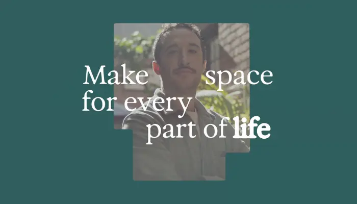
Made with brand and digital studio Koto, Talkspace’s revitalised brand spans marketing, website and campaign elements, highlighting the value of therapy experiences and promoting mental health.

Koto’s comprehensive rebrand aimed to reflect Talkspace’s 12-year evolution and the increasing accessibility and normalisation of therapy. Anchored in the Brand Idea ‘Make sense of it’, the new Talkspace emphasises that mental health care should be a regular practice, whether for navigating daily life challenges or addressing trauma or serious mental health conditions.

The Talkspace brand personality embodies the principle of ‘Sense Maker’, assuring members that Talkspace is a trusted partner in navigating life’s chaos and clutter, at a pace that suits each individual.

Talkspace’s fresh look showcases a redesigned brand symbol and refined logo, embodying the essence of the new brand concept while bringing space and clarity through its simplicity. Specifically, the T-shaped brand symbol signifies the versatility and adaptability of therapy, creating room for individuals to make sense of their experiences.

Additionally, Talkspace features a refreshed colour palette that aims to express and uplift, a new typography that conveys Talkspace’s brand values of clarity, emotion, and rigour, as well as two new illustration styles that can lean towards functionality or narrative emotion.

Talking about the refresh, Katelyn Watson, chief marketing officer at Talkspace, said, “We’ve transformed our brand identity to both reflect and celebrate shifts in the mental health landscape, especially the normalisation of therapy and mental health conversations, and the fact that innovation and insurance coverage make quality care more accessible than ever.”

Meanwhile, Joe Ling, creative director at Koto, commented, “Therapy and mental health play a crucial role in self-acceptance and the pursuit of happiness. In Talkspace’s rebranding journey, our aim was to underscore the importance of viewing therapy and mental health as essential practices.”

Singapore – As the Chinese New Year approaches, Coca-cola calls on everyone across generations in Singapore to celebrate in an interactive and meaningful way through a striking new packaging that is suited for the holiday. 

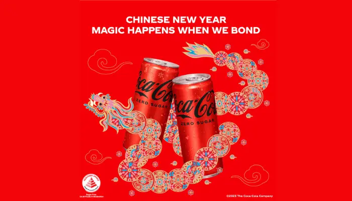
Designed to resonate with a wider audience, Coca-cola’s campaign features a redesign of Coca-cola’s cans with a dragon, this year’s zodiac symbol which perfectly embodies the spirit of the Chinese New Year.

Aside from this, Coca-Cola aims to recreate the tradition of wish-giving, a symbol of rediscovering each other and bringing families closer through their own interactive Dragon AR filter available on Facebook and Instagram, an engaging way for young people to send well-wishes to their loved ones.

The campaign is further brought to life as MediaCorp personality Hazelle Teo collaborates with Coca-cola on a music video that aims to light up this Chinese New Year and celebrate in style. 

Additionally, Coca-cola also made sure to put up engaging city-wide outdoor digital displays, as well as organised an experiential activation outside Wisma Atria through an immersive dragon tunnel, where Singaporeans can capture picture-perfect moments and take part in the activities to receive prizes. 

The new dragon-themed packaging of Coca-Cola is available only for this Chinese New Year. It is also worth noting that customers can win limited edition gold-plated dragon cans by spending S$18 and above on brands across Coca-Cola’s group of companies.