Manila, Philippines – Financial management app Lista launched its new branding to underscore its strategic shift towards offering personal finance services for users. 

Lista’s rebranding introduces ‘Finn the Carabao’, a lovable and relatable character that is set to become a prominent symbol of the brand in its aim to make personal finance more accessible and convenient for its Filipino customers.

The finance management app will also offer an opportunity for its users to access their credit scores for only 10 pesos. This move is Lista’s way to promote financial literacy, as it exemplifies their dedication to making financial education and empowerment accessible to all.

The rebranding efforts come as Lista strengthens their brand’s core mission to empower individuals to make informed financial decisions and achieve their financial goals while solidifying their position as a trusted partner in everyone’s financial journey.

Since its founding in 2021, the financial management app has been providing innovative financial solutions tailored to micro, small, and medium-sized enterprises (MSMEs). Lista plans to expand its range of services to offer more promotions and initiatives aimed at raising awareness about the importance of financial literacy for its users. 

Aaron Villegas, CEO at Lista, said, “We are thrilled to rebrand our logo and overall look as we embark on this exciting journey towards providing easy-to-use personal finance tools and solutions. While we have been proud supporters of MSMEs, we also recognise the pressing need to empower individuals in their own financial journeys. Our rebranding signifies our commitment to this mission.”

Commenting on the new logo, Khriz Lim, co-founder and COO at Lista, said, “Finn the Carabao embodies the spirit of Lista. Finn serves as the personification of Lista’s mission: to help Filipinos effectively budget their money in line with their life priorities. It stands ready to guide and support users on their financial journeys, ensuring they have a trustworthy and friendly companion by their side.” 

Singapore – Android, the largest mobile operating system globally, has unveiled its recent brand revamp, which includes its iconic robot mascot more prominently by introducing a new 3D look.

In a blog post by Jason Fournier, director of Android consumer brand management, the ‘bugdroid’ — the face and most identifiable element of the Android robot — now appears with more dimension, and a lot more character. 

As a visual signifier of the brand, they wanted the bugdroid to appear as dynamic as Android itself.

“We’ve also updated the robot’s full-body appearance to ensure it can easily transition between digital and real-life environments, making it a versatile and reliable companion across channels, platforms and contexts,” he said.

Meanwhile, their new visuals draw inspiration from their material design to complement the Google brand palette, as well as be adaptable. The refreshed and dynamic robot shows up where Android connects with people, community and cultural moments, and additionally reflect individual passions, personality and context.

“While we’ve added more curves and personality unique to Android, the new Android stylization more closely mirrors Google’s logo and creates balance between the two. We hope these small but significant updates to the Android typeface will better communicate the relationship between Android devices and the Google apps and services people already know,” he added.

Over the past decade, the Android brand has undergone several updates to modernize its look and feel and evolve with the needs of our community. In 2019, for instance, they changed their logo to be more accessible and easier to read. In addition, they have also updated the naming convention for Android releases from fanciful (e.g., Android Lollipop) to simple (e.g., Android 14), making subsequent releases clearer and easier to understand globally.

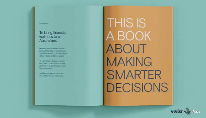
Australia – Australia’s fintech company Wisr has launched a complete brand redesign, done in collaboration with creative agencies Bear Meets Eagle on Fire (BMEOF) and Resn.

Wisr, formerly known as DirectMoney, deems to be the country’s first neo-lender and fintech pioneer in the consumer finance market. It builds products, apps, and services that brings financial wellness to Australians.

The new brand identity retains and builds on some previous aspects of the Wisr brand, which includes the logo and purpose, but almost everything else ‘Wisr’ has been rethought and reinvented around the new creative positioning ‘For your smart part’.

To mark its new brand redesign, Wisr has rolled out its first-ever major campaign with BMEOF, showcasing ‘For your smart part’. The comprehensive project runs across all brand design, product, and communication, and is built to deliver a clear message around its purpose – ‘financial wellbeing’.

The campaign includes an ambitiously crafted desktop and mobile experience, co-created by BMEOF and Resn. It also includes work from famed illustrator Peter Grundy, Swedish-based 3D animation artist Oscar Pet Petersson, and Revolver director Steve Rogers.

According to Wisr’s Chief Marketing Officer James Goodwin, the company’s focus is supporting customers’ smart decision-making and rewarding that good behavior, which in turn helps them achieve its purpose of helping improve Australians’ financial well-being.

“We’re massively proud of how we’ve built Wisr, but we also knew it was time to realign everything we were doing around a bigger idea, to take that next step. Bear and SPEED, our media partners, have challenged and supported us every step of the way along that journey,” said Goodwin.

Meanwhile, Toby Hussey, the managing director of BMEOF, commented, “It’s not often you find a project and partnership like this. What started out as strategic discussions and a campaign, eventually led to a complete re-evaluation of everything ‘brand’ for Wisr. It’s been a dream project for us.”

“Working with Bear and Wisr to help the brand come to life on the site, was a fun creative challenge. It was a great opportunity to bring a high level of design and polish to the fintech category,” said Dan Mercer, the creative director of Resn.