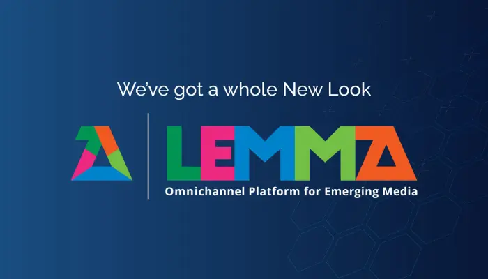
Lemma’s new look and feel represents its continued commitment to innovation while reinforcing its position as a leading global omnichannel supply-side platform offering trust, transparency, control, and flexibility to its stakeholders.

India-based homegrown and diversified communications group Madison World has announced its latest brand refresh ahead of its 36th anniversary celebration.
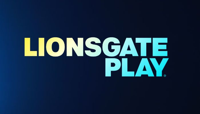
Aligned with its new identity, Lionsgate Play will continue strengthening its connection with the viewers, focusing on employing an advanced user interface, enhancing consumer experiences, faster app loading times, and an overall increase in stability, promising a polished look and feel when streaming...
The latest logo of QSR brand Leon's went from a modest shade of mustard to a bright, bold, and classic red.
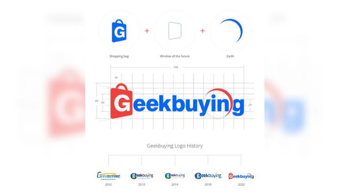
Geekbuying's brand upgrade will be launched in June, with a new logo and VI system, branding position, and core values.
HubSpot's new campaign aims to highlight its new logo, CRM, and mission to focus on reaching a new audience of upmarket decision-makers.
The new logo is also in line with their brand revamp last year to be more relatable to their growing consumer base.
To celebrate Shangri-La Hotels and Resorts' 50th-year anniversary, the brand has launched a refreshed logo.

SPi Global, the global content technology enterprise headquartered in Singapore, has rebranded to 'Straive'.
Media agency Trapper Media Services MY has launched a company-wide brand transformation, the first time ever since its founding in 2001.