United States – 
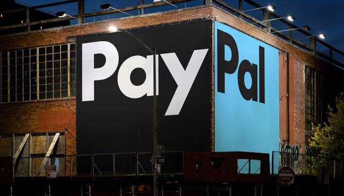
Multinational financial technology leader PayPal has unveiled a new brand identity designed to unify its image and reflect its mission of revolutionising global commerce, in collaboration with design firm Pentagram.

PayPal’s refreshed brand identity heralds a new chapter for the company and its customers, signalling a shift towards a simpler, cleaner, and more modern approach infused with optimism.

For this brand refresh, Pentagram collaborated closely with Diego Scotti, executive vice president and general manager of PayPal’s consumer group and global marketing & communications, and Geoff Seeley, chief marketing officer at PayPal, along with the company’s internal communications, marketing and advertising teams.

The design firm also worked with PayPal to manage the implementation of the new brand system, which includes an advertising campaign by BBH Global featuring Will Ferrell.

Designed by Andrea Trabucco-Campos and the Pentagram team, PayPal’s evolution features a custom typeface, PayPal Pro, a refined colour palette, and a motion language inspired by everyday payment behaviours such as tapping, flipping, and swiping.

Pentagram assisted PayPal in developing a new visual strategy for its brand identity, emphasising principles of simplicity, optimism, and trust to enhance accessibility for “Everyone, everywhere.” This bold and direct approach is designed to promote flexibility for future brand partnerships and collaborations.

Furthermore, the updated PayPal monogram showcases sharper, modern letterforms with de-rounded corners and a refined colour palette that adds depth and contrast. While maintaining its core structure, the monogram now functions independently from the wordmark, providing greater creative flexibility in the brand’s visual identity.

PayPal has also replaced its iconic 20-year-old logo with a new design featuring a custom typeface called PayPal Pro. This bold and clear wordmark focuses on straight lines and circular curves, ensuring the message remains the priority. Additionally, Pentagram is collaborating with Lineto and PayPal to create a secondary typeface, PayPal Pro Text, optimised for legibility at smaller sizes.

The new logo is complemented by a neutral black and white palette, distinguishing it from the traditional fintech blue. The previous yellow has been removed, and outdated yellow payment buttons have been replaced with black. This streamlined palette aims to enhance PayPal’s brand personality through vibrant imagery, showcasing the platform’s accessibility in authentic, spontaneous moments.

Finally, to highlight PayPal’s user-friendly experience, the brand launched a new motion identity that captures everyday transactional gestures, both digital and physical. The new brand animations bring the wordmark and typography to life with taps, clicks, flips, and swipes, seamlessly incorporating the movement of the payment experience into the brand identity.

As part of its new identity, PayPal has launched the PayPal Debit Card, with additional brand expressions to be introduced as part of an expansive design system—designed for everyone, everywhere.

In an official website blog, PayPal and Pentagram stated, “PayPal has been revolutionising commerce globally for more than 25 years with innovative experiences that make moving money, selling and shopping simple, seamless, personalised and secure. The digital payment platform is now ushering in a new era for customers that makes it easier and more rewarding to shop and pay with PayPal anywhere, anytime,” 

International marque Rolls-Royce has announced that it has taken measures to further resonate with its younger clients, specifically a revamp of its brand personality.

The company said that since it has introduced its edgier Rolls-Royce car model, Black Badge in 2016, it has attracted a younger demographic of clients, with clients showing to have an average age of 43. 

A different visual aesthetic and language, one that would “encapsulate the brand’s presence and standing as a true house of luxury” are the company’s main goals for the brand, and it has appointed UK-based design firm Pentagram to accomplish the reboot.

Rolls-Royce Chief Executive Torsten Müller-Ötvös said,  “As the marque’s digital presence increases, there has never been a more important time for the visual language of the company to reflect our standing as [a global] luxury brand.”

New brand colors

From textural wooden brown and graphite-colored hues, Rolls-Royce will now be donning a deep, majestic tone of purple. 

According to Pentagram, although the former colors of the brand showed its artisanal origins, the palette confined the identity to the past. 

“The desire was to seek a more expressive, luxurious colour palette, one appealing to both male and female clients, one with a future vision,” said Pentagram. 

The purple color named Purple Spirit will now become Rolls-Royce’s signature color, on which a metallic Rose Gold will be thrown in as a complementary hue. 

The Noir imagery which surrounds Rolls-Royce’s Black Badge range is also said to be punctuated anew by bursts of color, reflecting each model’s launch specification, illustrating the nature of the model as the brand’s edgier version.

Monogram and typeface

The company said that the double ‘R’ monogram will retain its original form but will be replaced on collateral. 

Meanwhile, the wordmark ‘Rolls-Royce Motor Cars’ as found presiding above the door of the marque’s establishments, was found to be corporate and unrepresentative of the marque’s standing as a luxury brand.

Pentagram is said to have sifted through typography pegs in the marque’s archives from the 1930s before ultimately using an art-deco style as the basis from which to envisage a new wordmark.

The words ‘Motor Cars’ have now been reduced in size, with the emphasis reverting to Rolls-Royce. Meanwhile, special significance has been paid to the letter ‘R’, to provide additional stability and prominence to this important character in the Rolls-Royce script.

For the brand’s typeface, on the other hand, the design team has chosen Riviera Nights, which stems from the same family of the brand’s previous font Gil Sans Alt, but now with additionally crafted and beveled letters.

The Spirit of Ecstasy

Amid the brand’s revamp, the marque’s emblem, The Spirit of Ecstasy, which has graced the prow of Rolls-Royce motor cars since 1911 has been decided to be given more attention due to its instantly recognizable and modern symbolism of British luxury. 

A wholly new visual treatment of the emblem has been created, called The Spirit of Ecstasy Expression where a visual with “an ethereal yet tech-like feeling” will be depicted. 

Akin to a silken fabric, The Expression will adopt a fluid form and a feel of versatility. An innovative digital tool that uses coding has been developed by Pentagram to enable The Expression to be used on any surface, from projection to embroidery, as well as to printing to engraving.

It will now be in both physical form at the marque’s global establishments and in digital form, and will start becoming a staple element of the marque’s visual language.