USA – We. Communications has introduced a brand refresh that includes a new logo, an updated name, and a revised vision, reflecting its approach to helping businesses navigate communication challenges in a rapidly changing world.

The refreshed We. Communications brand focuses on simplifying complex ideas and making them more accessible. By highlighting key insights that resonate with people, the agency aims to help companies communicate effectively—whether by explaining AI advancements or making green energy innovations more understandable.

“We’ve learnt that beneath even the most unruly or unpredictable situations lies a human need. That could be for connection, credibility, joy or a sense of fulfilment. But it’s always there,” said Waggener Zorkin, founder and global CEO of We. Communications.

“It’s by pushing to uncover and speak to those truths that we can shape how people think, feel and ultimately act,” she added.

Key changes in the rebrand include a streamlined name, shifting from “WE” to “We.”, to create a more human and cohesive identity. The update aligns with the agency’s founding values and its belief that true strength comes from collaboration.

The rebrand also includes a new logo with a circular design, reflecting themes of collaboration and community. Additionally, the agency has launched an updated website focused on addressing current communication challenges and plans to release an updated ‘Brands in Motion’ study in the coming months, offering insights into shifting business landscapes.

Dawn Beauparlant, CEO of North America at We., said, “Our new brand better reflects the agency we are today. Pulling from our deep expertise navigating complexity and our willingness to run toward the hard stuff, challenge assumptions and dig deeper in a world where the answers aren’t always clear.”

Kass Sells, CEO of International at We., added, “This refresh reinforces our commitment to turning big challenges into powerful opportunities for connection, impact and growth. It’s about ensuring our clients can confidently navigate change, tell their stories in meaningful ways, and drive real progress in the world.”

For over 40 years, We. has connected technology and human experience, expanding its expertise across industries. This evolution shapes its latest brand refresh, reflecting a focus on helping clients navigate change and engage their audiences.

The updated brand will be introduced globally, with some We. companies transitioning to the new branding later in 2025.

“The ability to communicate through uncertainty and shifting landscapes is a differentiator for companies looking to lead in complex times. Whether unveiling a new drug discovery or responding to a global crisis, organisations that can articulate their purpose, engage the right stakeholders and make sense of nuanced challenges will be the ones to thrive,” shared Zorkin.

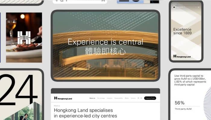
Hong Kong – Hongkong Land, a property investment, management, and development group, has partnered with branding agency DNCO to refresh its corporate identity, highlighting its core strengths and long-standing presence in city centre developments.

As part of its brand refresh, DNCO updated Hongkong Land’s identity to emphasise its core values of excellence, innovation, and hospitality. Centered around the theme “experience is central,” the new branding reflects the company’s long-standing presence in Hong Kong’s Central district and its focus on customer experience and urban development.

DNCO introduced three core values for the team: “Always Forward” emphasises continuous innovation, “Think in Generations” highlights craftsmanship and sustainability, and “Be a Bridge” reflects a commitment to building connections, inspired by Hongkong Land’s pioneering walkway system.

The agency also updated Hongkong Land’s iconic ‘H’ symbol, originally designed by Henry Steiner, to align with digital advancements, introducing a three-dimensional design with motion while preserving its original intent.

The updated symbol features added depth and dimension, incorporating textures, overlays, and perspective shifts inspired by Hongkong Land’s bridges and elevated walkways. Combined with reportage-style photography, the design aims to reflect the dynamic nature of city centre spaces.

Meanwhile, DNCO selected ‘Univers’ for its historical connection to the company and ‘Noto’ for its global reach, supporting over 1,000 languages. The typography features a classic neutral base, complemented by accent colours to add energy and modernity to the corporate brand.

Michael Smith, chief executive at Hongkong Land, said, “DNCO has given us a brand language to elegantly articulate our strategy, alongside a visual identity that reflects the premium quality at the heart of everything we do.”

Founded in 1889, Hongkong Land has played a key role in shaping city centre destinations, from reclaiming land for Hong Kong’s Central district to establishing the first Mandarin Oriental. Under new leadership, the company refreshed its brand to reflect a more forward-looking approach. 

Hongkong Land’s brand refresh is being introduced through a campaign across Hong Kong, Vietnam, Singapore, and Shanghai. DNCO also conducted brand masterclasses for over 800 employees. A new brand tool and redesigned website are in development.

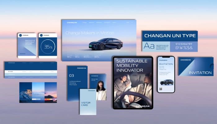
China – Changan Auto, the Chinese automotive brand, has unveiled a refreshed brand identity crafted by global brand consultancy Landor, aimed at resonating with international audiences and driving growth in key markets.

Changan Auto partnered with Landor to create a brand story that reflects its ambition and innovation as a rising global automotive force. The refreshed identity blends the CHANGAN brand with a distinct yet harmonious presence, highlighting the company’s commitment to high-quality, advanced mobility and positioning it as a pioneer in innovative driving experiences.

The brand’s new creative concept, ‘Beyond the Horizon,’ features gradients inspired by nature, symbolising innovation and progress. The visual language in photography and film evokes a sense of exploration, portraying individuals as pioneers charting their own paths toward a richer, more fulfilling life.

Steven Gao, business director of Landor China, said, “Partnering with Changan Auto on their global journey has been a privilege. Our collaboration has resulted in a powerful brand strategy and visual identity that will position Changan for success in key international markets and contribute to the continued growth of the Chinese auto industry on the global stage.” 

Changan Auto has already expanded into key global markets, including Thailand, the Middle East, and South America, with plans for further growth in 2025.

Indonesia – To strengthen its position as a high-quality, mid-to-high-end stationery brand, Bantex has unveiled a comprehensive brand refresh alongside a significant expansion of its product line in Indonesia. 

Launched at a conference in Jakarta, Bantex introduced 31 new categories and over 600 SKUs, marking a major milestone in its brand revitalization. This initiative includes a significant expansion of product offerings, the launch of innovative items, and upgrades to its visual identity, such as refreshed packaging and design, all tailored to meet the needs of both local and global markets.

The expanded product line spans a diverse range of categories, including writing materials, notebooks, office stationery, storage solutions, binding, adhesives, and document management tools. Additionally, it introduces smart devices such as attendance machines, scanners, laminators, shredders, and safes, further solidifying Bantex’s position as a one-stop solution for high-quality stationery and office needs.

During the event, Bantex’s senior leader emphasised the importance of their recent brand refresh and strategic expansion. He noted that these efforts are aimed not only at achieving growth but also at bolstering market confidence and outlook. He further elaborated that the company is committed to innovation and leadership in delivering top-tier stationery solutions.

Meanwhile, a senior leader from RUHONG Group, Bantex’s new shareholder, highlighted the potential of Indonesia’s growing market and reaffirmed the group’s commitment to investing in Bantex. He outlined plans to enhance local manufacturing capabilities and create job opportunities, emphasising that these efforts aim to drive long-term growth and foster a brighter future.

Bantex’s brand launch conference marked a key milestone, showcasing its refreshed image and “Achieving made easy” philosophy. The initiatives highlight Bantex’s commitment to innovation and quality, solidifying its position as a leader in high-end stationery tailored to diverse client needs.

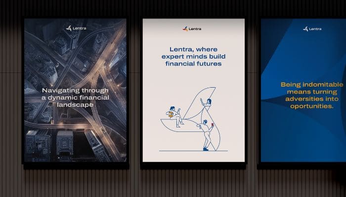
India – Recognising the need to align with evolving industry trends, digital lending platform Lentra has partnered with Landor for a brand refresh to reflect India’s shifting credit consumption landscape.

Derived from blending ‘LENding’ and ‘TRAnsformed,’ the name ‘Lentra’ reflects its mission to facilitate credit access for businesses of all sizes, promoting financial inclusion and independence.

Serving over 50 banks and NBFCs in India, Lentra’s digital lending platform empowers smarter banking with reduced credit risk and faster turnaround times. The platform enables banks to fully digitise lending processes, boost revenue, and reduce risk. Covering the entire loan lifecycle—from KYC and credit decisioning to servicing and early warning—Lentra’s cloud-based, modular infrastructure offers scalability, security, and flexibility for future-ready growth.

The brand refresh marks a pivotal step in Lentra’s journey to reimagine its identity and strengthen its market position. Designed to forge a deeper emotional connection with clients, the refresh introduces subtle yet impactful changes, giving Lentra a more sophisticated identity that resonates with today’s values.

“Brands are dynamic entities that undergo evolution over time. Our partnership with Landor helped us do just that—refine our brand identity to resonate with the evolving client expectations and establish a strong foothold in the ever-transforming credit landscape,” Lentra’s spokesperson said. 

“The positive feedback from the audience has been encouraging, reinforcing Lentra’s commitment to surpassing customer service benchmarks within the industry. With a renewed focus on brand integrity, customer journey optimisation, and industry relevance, Lentra stands at the forefront of innovation and progress in the ever-evolving landscape of credit consumption in India and is poised to drive meaningful change in the financial services sector,” the spokesperson added. 

Also speaking on the brand refresh, Landor’s spokesperson explained, “Our goal with Lentra’s brand refresh was to continue evolving expression of our original vision of creating a robust, trustworthy, and dependable brand that banks can rely on, employees can take pride in, and investors can support with confidence. The new identity reflects Lentra’s indomitable spirit that can stand the test of time and represents Lentra’s unwavering commitment to trust, transparency, and technological excellence.” 

“The Lentra tri-blade encapsulates the essence of giving and receiving, embodying intelligence, security, adaptability, and agility. Lentra’s rejuvenated brand identity serves as a timeless symbol of innovation and excellence, setting them apart as pioneers in the industry and helping banks exceed customer expectations,” the spokesperson continued. 

Lentra aims to become the leading end-to-end digital lending platform for banks and NBFCs, setting a new standard for efficiency and customer experience in the industry. With a strong focus on brand identity, user experience, and regional impact, Lentra seeks to drive a more streamlined and consumer-friendly future in lending.

Singapore – Electrolux Group’s premium brand AEG has unveiled a bold new visual identity along with its first-ever sonic branding, marking a modern evolution for the iconic 137-year-old German brand.

AEG partnered with growth and transformation firm Prophet to create its new visual identity, designed to reflect the brand’s commitment to bold design and uncompromising innovation. The updated look, recognised by numerous third-party awards, will be applied across various marketing assets, including key visuals, online content, events, and in-store displays.

“Ensuring a brand remains relevant and distinctive is a big challenge for many brands. This refresh not only highlights the importance of evolving a brand with a rich heritage but also stands as a testament to our creative partnership with Electrolux Group,” says Gregg Finlay, executive creative director and AEG account lead at Prophet.

According to AEG, the initial testing showed strong results, with the refreshed branding scoring well among global consumers and receiving positive feedback from retail partners.

Tom Astin, AEG brand and strategy director, said, “We are proud to present a sharpened and more contemporary AEG brand. Our consultations with consumers, together with strong product innovations, have been translated into a bolder and progressive expression—through visual and sound—with a world where distinctive characters play a central role alongside a colour scheme that sets AEG apart from its competitors. The evolved colour palette pays homage to our beginning as a brand back in 1887 by continuing to use red, but now sees the application of darker hues to create more cut-through and distinction. This is a modern update that strongly conveys our premium position in the market.”

Meanwhile, for its first-ever sonic branding, AEG also collaborated with MassiveMusic, the company behind sonic identities for brands like TikTok and Philips. Together, they crafted a unique sound identity that aligns with AEG’s modern brand evolution.

“As well as a visual update, we have also tapped into the emotional shortcut that sound provides to create the first ever sonic identity for AEG. We wanted to capture the world of AEG in audio and asked ourselves what the personality of the brand would sound like?! Our tests placed the music suite in the 78th percentile for memorability and the 80th percentile for appeal. We’re very excited to see this come together in the first instance to support the launch of our latest kitchen range and think the new Sonic identity does a great job to reinforce our brand promise to Challenge the Expected,” Astin explained.

Laura Jones, GM and director of client services for the UK at MassiveMusic London, added, “This was a unique opportunity to bring contemporary edge and relevance to a trusted, household brand through sound. Taking inspiration from AEG’s heritage, design ethos, and positioning, we blended warm, elegant strings with electronic textures, underpinned by a highly recallable melody. The result is a modern, warm, and sophisticated, yet effortlessly cool, suite of sounds that are perfectly in tune with AEG’s new visual identity.”

AEG’s bold new look and sound identity debuted alongside its latest Kitchen Range, featuring AI-assisted cooking technology. The range includes AI TasteAssist, designed to help consumers elevate their cooking with smart, intuitive features.

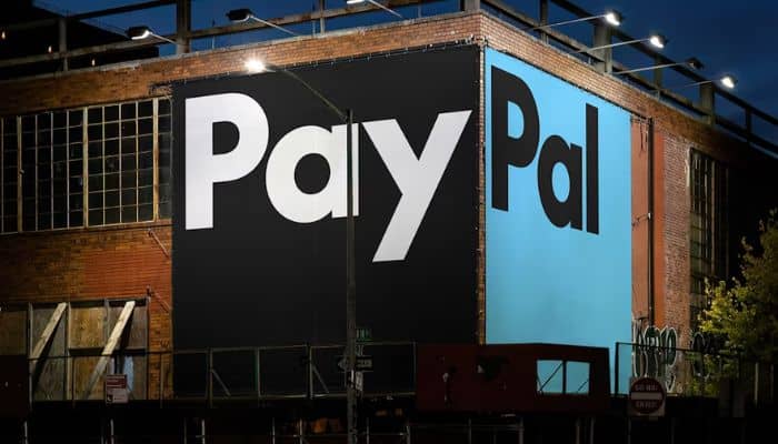
United States – Multinational financial technology leader PayPal has unveiled a new brand identity designed to unify its image and reflect its mission of revolutionising global commerce, in collaboration with design firm Pentagram.

PayPal’s refreshed brand identity heralds a new chapter for the company and its customers, signalling a shift towards a simpler, cleaner, and more modern approach infused with optimism.

For this brand refresh, Pentagram collaborated closely with Diego Scotti, executive vice president and general manager of PayPal’s consumer group and global marketing & communications, and Geoff Seeley, chief marketing officer at PayPal, along with the company’s internal communications, marketing and advertising teams.

The design firm also worked with PayPal to manage the implementation of the new brand system, which includes an advertising campaign by BBH Global featuring Will Ferrell.

Designed by Andrea Trabucco-Campos and the Pentagram team, PayPal’s evolution features a custom typeface, PayPal Pro, a refined colour palette, and a motion language inspired by everyday payment behaviours such as tapping, flipping, and swiping.

Pentagram assisted PayPal in developing a new visual strategy for its brand identity, emphasising principles of simplicity, optimism, and trust to enhance accessibility for “Everyone, everywhere.” This bold and direct approach is designed to promote flexibility for future brand partnerships and collaborations.

Furthermore, the updated PayPal monogram showcases sharper, modern letterforms with de-rounded corners and a refined colour palette that adds depth and contrast. While maintaining its core structure, the monogram now functions independently from the wordmark, providing greater creative flexibility in the brand’s visual identity.

PayPal has also replaced its iconic 20-year-old logo with a new design featuring a custom typeface called PayPal Pro. This bold and clear wordmark focuses on straight lines and circular curves, ensuring the message remains the priority. Additionally, Pentagram is collaborating with Lineto and PayPal to create a secondary typeface, PayPal Pro Text, optimised for legibility at smaller sizes.

The new logo is complemented by a neutral black and white palette, distinguishing it from the traditional fintech blue. The previous yellow has been removed, and outdated yellow payment buttons have been replaced with black. This streamlined palette aims to enhance PayPal’s brand personality through vibrant imagery, showcasing the platform’s accessibility in authentic, spontaneous moments.

Finally, to highlight PayPal’s user-friendly experience, the brand launched a new motion identity that captures everyday transactional gestures, both digital and physical. The new brand animations bring the wordmark and typography to life with taps, clicks, flips, and swipes, seamlessly incorporating the movement of the payment experience into the brand identity.

As part of its new identity, PayPal has launched the PayPal Debit Card, with additional brand expressions to be introduced as part of an expansive design system—designed for everyone, everywhere.

In an official website blog, PayPal and Pentagram stated, “PayPal has been revolutionising commerce globally for more than 25 years with innovative experiences that make moving money, selling and shopping simple, seamless, personalised and secure. The digital payment platform is now ushering in a new era for customers that makes it easier and more rewarding to shop and pay with PayPal anywhere, anytime,”